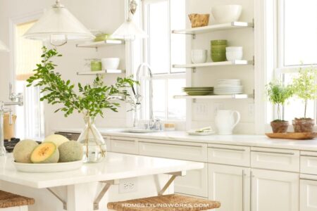
MAKE YOUR EVERY DAY MORE BEAUTIFUL® IN THE KITCHEN
Today, I’m going to talk about infusing your kitchen with elements of European style. Over my 20-year career producing locations for various clients, I’ve styled almost 200 kitchen photo shoots. Many of the kitchens have been influenced by European design (specifically, the Country French vernacular).
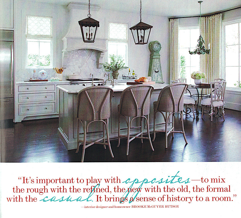
One of the prettiest kitchen stories I produced was at the Houston, Texas home of the talented interior designer Brooke McGuyer, shown below (photographed by Ryann Ford for Country French magazine). Brooke did a great job of adding European elements to her light and bright kitchen with antique furnishings, lighting and accessories.
AN OBSERVATION
Over the years, as I’ve traveled throughout Europe and stayed in and visited many different homes, I made an observation about European kitchens vs. American kitchens. The kitchens in Europe had an effortless design style to them (no matter the size). Every single element wasn’t built-in.
However, many American kitchens (with a few exceptions, including Brooke McGuyer’s lovely Houston kitchen) can have a “straight-from-the-showroom” look. Whereas the European kitchens I visited had a more “personal” feel to them. This is fairly easy to achieve, which I’ll outline in the points below. I’ll also share ideas on how you can make your kitchen a little more personalized with collections and “utilitarian chic” objects.
But let’s start with the inspiration point. The kitchen below is in Belgium, by the acclaimed interior designer Walda Pairon. (Belgium is a country you want to visit, by the way):
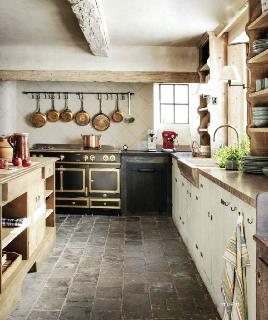
The kitchen above is the opposite of a “straight-out-of-the-kitchen-showroom” look. And note the absence of upper cabinets (but still, lots of storage). And LOADS of patina and character. This kitchen embodies the points I’m going to make below.
Here are my observations about European kitchens, both design and styling-wise:
CABINETRY & STORAGE
First off, European kitchens don’t have long runs of upper cabinets. However, there’s plenty of storage (even in smaller kitchens), but storage is in the form of freestanding antique pieces (such as a hutch or buffet). Also, open shelves are quite prevalent.
If there’s something that we Americans tend to hold onto quite fiercely is the notion that we NEED all of those upper cabinets. Think about those high-high-high cabinets that need a ladder to get to. Do you use anything in those uber-upper cabinets? Probably not. Why? Because they’re a pain in the you-know-what to access. Even in larger European kitchens, things are more out in the open and easier to access.
Below are images of designer Walda Pairon’s own kitchen in Belgium. Note the open storage and casual, collected feel of the space.

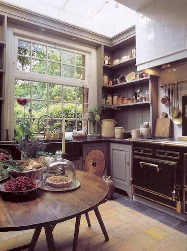
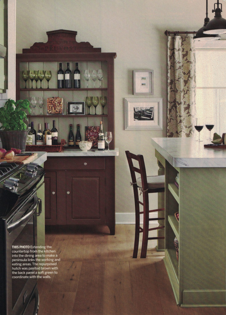
IMAGE BELOW: Walda Pairon’s open display concept was something that inspired me in a kitchen I designed and produced for Better Homes & Gardens® Kitchen & Bath Makeovers magazine. As part of the kitchen redesign, we re-vamped the homeowner’s existing oak hutch and had it stained a different color from the base cabinetry throughout the kitchen (notice that we painted the backing of the hutch a pale celadon green, to lighten it up). We also added a marble countertop and topped the piece with a decorative wood pediment. Finally, I styled the hutch as a European-inspired wine bar with glassware, trays and entertaining accessories. The lower cabinets and drawers store linens, bar items and additional spirits.
UTILITY & PURPOSE
European kitchens have a purpose. I might be stating the obvious, but they’re meant for serious cooking and (sometimes) gathering. Utility and purpose override “knick-knacks” and things not used for cooking and serving. There are very few purely decorative elements in a European kitchen.
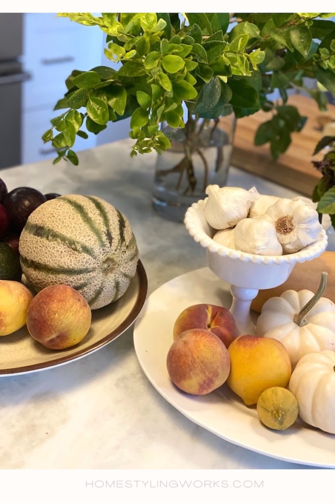
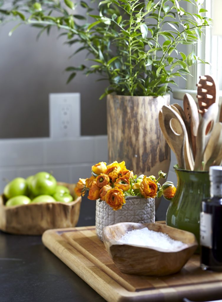
And food is realistically displayed in bowls and on platters. I’ve employed this concept when styling kitchens over the years, and also in my current kitchen – especially after a trip to the farmers market. I call these vignettes “Pretty With a Purpose”.

ISLANDS ARE REALISTICALLY SCALED
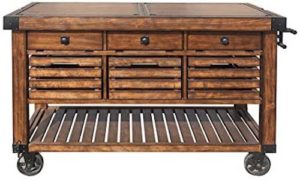
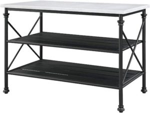
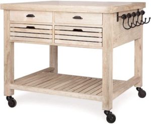
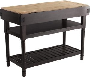
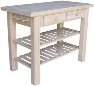
European kitchens don’t have islands the size of, well, Rhode Island. Many European kitchens are small (by American standards), so their “islands” are usually an antique table or some kind of butcher block situation. Their islands are not really islands – they’re more like “work tables” where serious cooking and baking happens. They sometimes have storage underneath. Below are a few examples of table/islands you’d find in a European kitchen (click on the images for product links):
ISLAND IN REAL LIFE
Better Homes & Gardens Special Interest Publications. Photo: Michael Partenio
Builder: Teakwood Builders
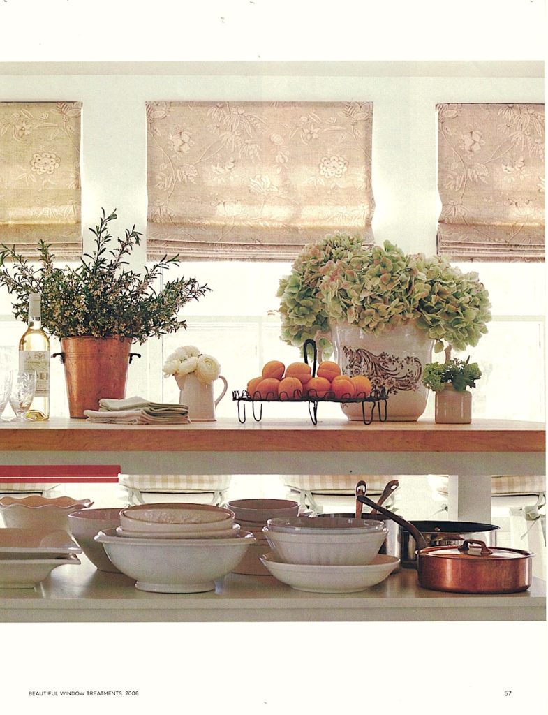
ABOVE: When I designed my kitchen in Saratoga Springs, NY, I wanted the space to have a European feel to it, so I designed a painted “table-like” island as the centerpiece of the small kitchen. I had my contractor, Teakwood Builders, build the island into the space, with lower open shelves and a custom-sized wood butcher block top. I purposely kept the lower shelves open to make it easy for me to access my collection of copper cookware, ironstone bowls and platters. Keeping the island open was more than just for aesthetics: the kitchen’s footprint was only 150 square feet, so cabinets on all sides would have impeded work flow. I also incorporated a few vintage finds throughout my kitchen from the famed Marché aux Puces de Saint-Ouen in Paris, including the antique copper ice bucket, ironstone vases and wire baking cooling rack. Fresh flowers and market produce complete the look.
MAKE THE RANGE THE SUPERSTAR
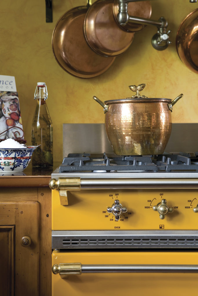
Below is another kitchen story I produced and styled for Better Homes & Gardens® Kitchen & Bath Ideas magazine, back in 2005. This kitchen, built by Witt Construction, is a more “American-ized” version of the Country French kitchen style (for example, the walls and range hood are faux painted – a big trend back in the early 2000’s). But that swoon-worthy LaCanche range in “Provence Yellow” is the superstar of the kitchen, and it is an investment that never goes out of style. The hanging copper pots and the pot rack are another European touch.

COLLECTIONS AREN’T JUST “FOR SHOW”
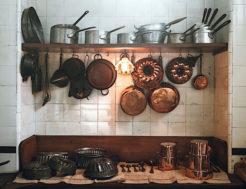
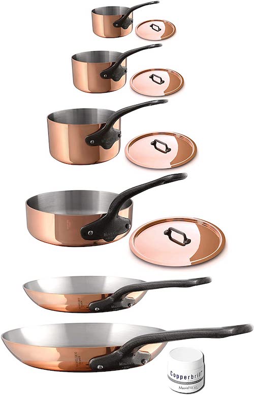
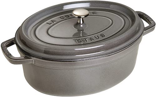
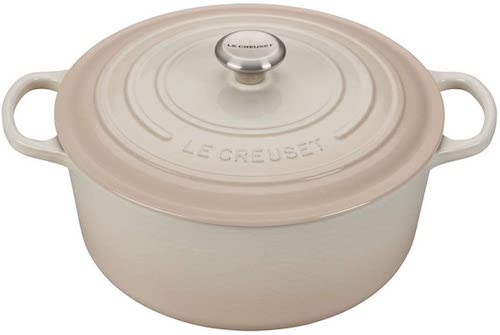
European kitchens showcase collections, but the collections aren’t just for show. They’re used, nearly every day. For collections, think: Copper cookware and molds, antique white ironstone, vintage salt cellars, cutting boards, mortar and pestles, etc. Also, because Europeans use their cookware daily, they tend to buy better quality products. Put simply, they use their pretty stuff. If they have a fabulous copper stock pot, they use (and display) their fabulous copper stock pot. It’s not unusual to find “the good stuff”, such as LeCreuset or Staub dutch ovens and Mauviel copper cookware in a European kitchen. Pricey? Yes. But worth it, as all of these pieces are classic, last for years and are beautiful enough to display (something I can personally attest to). Also keep in mind that Europeans tend to pass these legacy pieces on from one generation to the next.
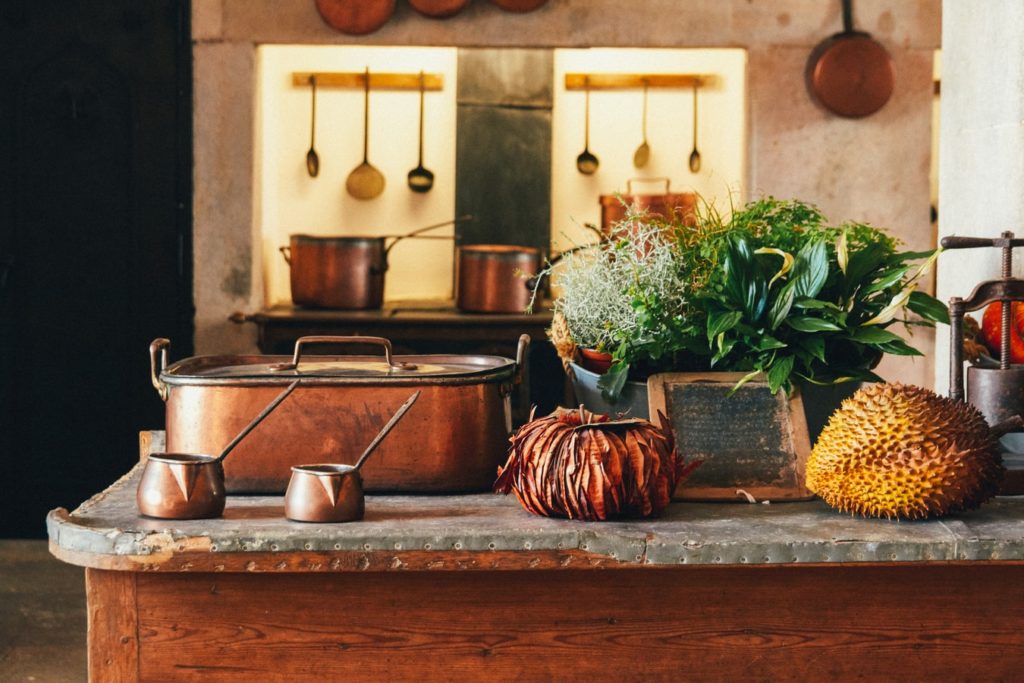
Below is an example of using beautiful copper kitchenware in the simplest of everyday settings. Here are links to the copper drip coffee pot and the beautiful copper dripper shown below.

SIMPLY STYLED COLLECTIONS
In the image below, I produced & styled an “Antique Collectors” photo shoot in my kitchen that featured my friend Stacy’s antique ironstone jelly molds. Again, the European collecting concept is at work here – these molds are much too pretty to keep behind closed doors (plus, you’re more apt to use things if you see them). I also styled the molds with another purpose – holding lemons and as a vase for flowers and a planter for herbs.

ANTIQUITY OVER NEW
Europeans don’t shy away from signs of wear-and-tear and “old stuff”. Patina is the name of the game – in other words, everything isn’t right-out-of-the-box, brand-spanking new.
A good example of patina is the image below. Notably, the antique table with a fabulously weathered zinc top. Love love love it – reminds me of bars throughout Paris.
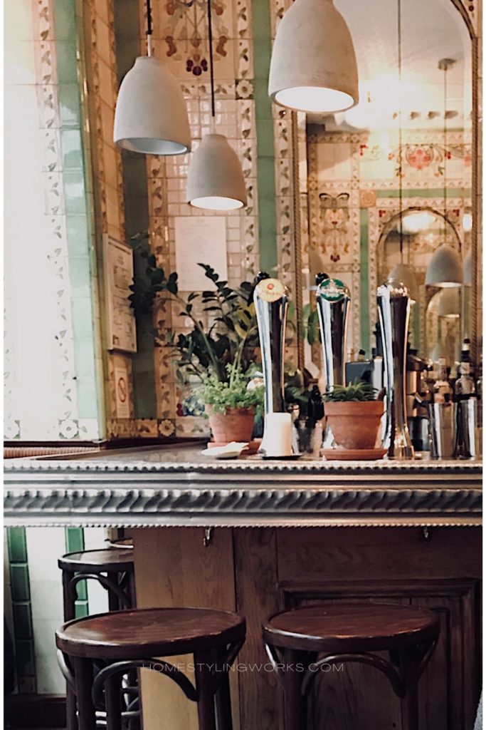
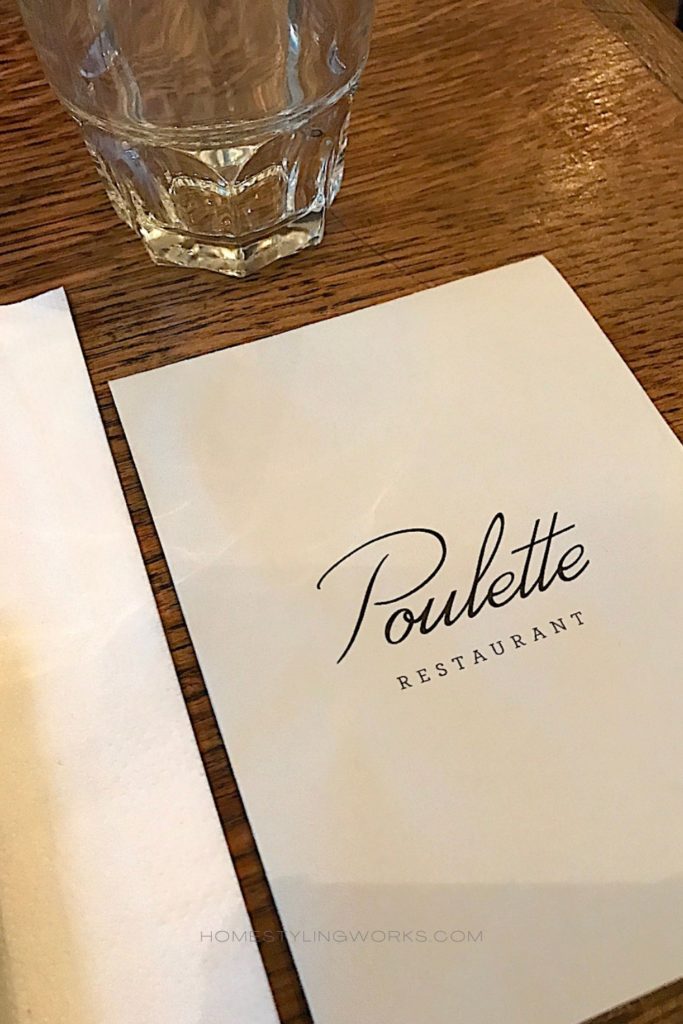
Like the fabulous bar at one of my favorite Paris bistros in the Marais, Poulette (below). Go there for the Steak Frites. Just go.
FOOD IS ALWAYS FRONT AND CENTER
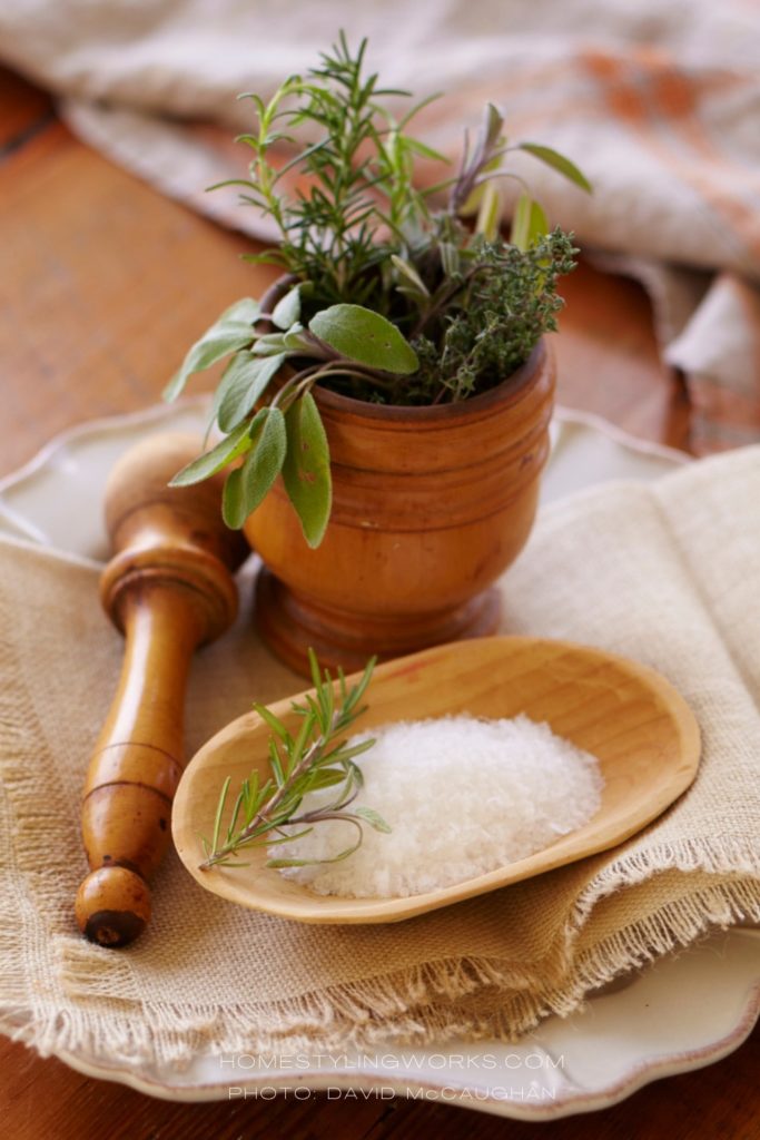
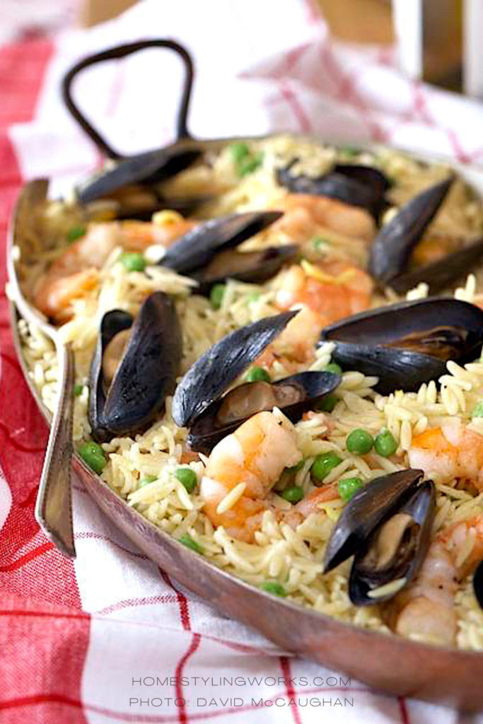
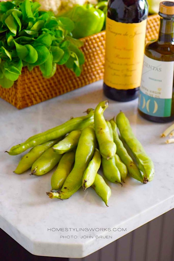
Below are several images I styled for various photo shoots, in European-inspired settings. Note the presence of fresh herbs, farmer’s market produce and vintage linens in these photos – both frequently found in European kitchens. Also, food and wine go hand-in-hand in Europe, if you didn’t know that already!


HOW TO ADD A EUROPEAN TOUCH TO YOUR KITCHEN
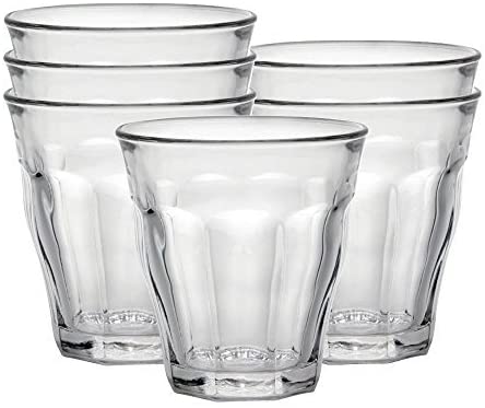
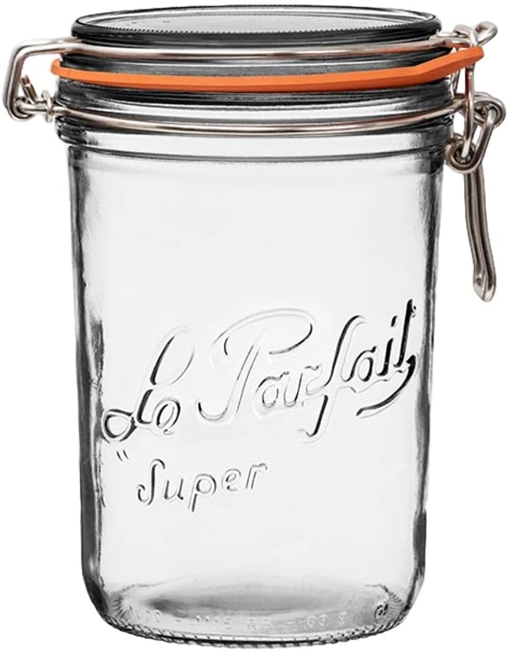
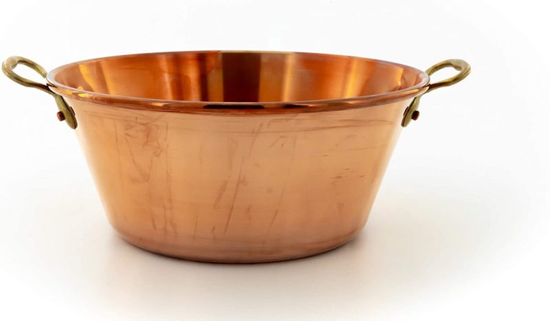
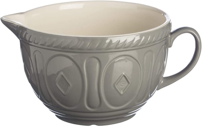
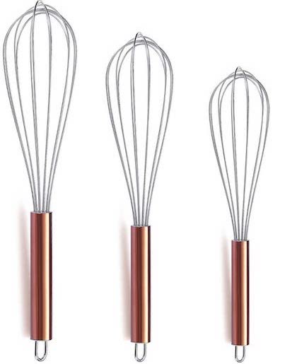
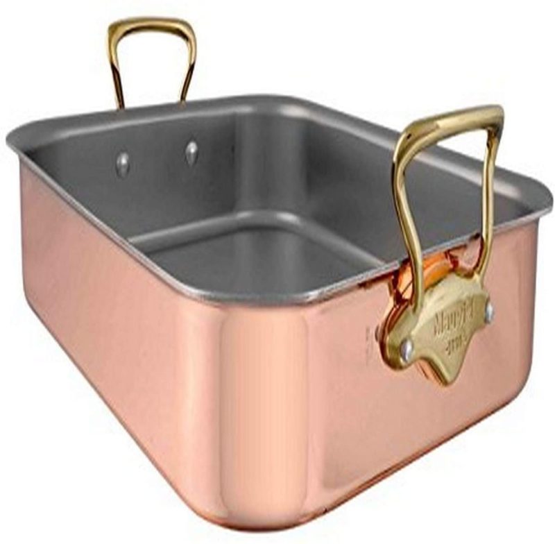
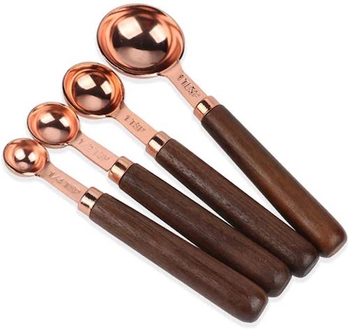
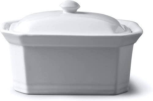
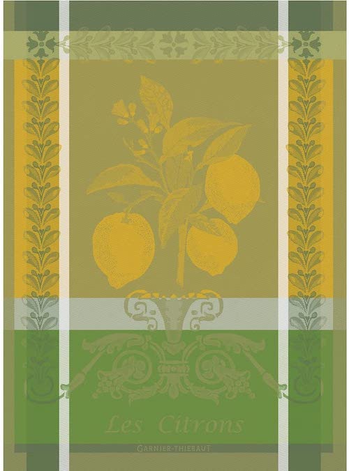
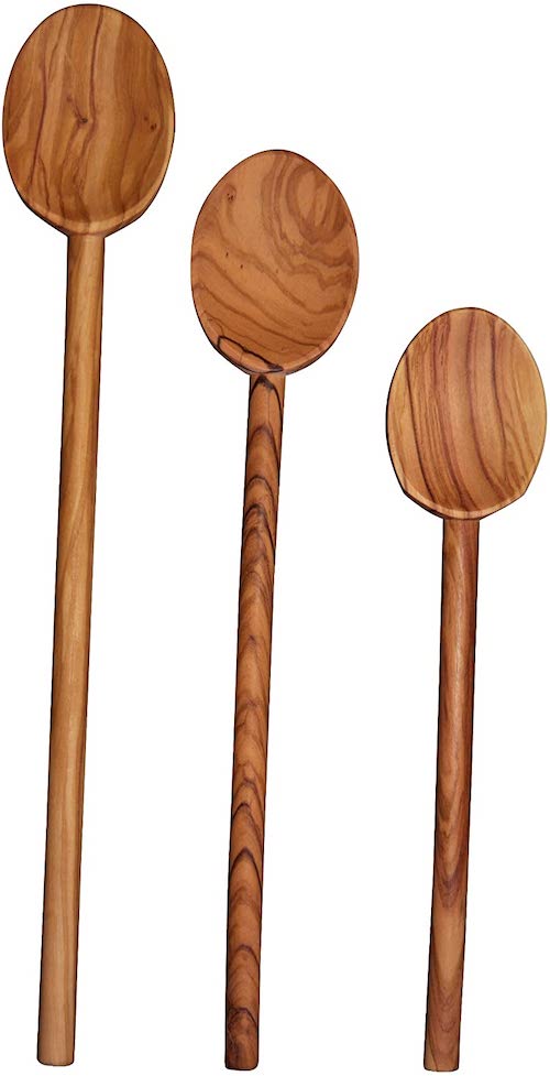
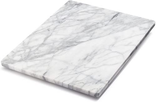
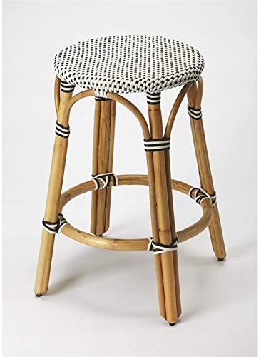
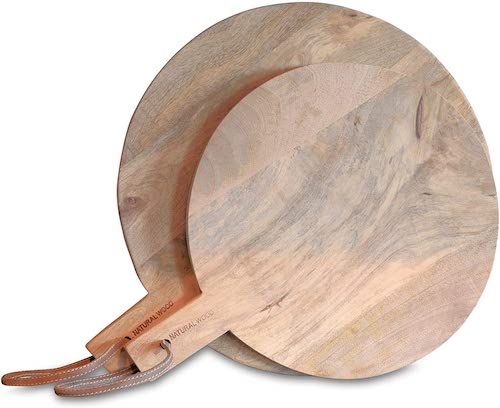
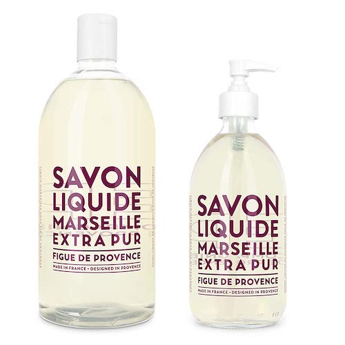
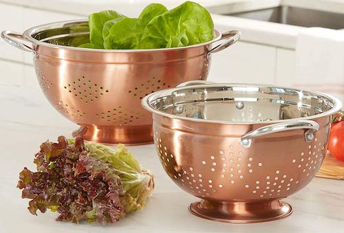
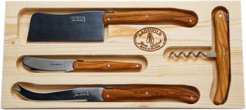
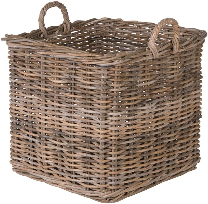
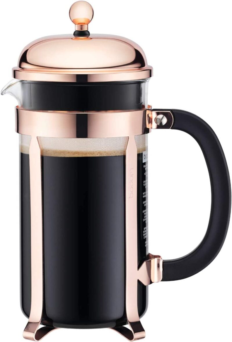
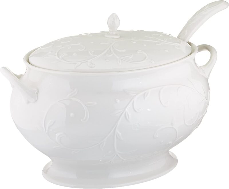
There are simple ways to add European flair to your existing kitchen, without starting a whole new kitchen design! I’ve curated a shopping gallery below, featuring elements of European style.
CLICK ON IMAGES FOR PRODUCT LINKS:
A QUICK RECAP
It doesn’t take a whole remodel or redesign to infuse your kitchen with elements of European style. That being said, you have my blessing if you want to take out your upper cabinets and put in some open shelves (with beautifully styled collections)!
And on the subject of European kitchens, in next week’s post, I’m going to share a favorite dish I learned how to make on my travels in Italy. Stay tuned!


