ARRANGING WHITE COLLECTIONS WITH MY
STYLING BY NUMBERS™ ILLUSTRATIONS
Today I’m making the case for adding a WHITE COLLECTION to your kitchen or dining room. Here’s how I came up with the idea for this post. The images above from my kitchen cover story in Better Homes & Gardens® “Kitchen Makeovers” magazine was previously seen in my post about “My Yellow Phase”. But I realized as I was writing that post that styling kitchen shelves similar to the ones above is a bit of a dilemma to a lot of people. So I decided to turn that into a separate “Styling By Numbers” post, inspired by the image above.
One big takeaway from “My Yellow Phase” I learned was that WHITE never goes out of style. Especially white collections. Why? Because white goes with every other color on the planet – even other shades of white! I like to say “Where there is one, there should be many”. In fact, I talk about starting a collection in my Style Guide, a FREE gift to new subscribers (subscribe and download here).
A styling principle I employed over 20 years of producing photo shoots for magazines is this: Either you have one special, WOW! item take center stage, or you have a collection of items that, when artfully styled, read in the aggregate as one “special” WOW! item.
CREATING A WHITE COLLECTION
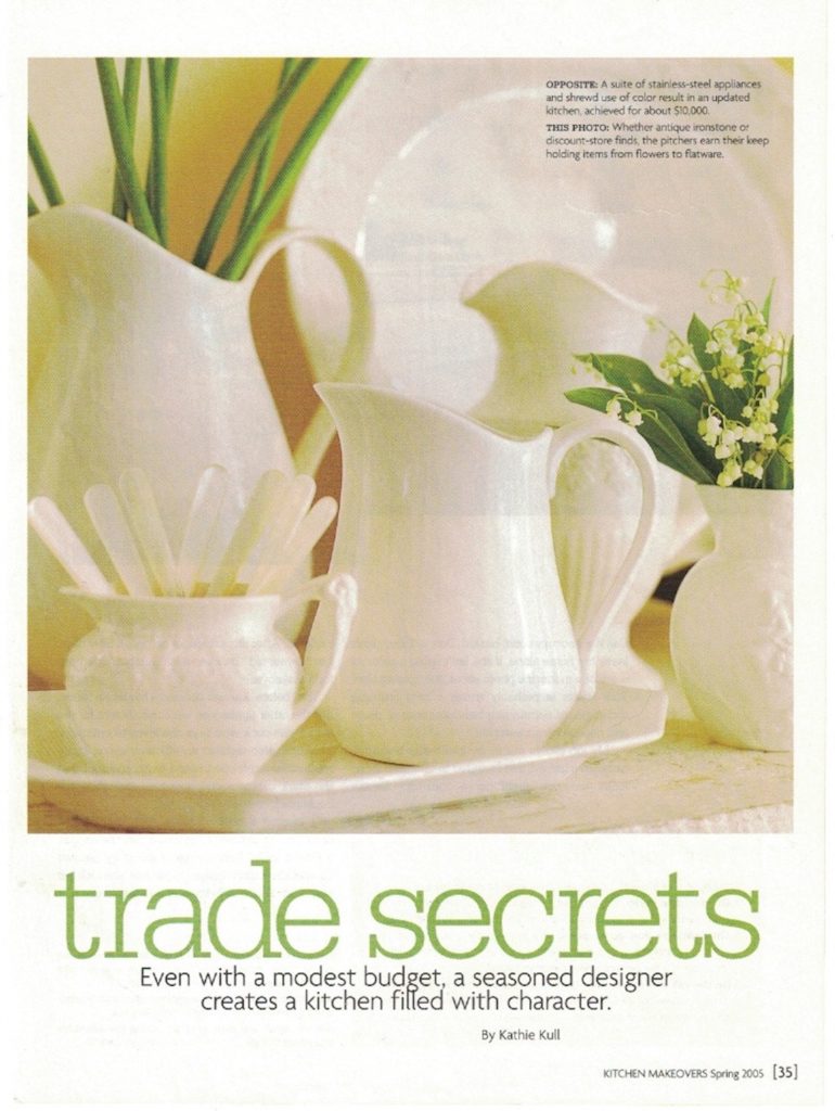
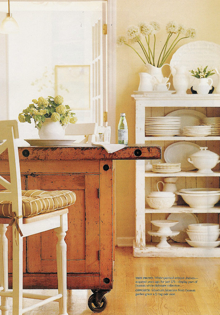
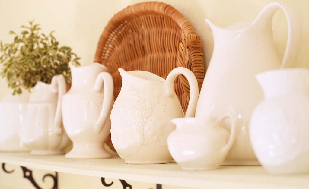
I’ve amassed my white collection over many years, starting with the white antique painted shelves in my kitchen above. I like to display – and use – a mix of pieces – from everyday white dinner plates and bowls to serving bowls, platters, cake stands and pitchers. In fact, a collection of white pitchers is not only beautiful, but practical – these make lovely vases for flowers and branches.
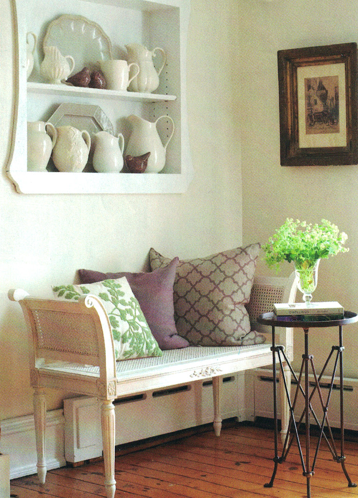
In my next home (below), I styled my collection of white pitchers in a small niche in my dining room. The pitchers were accented by pops of celadon green and light purple, for a photo shoot for Better Homes & Gardens® “Color Made Easy” magazine.
To start a white collection, first look through your cabinets – you probably already have the makings for a white collection (or at least a good start!) I’ve also curated a collection of white vases, tureens, platters and dishes in the shopping gallery below.
LET’S START WITH THE SHELVES
So, first things first. Let’s start with the shelves. Your collections need a nice vehicle for display. The whole idea is to create a focal point in one place that showcases a collection (similar to my kitchen image above).
And for those of you who are concerned about “open shelves” – let me make a case for those. When items are out on display, you remember you have them and will use them! How many times have you gone into the “black hole” cabinet over the refrigerator and found a long-forgotten platter that you stashed up there? That won’t happen when you see them every day. When you go to use a platter or bowl, just give it a quick rinse and you’re all set. But if you use things (like dishes and bowls) all the time, you won’t even need to do that!
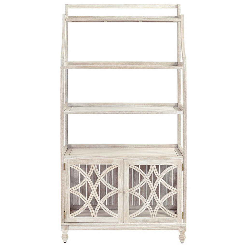
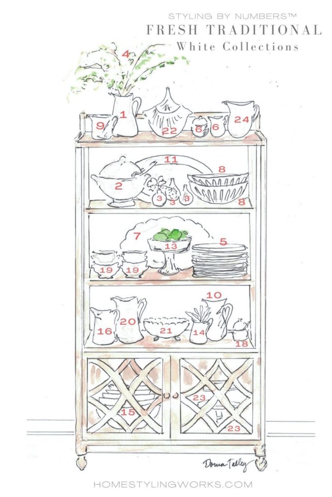
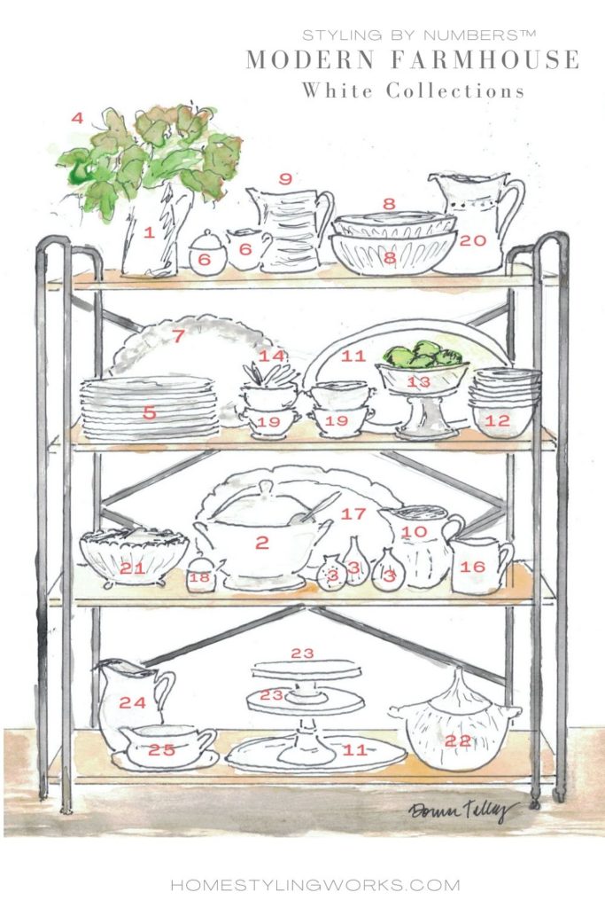
For the “Fresh Traditional” look, I absolutely love the Ceylon Baker’s Rack from Ballard Designs (below left) – a fresh, modern take on the usual wrought iron baker’s rack. This would be fabulous in a dining room or breakfast area in a kitchen. For the “Modern Farmhouse” look, I chose the iron and reclaimed wood shelves (below right) for their versatility. At 64″ long and 65″ high, they would look right at home in a cottage or rustic farmhouse setting. I could even see these in a modern loft, styled with the white collections featured in the shopping gallery.
STYLING BY NUMBERS™ ILLUSTRATIONS
I’ve sketched two different looks for the two shelves above. The first is a “Fresh Traditional” look with the updated wood bakers rack and the second is a “Modern Farmhouse” look with rustic wood-and-iron shelves. Both images are styled with white collections featured in the shopping gallery, with corresponding numbers (that’s why it’s called “Styling By Numbers™”).
SHOPPING BY NUMBERS
Below is a gallery of favorite white items that are both practical (dishes and bowls) and pretty (tureens, pitchers, bud vases). The numbers below each of these images correspond with the Styling By Numbers™ illustrations above.
CLICK ON THE IMAGES BELOW FOR PRODUCT LINKS


STYLING NOTES
As you can see in the illustrations, I’ve done all the styling (to scale) for you. But I’d like to share a few styling principles from the two styled shelves, so you can better understand the concepts at work.
VARYING HEIGHTS
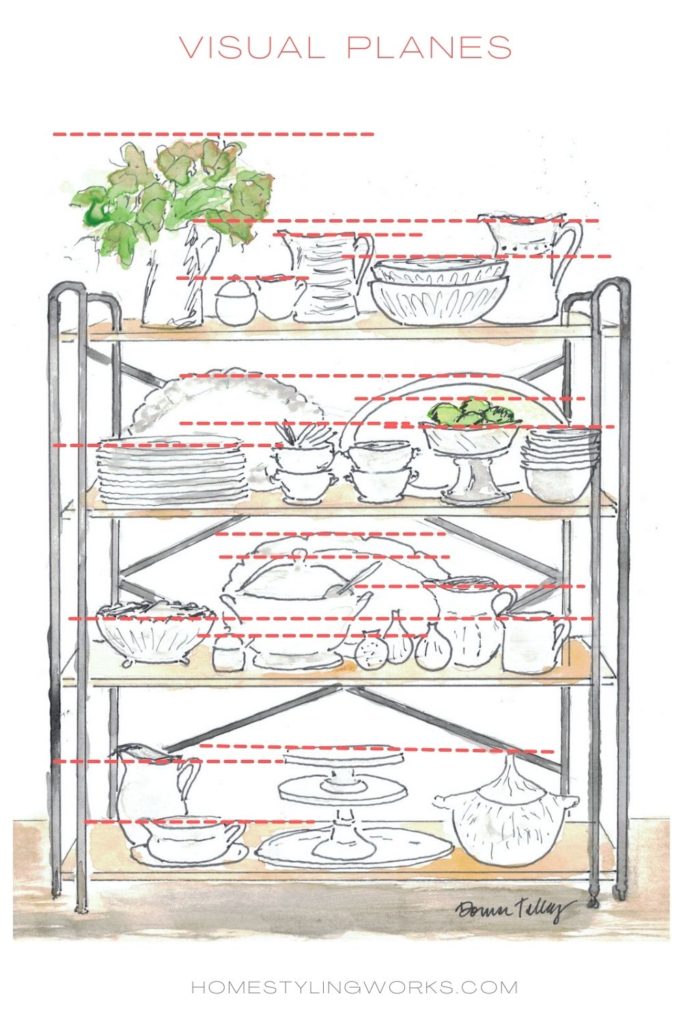
The first thing to keep in mind is varying the heights, so all the items aren’t on the same visual plane. What is a “visual plane”? We would use this term on photo shoots, which means that everything isn’t all at the same horizontal level across.
I’ll show you a visual so you can see what I mean by “visual plane”. In the “Modern Farmhouse” illustration below, I’ve added red lines at varying planes on each of the shelves. Some of the items line up, but notice they’re not right next to each other. You want to vary the heights and visualize those imaginary lines when you’re styling a collection. There is also a high point on the top shelf, in the form of green branches.
SMALL ITEMS ARE GROUPED WITH LARGER ITEMS
The collections in the gallery feature larger items (such as the tureen, serving bowls and the stack of plates), as well as smaller items (the trio of bud vases, sugar and creamer and honey pot). Now, if you put all the small items together on one shelf, without any varying sizes, the small items would read as teeny-tiny. You want to mix the smaller items (as a small group) with the larger items on each shelf. Which leads me to the next important point. Balance.
ACHIEVING A PLEASING BALANCE
An important tip to achieving a balance is to group similar things together – for example, the pitchers on the top shelf. I’ll give you an example of how the balance would be off – and that usually happens on a top shelf. I’ve seen a big styling no-no happen on shelves with a stack of books, with a pitcher on top. It just looks like it’s ready to fall off. If you wanted to add beautiful cookbooks to this shelf arrangement, I would add them to the second or third shelf. Just keep in mind the visual planes will change if you start stacking items. If you want to add cookbooks, you can read about my favorites here, here and here.
PRACTICALITY COUNTS
This white collection is meant to be used. With that in mind, I put more everyday items (plates and bowls) on higher shelves, and less-used items (cake stands) on lower shelves in both of the illustrations.
ADD A SMALL POP OF COLOR
A way to make white collections look interesting is to add a little pop of color. In these illustrations, I added a pop of green, with limes in the footed bowl and simple green branches on the top shelf. However, you don’t have to add color if you prefer to go all monochrome, with varying shades of white and cream. In that case, the faux dogwood branches from Ballard Designs (#4) would be a lovely addition to a fully monochrome look.
TEXTURE MAKES A WHITE COLLECTION INTERESTING
You’ll notice that I selected a few items items in the shopping gallery that feature a textural element, which is very important to making white collections interesting. Think of texture as “pattern”, but in a tone-on-tone application. Texture keeps a monochromatic collection from looking flat. And remember that branches and flowers count as texture.
STYLING TAKEAWAYS
Keep these things in mind when styling your white collections:
- SIZE
- SCALE
- BALANCE
- PRACTICALITY
- TEXTURE
And, most importantly, “WHERE THERE IS ONE, THERE SHOULD BE MANY” (I love saying that!) I hope this post has inspired you to add a white collection to your home – one that you can add to over time to Make Your Every Day More Beautiful®.