A NEW “STYLING BY NUMBERS®” POST
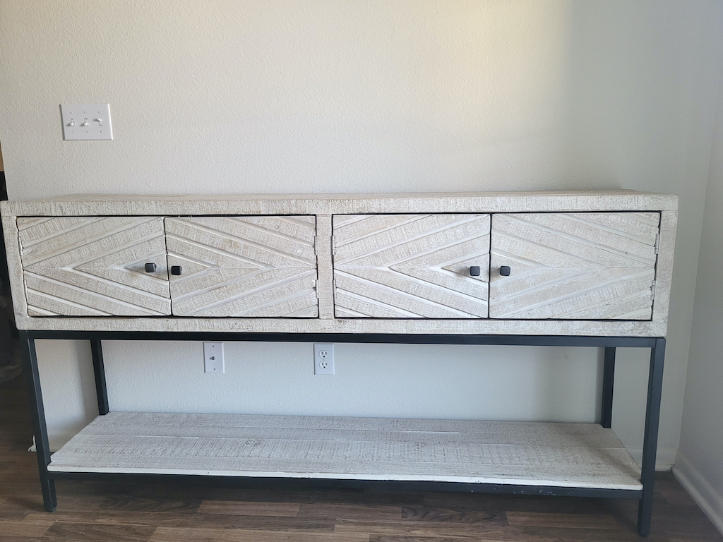
My idea for this post came from my sweet niece, Dianna, who sent me a photo of her new console cabinet/sideboard and asked for some styling advice. So I thought it would make an interesting post for my “Styling By Numbers®” concept (more on that later in the post).
VERSATILITY IS KEY
The first thing I thought when I saw Dianna’s console table was that it could be utilized in a few different ways: as a dining room sideboard/buffet, as a nice-sized bar/entertaining cabinet, as a sofa table, or even in an entry hall. That ticks a lot of versatility boxes!
Versatility is an important consideration when buying furniture. As twenty-somethings in their first home, Dianna and her husband will probably be bringing this along to future homes, and it will undoubtedly wear a few different “hats”, based on where they’re at in life. Also, I’ve linked to other versatile console tables and buffets from the Home Styling Works Online Shop at the end of the post.
STYLING PROPORTIONS
Dianna shared with me how she styled the piece and – with her permission – I wanted give her a few styling pointers.
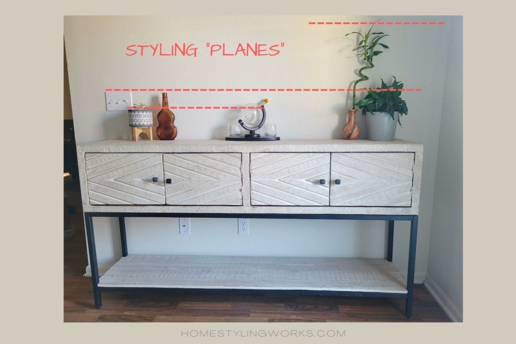
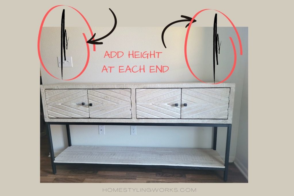
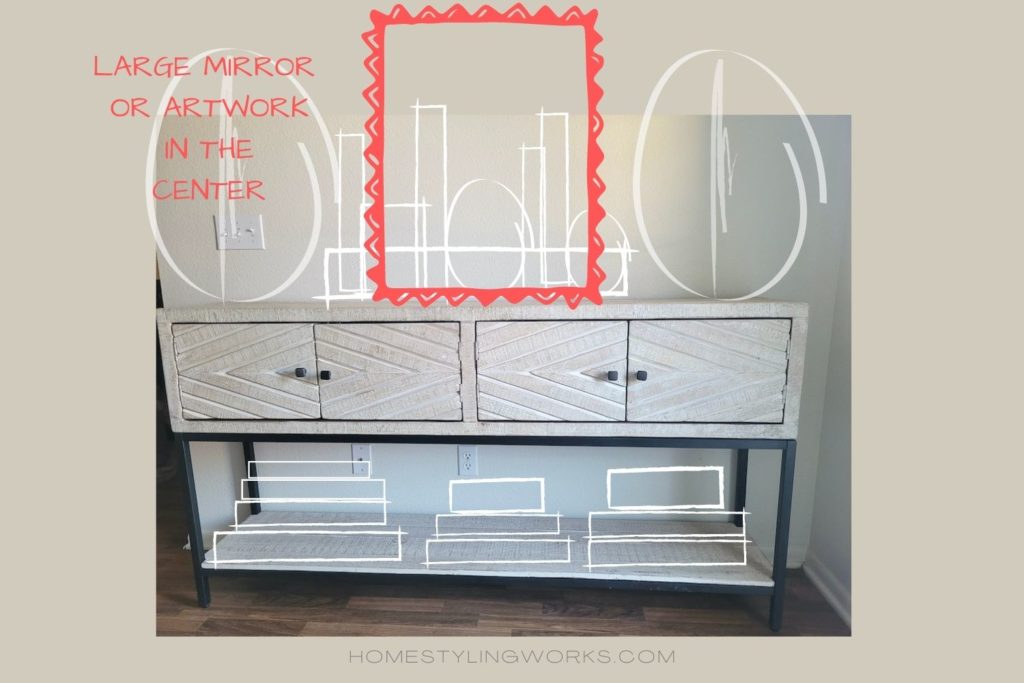
The first thing my “styling eye” noticed was that all the objects she has on the table are similar in scale. I made the red circles the same size to illustrate this point. Also, the bottom shelf is a great spot to add an additional storage element.

Remember in my “White Collections” post where I talked about “Styling Planes”? That’s where I draw an imaginary horizontal line across the heights of different objects. You’ll see in the image below that there are only three definitive styling planes. Ideally, you want items in a few different heights (more like 5 or 6 styling planes), for visual interest.
TELL A “LITTLE STORY” WITH OBJECTS
I like to think of styling a piece as telling a little story. What do I mean by that? Well, think of items that would be a conversation starter (as in: “Hey, where did you get this cool XXXXXXXX?” We found that on our honeymoon!” See, that’s a little story. So when people ask me “where do I start?” when styling a piece like this, here’s my advice:
- Determine the place and usage
- Start with something that tells a little story
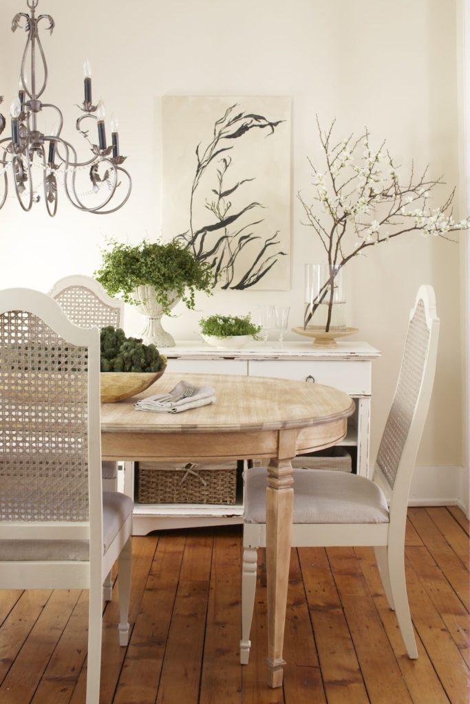
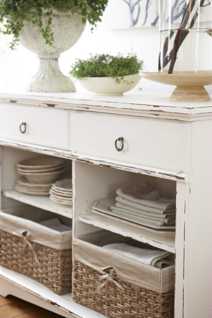
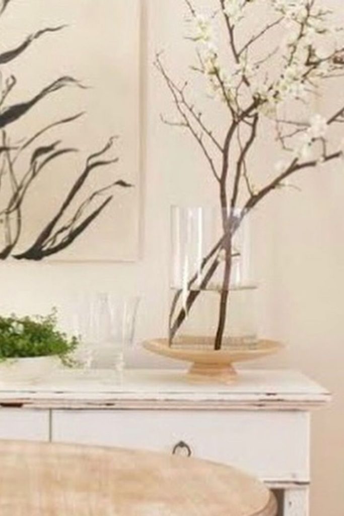
An example of “telling a story” with objects is in my former dining room in Saratoga Springs, NY that was photographed for a feature story in Better Homes & Gardens magazine. My story here was a French-inspired botanical theme, so I styled the painted white console with a modern botanical artwork that I painted, which was echoed in the airy white branches. A favorite white urn from my collection was planted with trailing ivy and a smaller bowl was filled with green moss. The top was meant to be pretty, and the lower open cubbies and drawers provided needed storage for plates, platters and table linens. The painting and the urn tell a little story.
EDITORIAL EXAMPLES: ENTERTAINING
In this post, I’m going to style Dianna’s console table two ways: as an entertaining bar, and also as an entryway table. With those two concepts in mind, I visited my photo shoot/editorial story archives to show a few inspiration photos of spaces I styled with those two purposes.
EXAMPLE #1: ENTERTAINING BAR IN THE DINING ROOM
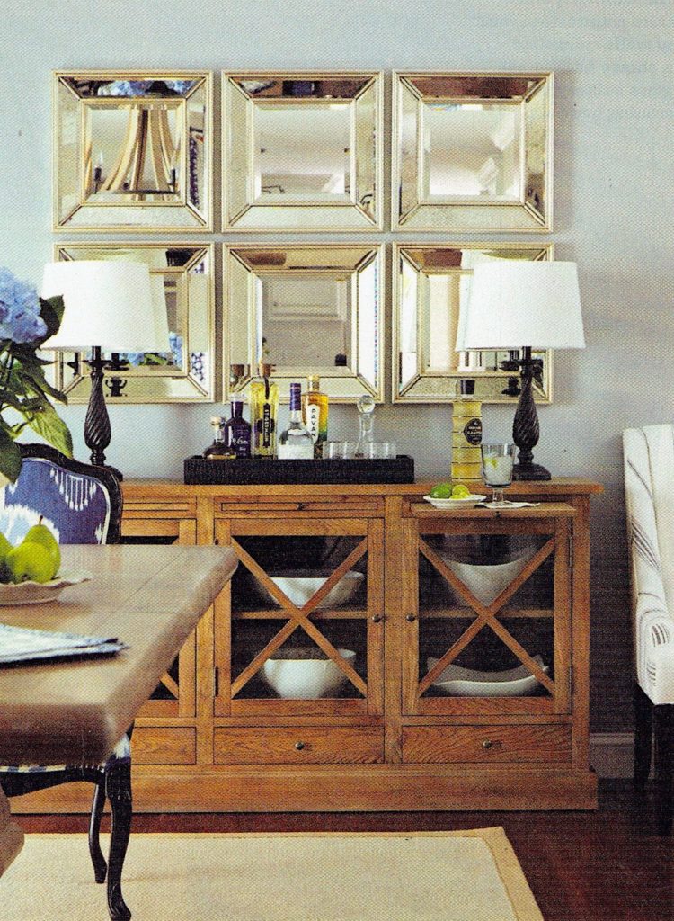
For the story below that I produced for Better Homes & Gardens® “Kitchen & Bath Makeovers” magazine, I styled the dining room sideboard for entertaining. The glass-front piece from Ballard Designs includes pretty white serving bowls in the lower area. I styled the top of the sideboard with a pair of black lamps and added a bar tray filled with beautiful liquor bottles. Notice the scale of the lamps and tray, which correspond to the six square mirrors above the piece, which “read” as one large focal point. Everything is done with scale in mind.

EXAMPLE #2: ENTERTAINING BAR IN THE KITCHEN
I applied the same styling principles to this story I produced for Better Homes & Gardens “Kitchen & Bath Makeovers” magazine.
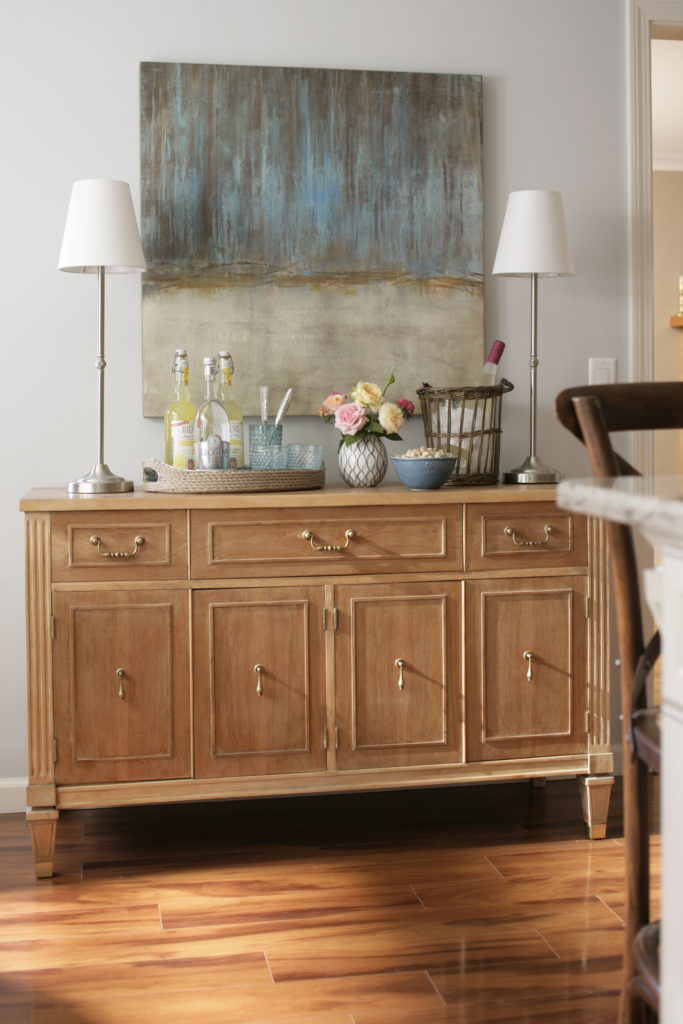
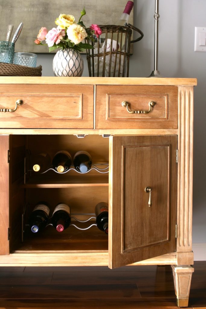
The buffet piece was a thrift store find that we stripped to its natural oak finish (we also changed out the hardware). This piece was styled with entertaining in mind – I added metal wine racks to the the inside of the cabinets below, which also store liquor and mixers. The drawers store smaller bar items and linens. I chose a large abstract canvas painting to offset the traditional lines of the sideboard. A pair of thin buffet lamps anchor each end, the the top was styled with a wicker tray, bottles and flowers. Note the scale of the large painting, which is important for overall visual balance. I’ll get into scale later in the post.
EDITORIAL EXAMPLE: ENTRY WAY
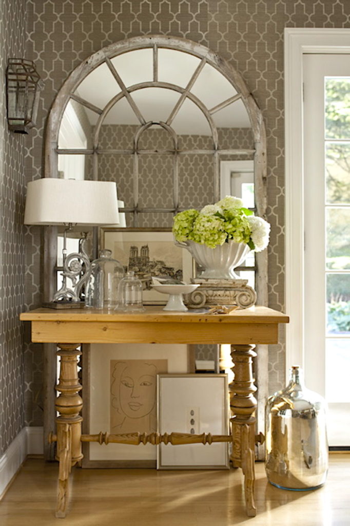
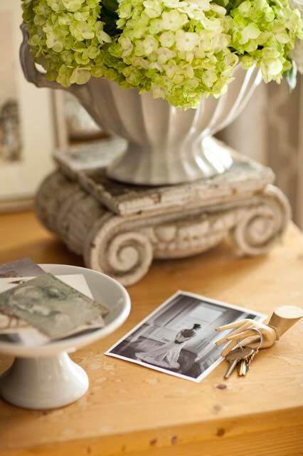
I styled the images below for a story I produced for Better Homes & Gardens “Best of Flea Market Style” magazine. This antique table was right next to the entry, so there’s a small footed bowl for keys. I incorporated art, flowers, glass cloches and vintage finds in this vignette. Pretty pale green hydrangeas are displayed in an antique ironstone compote, and are elevated by the antique plinth. Pretty meets practical, with an added dose of personal collections in this entry table.
MY “STYLING FORMULA”
Let’s start with my “Styling Formula”. I call it “The Four P’s”: Purpose and Practicality first, then Proportion and Planes.
PURPOSE: How will you use the piece? That will dictate the styling.
PRACTICALITY: If you’re going to be storing items, those need to be easy to access (more on that later, as I’m styling the console).
PROPORTION: All the items need to be proportionate to the piece. This is a common styling mistake, and more often, it’s using items that are too tiny and not scaled to the overall proportions of the furniture.
PLANES: Remember above when I talked about Dianna’s console only having three “Styling Planes”? Those are the varying heights (or “styling planes”) that create visual movement and interest. You want to aim for 4-6 styling planes on a piece this size.
I’ll be explaining “The Four P’s” as I walk you through how I’m styling the console.
STYLING, STEP-BY-STEP
I’m going to deconstruct my styling process, so you can see the step-by-step on how to style the console with “The Four P’s” in mind.
Before getting into the specific objects I’ve chosen to style this console for both an entertaining and entryway purposes, I’m going to walk you through the STYLING PRINCIPLES.
STEP #1 (BELOW): Start by adding height at each end, to balance the length of the console. Height can be in the form of a lamp, a sculpture, or some other kind of tall object.
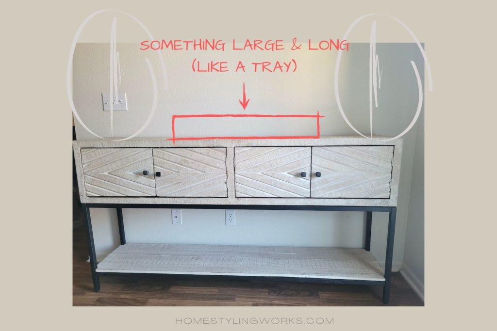
STEP #2 (BELOW): The next step is to “anchor” the center of the console with something large and long, such as a tray. This is important for PRACTICALITY, as you want to corral items together to look neat and cohesive.
STEP #3 (BELOW): You can choose to add a tray or not, but adding items with varying heights is important in terms of styling planes. Remember, you don’t want everything all at the same height.

Here are the styling planes at work below. There are 6 planes, which is visually interesting.

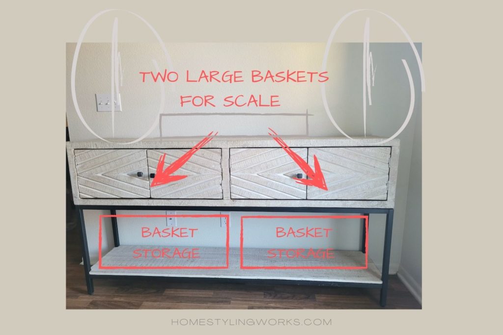
STEP #4: Remember the unused space below? We’re going to put the principles of SCALE at work here but adding two large baskets that read as one large item. This is important to balance the smaller items on the top of the console.
Below, I’ve applied the same scale principle, but instead of using large storage baskets, I’ve styled the lower level with large scale art books and decorative storage boxes. This is a great look for an entertaining use, as the books add personality and reflect the interests of the homeowner.

STEP #5: This is an important step! Add a large mirror or framed artwork. Scale is important – bigger is better here. For this sized console (68″ long), I would choose art that is 24″ x 30″ or larger. Also, the artwork or mirror should be hung a little higher than the top of the tall items at each end.

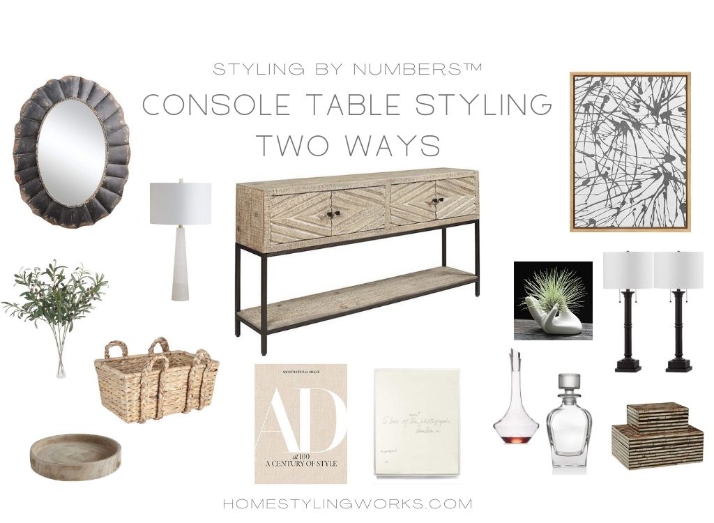
Now, onto the STYLING BY NUMBERS® part of the post. If you’re not familiar with my Styling By Numbers® concept, you can read more about it here.
STYLING BY NUMBERS®
Keeping the above principles in mind, I’ve sketched two styling scenarios for this console table. The first is as an entertaining bar, and the second is as an Entry Table. You’ll notice that I’ve incorporated “The Four P’s” styling principles in both of these sketches.

CURATED CONSOLE TABLE: ENTERTAINING BAR
I sketched the console table as an “Entertaining Bar” in the image below left. The corresponding product images (with numbers) are in the right image. Product links are below the images.
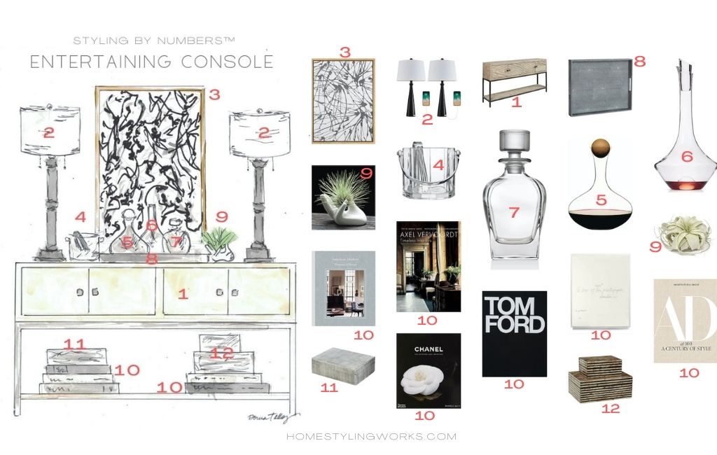
CLICK ON THE IMAGES BELOW FOR THE PRODUCT LINKS:


CURATED CONSOLE TABLE: ENTRYWAY
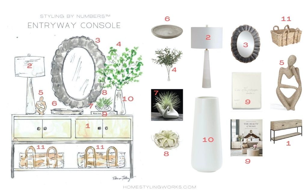
CLICK ON THE IMAGES BELOW FOR THE PRODUCT LINKS:


TRY IT AT HOME!
Take a fresh look at some of your furniture and see if you can re-purpose a piece for an entry table or entertaining bar. Or you can start from scratch and shop some of my favorite buffets, sideboards and console tables available in the HSW Online Shop.
I hope this post has inspired you to Make Your Every Day More Beautiful® with a practical and pretty styled console table.