Some styling takeaways from the “IT” color of 2005 (that’s back in style again)
Today’s “Then & Now” theme is about color. Have you noticed that there are “IT” colors that define a certain time? Today, richly-hued green and blue kitchens are trending. Gray kitchens are still having their moment, and gray has definitely been a hot color trend in kitchen cabinet and paint colors, but it’s a hard color to get right (there are definitely more than fifty shades!) As far as other rooms in the home, according to the paint folks at Benjamin Moore, calm, comforting colors are very much on trend in 2021 – cashmere, warm white, muslin, buff, rosy-peach, etc.
Which brings me to yellow… and my “Yellow Phase”.
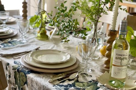
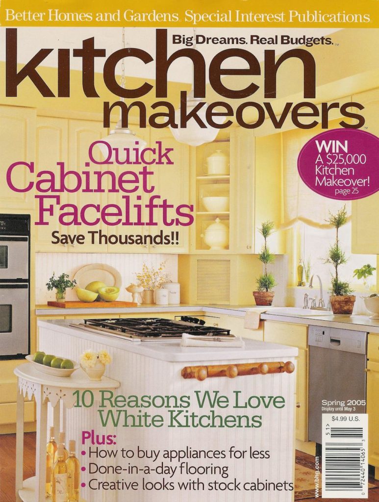
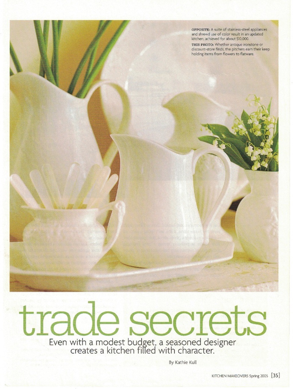
Back in 2005, when we shot my former kitchen in Saratoga Springs, NY for Better Homes & Gardens® “Kitchen Makeovers” magazine (shown in the image above), buttery, English Country-inspired yellow was all the rage. In fact, I remember when I was scouting other kitchens for this particular magazine, the editor said to me “I’d love it if you could find ten more yellow kitchens like yours for us to shoot!” That’s how popular the color was in the early- to mid-2000s.
YELLOW THEN: IT WAS ALL YELLOW
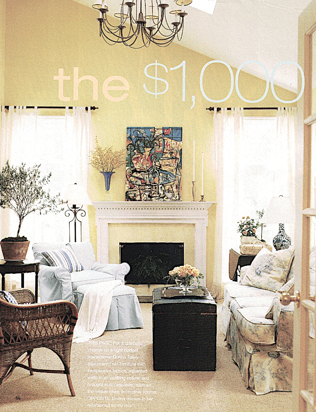
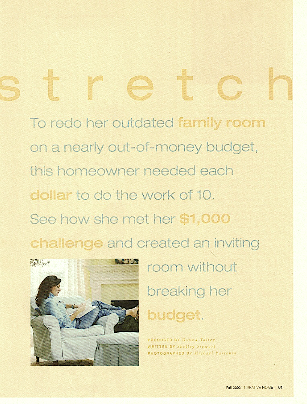
In addition to the kitchen cabinets, I also painted the walls in the family room a soft yellow hue. My family room below was featured in Better Homes & Gardens® “Creative Home” magazine in 2003. I would call this my “English Country with a twist” phase (the “twist” is the abstract painting over the fireplace).
When I moved into my next house in 2004, the first thing I did was paint the walls – you guessed it! – butter yellow. Below is that living room featured in a holiday photo shoot for Better Homes & Gardens® “Creative Home” magazine in 2005.

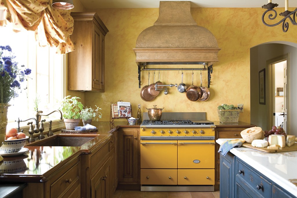
During the 2000s, I produced a few yellow kitchen stories, as well. The image below is a Country French kitchen story I produced for Better Homes & Gardens® “Kitchen & Bath Ideas” magazine around the same time we shot my kitchen story. The centerpiece of the kitchen – with its yellow-ochre walls and colorful window treatment, was the Provence Yellow LaCanche French range.
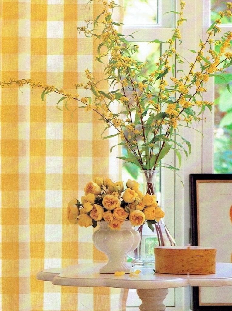
When I was producing and styling photo shoots for advertising clients, yellow was a very happy (and hot) color. As you can see from the image below, I created a rich yellow monochromatic scheme – from the English roses and forsythia branches to the Buffalo Check curtains. I call this look “taking one color and running with it”. Now, I “free foraged” the flowers for the photo shoot from the back yard. But you can achieve this look with some very realistic silk flowers. These silk forsythia flowers from Ballard Designs would make a lovely pop of yellow styled on an entry table or dining room buffet. If you subscribe to my website and have downloaded my Style Guide, you’ll know that I’m a fan of “Free Foraging”. If you haven’t subscribed, you can do so here.
YELLOW NOW: SUBDUED HUES
The point of my “Then & Now” posts are to illustrate design and styling take-aways from past magazine stories and photo shoots I produced. I’m also highlighting design principles remain that remain timeless (the “Now” part of the program).
So back to yellow. I have nothing against yellow now, but today I wouldn’t DREAM of making the radical commitment of painting my cabinets (or walls) a color. But in the past few years, I’ve embraced adding color to my home, albeit in smaller doses.
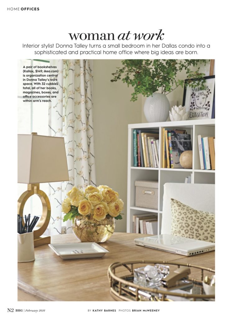
For example, when I moved to my Dallas condo and we shot my home office for Better Homes & Gardens® magazine in 2015 (photo below), I tempered the “yellow factor” and brought in the color in much more subtle ways (the flowers and rug). You can read more about my Dallas home office story here.
Here are a few of my “NOW” tips for incorporating yellow into your home decor:
1. ADD COLOR WITH ONE STATEMENT PIECE
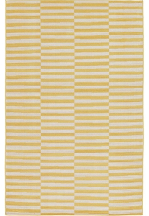
You don’t have to paint a whole room with a bold color to make a statement. Enter “the color statement piece”. For example, a fabulous vintage style rug (below left) in a rich yellow/mustard hue would be gorgeous in a neutral living room, office or kitchen. Or, for a more modern look, the yellow striped rug (below center) would add a sophisticated pop of color to any home decor style. The Tabitha rug from Ballard Designs (below right) is a modern take on a traditional European style pattern. I love the combination of dijon and gray – we’ll get to that color combo later in the post.


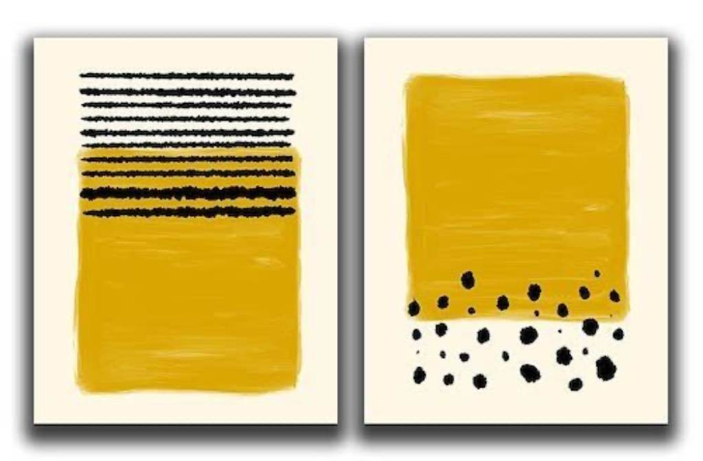
Don’t want to commit to a rug? No problem. These cool abstract prints would be a welcome pop of color in an otherwise neutral space. Art is always a great way to add color without a big commitment.
2. COLLECTIONS ADD PERSONALITY & STYLE
In my yellow kitchen, I displayed my collection of white ironstone (in both the corner open cubbies in the kitchen cover shot and in the white painted shelves next to the antique island). One or two items don’t make a collection. NUMBERS make a collection, so the styling takeaway is find what you love and keep an eye out for items at antiques and thrift stores to add to the mix. But the BIGGEST TAKEAWAY from “My Yellow Phase” is that White never goes out of style. Why? Because it goes with every color on the planet (even other shades of white!)
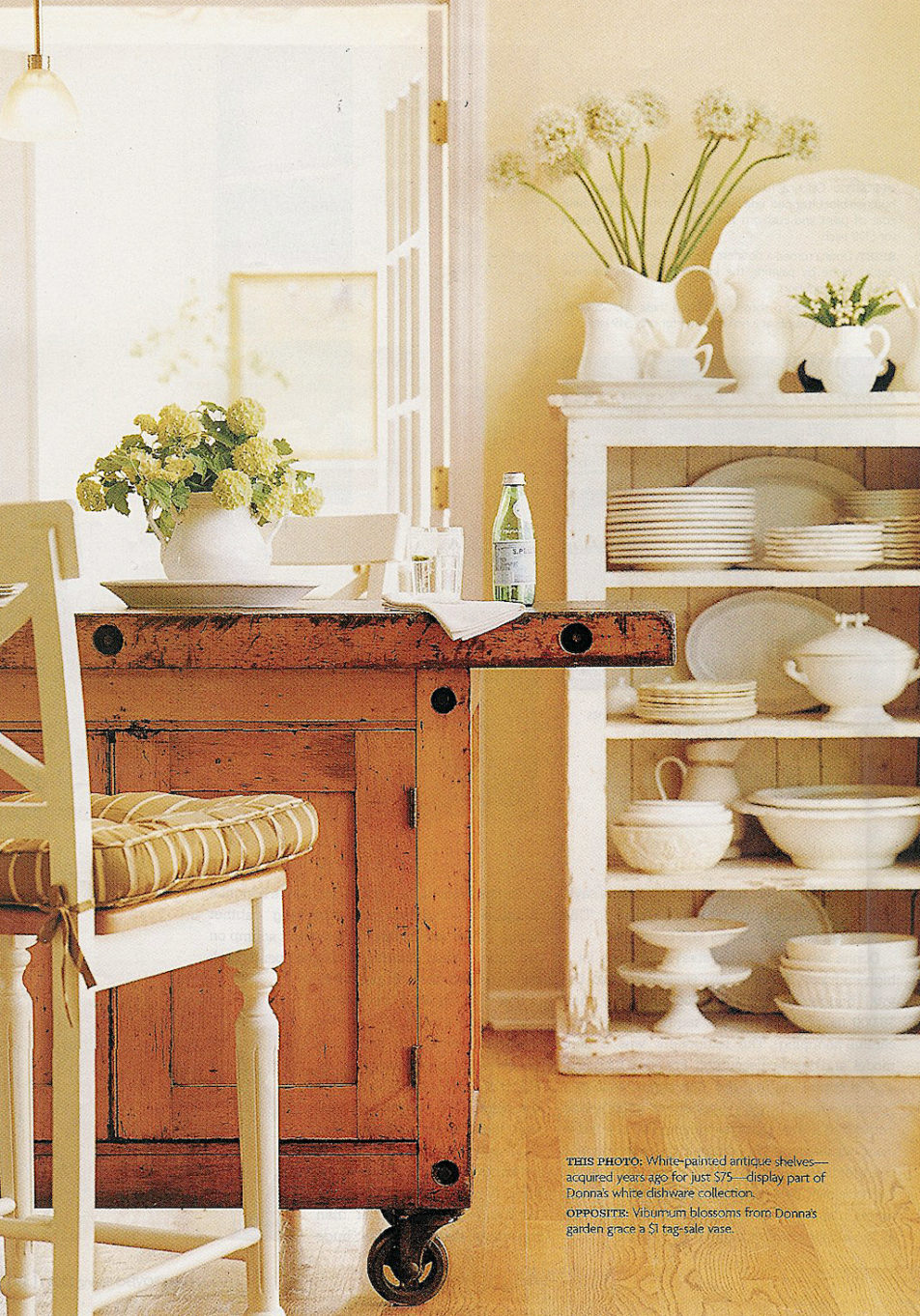
A nice way to introduce a pop of yellow is to incorporate some yellow elements interspersed throughout the white collection. The pop of yellow can be in the form of flowers (see below) or a bowl of lemons. Styling note: If you’re going to add a bowl of fruit, it looks better on the higher shelves (will you really reach all the way down to the bottom shelf to grab a lemon?) And flowers should always go on the top shelf, with some air space. Remember, practicality counts when styling a collection.
3. INTRODUCE THE “COLOR OF THE MOMENT” IN SMALL DOSES
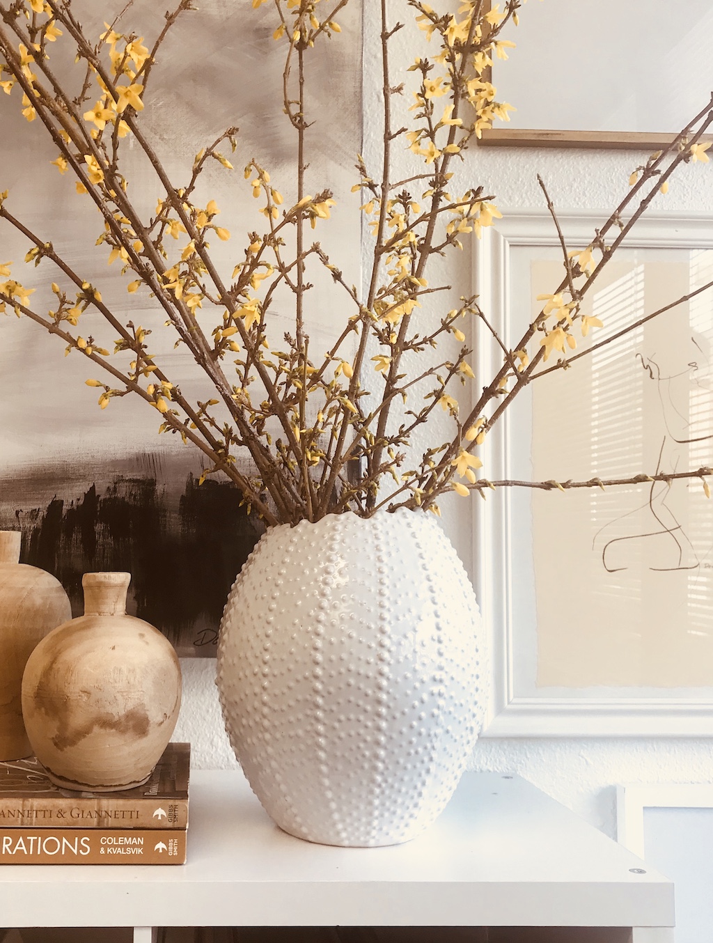
Small doses = accessories, flowers, pillows (things that are easy to change out). And it doesn’t get any easier than a beautiful bouquet of yellow flowers. Look to your local Trader Joe’s for a fabulous selection of happy yellow flowers. Some of my favorites are forsythias branches, daffodils, ranunculus, dahlias, garden roses, tulips and snapdragons, and these are all easy to find at your local supermarket.

4. SELECT A COLOR AND ADD A “FRIEND”
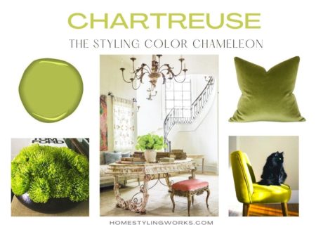
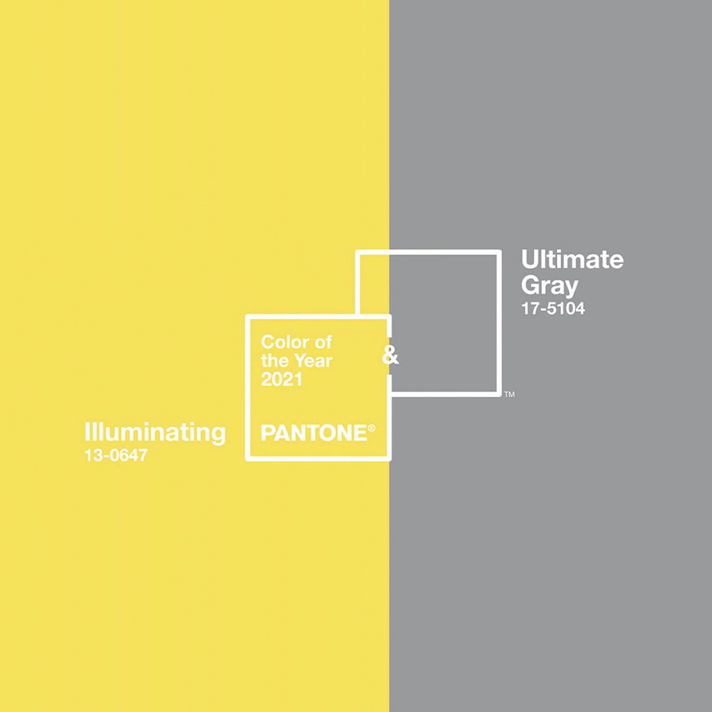
There’s strength in color pairings. Case in point: The people at Pantone® (the color experts) have named TWO colors as their “Color of the Year” for 2021 – “Ultimate Gray” and “Illuminating” (a rich yellow hue). These two look so fresh and fabulous together. This is the 2021 way of adding a happy color (yellow) with a more grounded color (gray) that also looks super-sophisticated when paired together. See how it all comes around again? The “IT” color of 2005 is back again, 16 years later.
LET’S GO SHOPPING!
Instead of committing to a wall (or cabinet or sofa or chair) color, I’ve put together some ideas on how you can subtly add yellow and gray hues with accessories (throws, pillows, vases, dinnerware, napkins) and flowers.
CLICK ON THE IMAGES BELOW FOR PRODUCT LINKS


THE FINAL TAKEAWAY
The most important takeaway from this post is that color is a VERY personal thing. You don’t necessarily have to follow trends – if you’re a yellow person, you’re a yellow person. If you’re not, you’re not. The point is that you can introduce a favorite color (not just yellow!) in smaller doses, if you’re a little shy or unsure.
I hope this inspires you to start adding COLOR into your home styling. You might even take another look at yellow.
Stay tuned for next week’s Styling By Numbers™ post, where I’m going to style a whole collection of white kitchen accessories on shelves, similar to the image in my yellow kitchen story. To be continued…