It’s all about a vibe – not a locale
“Summertime, and the living is easy”, wrote George Gershwin. And as it should be – especially in your home. After all, who doesn’t want their home to feel relaxing, inviting, approachable, casual, comfortable and carefree? All those things that describe summertime. In this post, I’m going to show you ideas on how you can achieve a year-round, easy, breezy, casual vibe in your home with some simple styling and decorating ideas.
MORE ABOUT THOSE “VIBES”
What’s the first thing that comes to mind when you hear “comfortable, casual and carefree” when talking about a decorating style? You might think “beach house” (or “waterfront home”). Well, yeah, who doesn’t want a house on the water? However, those descriptions are really VIBES. And you can certainly create all those vibes in your own home, no matter where it’s located. Water nice – but not necessary.
Whether you’re lucky enough to live near the water in a fabulous place like Martha’s Vineyard, Nantucket, coastal Florida or the California Coast, or you’re deep inland (or maybe even a desert climate, like where I live), you can still get that “summertime casual” vibe in your home.
Let’s talk about “casual” and its connotations in home decor for a sec. Most people associate “casual” with a vacation house experience. You go to a coastal or lakefront destination, and “casual” means nautical knick-knacks and “themed” decor. We’ve all seen it, and you know what I mean. Ship steering wheel and anchor wall hangings. Life preservers. Lobster dinnerware. Fishermen’s nets. Starfish. Conch shells. “At The Beach” or “Life’s A Beach” signs in coastal areas. And it’s not limited to the coast, either. Wagon wheels, wild animal figurines and cabin decor are found in tourist shops in mountain resort settings. You can also find these types of predictable accessories at big box home decor stores.
WHAT’S THAT EASY BREEZY STYLE?
You don’t have to decorate your home like a vacation rental to achieve a casual vibe in your home. What I’m really talking about, decorating-wise, is natural light, soft tones and a clean aesthetic. This classic style is meant to elicit that breezy vibe of being on vacation. But that’s about a FEEL, not about THINGS. Especially “nautical” things, which can turn cliché very quickly.
Casual and carefree style isn’t about touristy-themed paraphernalia. It’s about a FEEL or a VIBE.
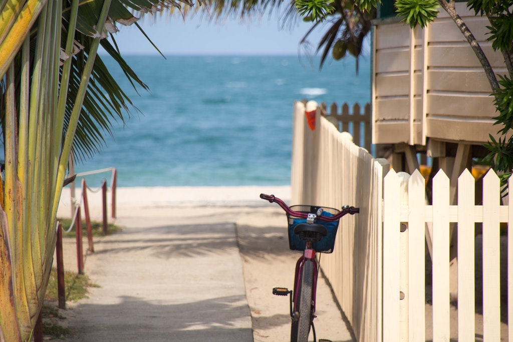
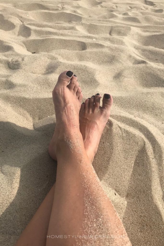
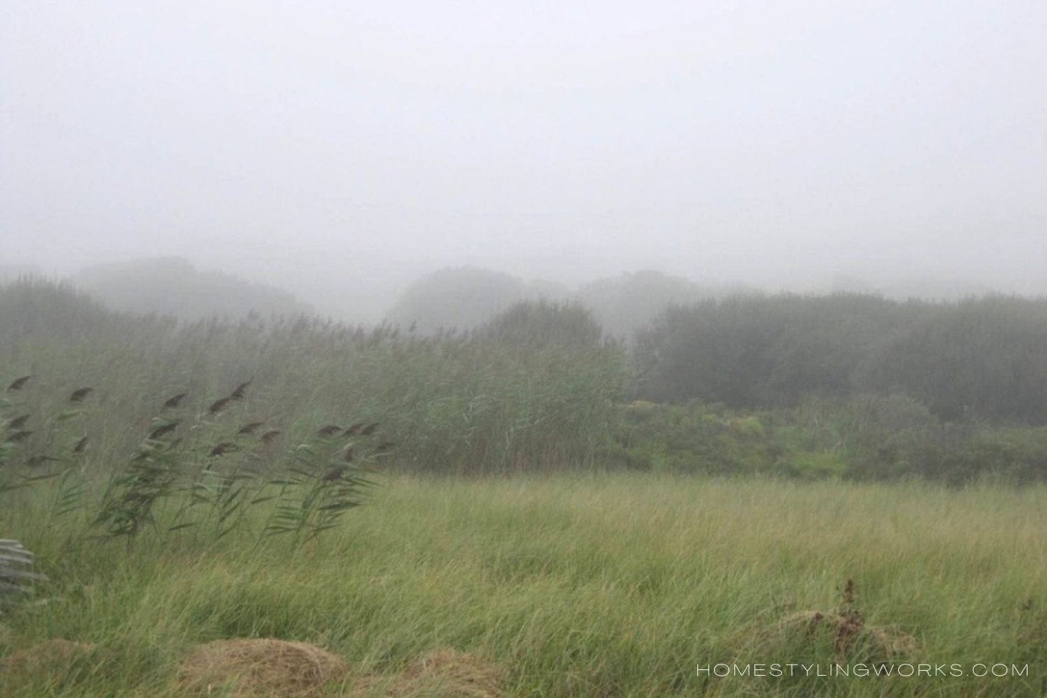
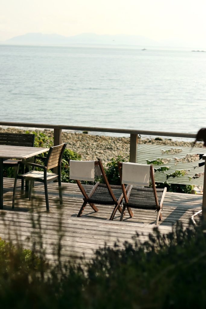
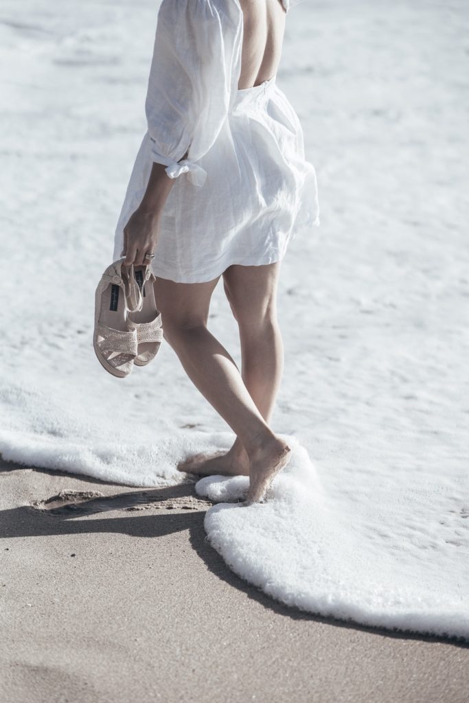
As in: How do you want your home to FEEL? The images below evoke these feelings: Relaxed, casual, comfortable, calm, inviting but laid-back, not fussy.


KEY DESIGN ELEMENTS
There are five design elements involved in creating a casual vibe in your home:
- COLOR PALETTE
- TEXTURE + NATURAL MATERIALS
- COLLECTIONS
- ELEMENTS OF NATURE
- PATINA
You want to keep these five elements in mind when creating a casual vibe in your home.
Let’s start with the Color Palette.
DESIGN ELEMENT #1: COLOR PALETTE
The color palette is a very important component to achieving a casual vibe in your home. The most important thing to keep in mind is it’s best to start with a neutral base (light colored walls, neutral furnishings).
I’ve created three color palettes below, which all have a slightly different vibe – but all of them definitely read “casual” and “inviting”.
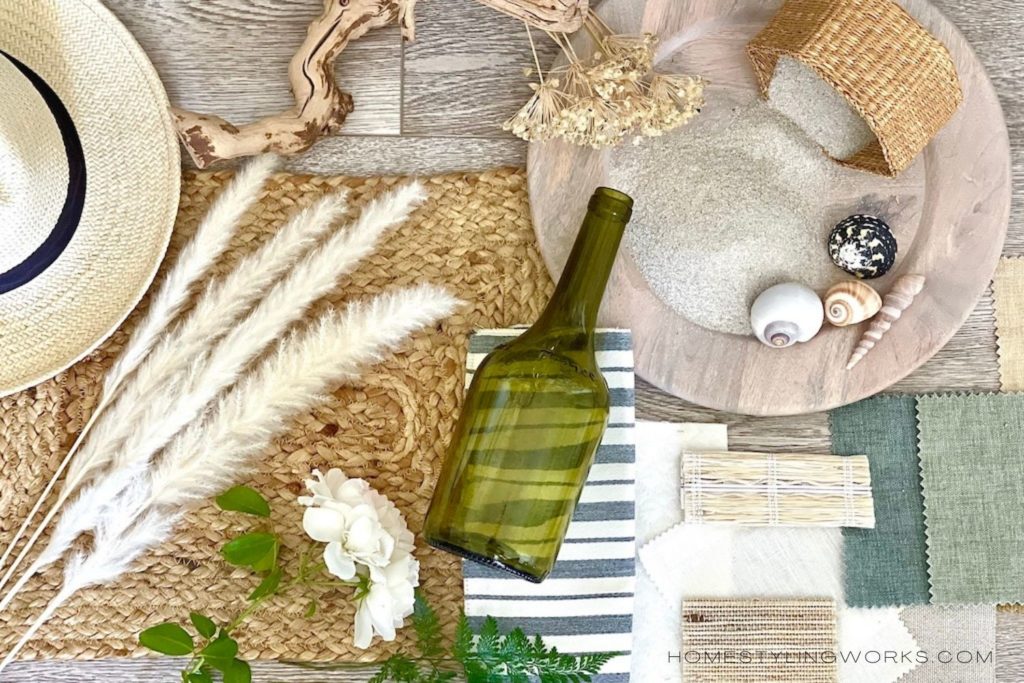
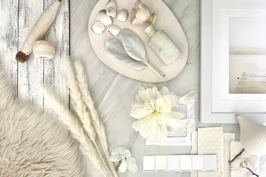
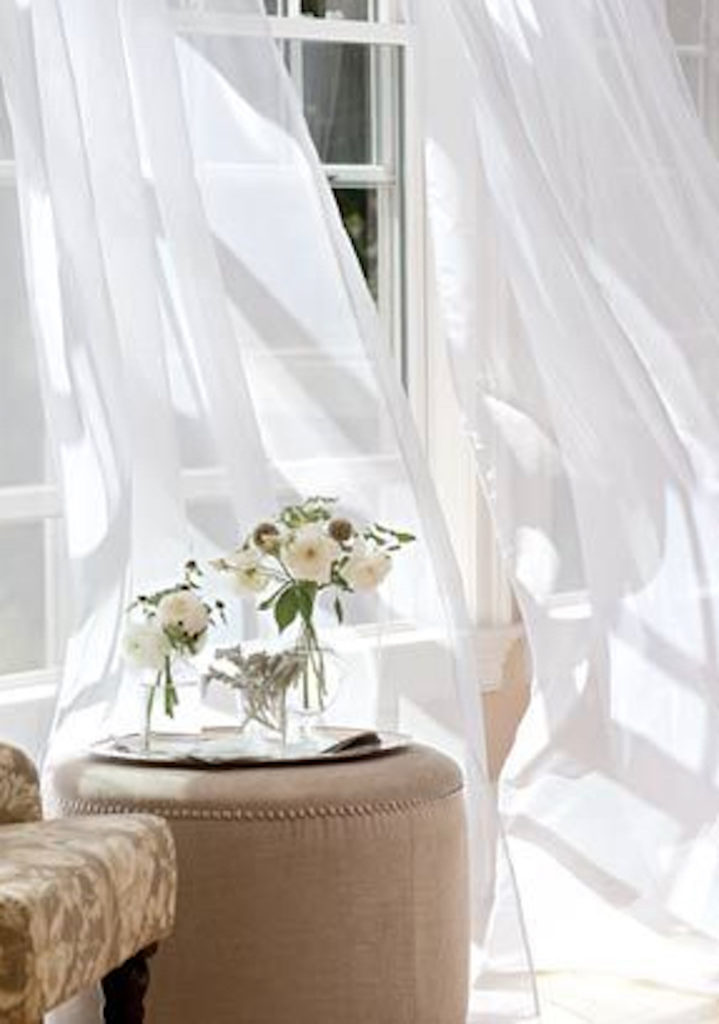
SUNRISE (AND SUNSET) INSPIRED PALETTE:
The first color palette (below) features soft, muted tones of sand, driftwood and sea glass. You can add these colors by changing out your sofa pillows (easy!), swapping out a heavy rug for a jute area rug or runner, and even adding woven roman shades or sheer curtains to your windows. Even a wooden peg rack with hanging straw market baskets and beach hats can be a decor element.


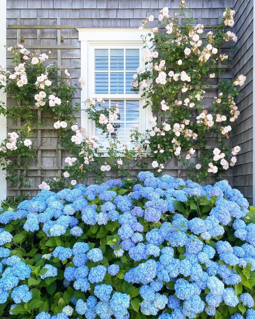
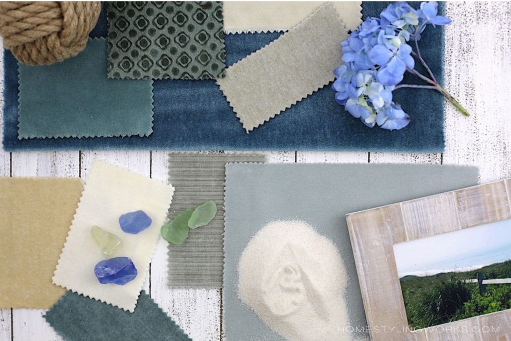
INSPIRED BY THE SEA AND THE SKY PALETTE:
Blue is one of the most popular colors in home decor, and it’s easy to add a casual vibe to your home with shades of sea and sky (accented by crisp whites). Classic blue-and-white never goes out of style, and you can add these in the form of pillows, throw blankets and artwork. And, of course, you can never go wrong with blue hydrangeas (freshly clipped from your garden is ideal, but you can find these cut at the supermarket or at your local nursery).

CALMING WHITE MONOCHROME PALETTE:
For those of you out there who think that white is boring – think again! A “shades of white” palette is an all-out winner when creating an easy, breezy, casual vibe in your home. There are over 900 shades of white paint alone (who knew!). Glossy, milky, creamy, eggshell, linen, vanilla – and the list goes on. Texture is the key to making white not look flat or boring (more on texture later in the post). A chunky white chenille throw, a collection of driftwood in a marble bowl, white baskets, an alabaster light fixture are just a few ways to make a white monochrome palette interesting. And remember, everything goes with white, so it’s easy to add an accent color (such as pale green or a very light blue).

DESIGN ELEMENT #2: TEXTURE + NATURAL MATERIALS
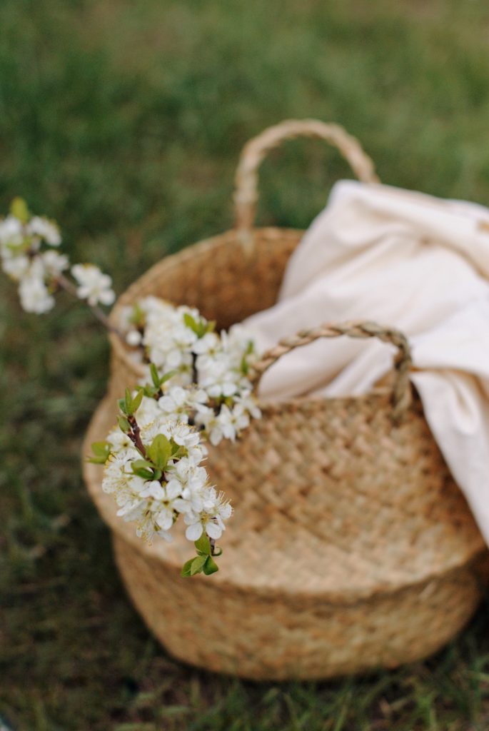
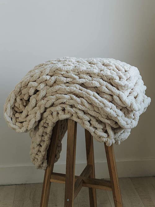
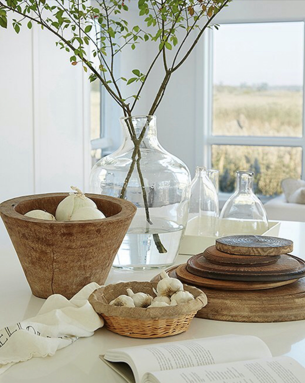
You can incorporate texture in the form of linen and cotton textiles, nubby jute, sisal, seagrass and raffia, stone, pebbles, seashells, driftwood and dried leaves. A white slipcovered sofa is classic, casual and practical – as are white linen curtain panels. Textural accessories include wicker baskets, chunky blankets, weathered wood, soft faux fur sheepskin chair throws, matelasse coverlets, stems of pampas grass, and textured ceramic vases.
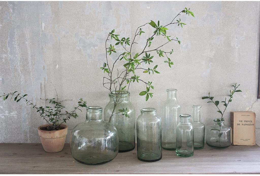
DESIGN ELEMENT #3: COLLECTIONS
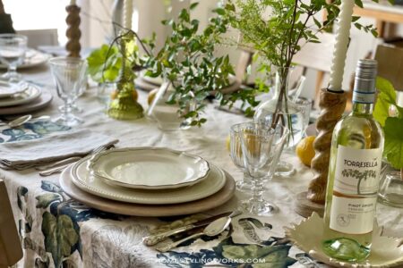
Collections fit right into casual style. And you don’t need to collect chinoiserie or fancy things to make an impact. A simple collection of light green glass bottles in varying sizes, filled with sprigs of foraged greenery, adds a lovely focal point to a tabletop. (I talk more about “Free Foraging” greenery in my “Styling Secrets” Guide – free to subscribers. Click here for the link to subscribe and receive your free guide).
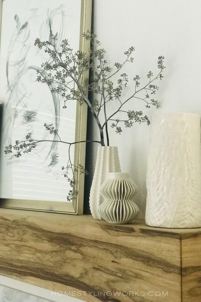
Below left, a trio of of sculptural white vases, with a bit of dried seeded eucalyptus, styled on a mantel reads as a “collection”. And in the image below right, this casual California beach house featured in Southern Living magazine takes the “collecting” element to the next level (but it’s all still easy, breezy and not at all formal). I talk more about creating a beautiful White Collection in this post.
DESIGN ELEMENT #4: ELEMENTS OF NATURE
Think of what you see in nature: grasses swaying in the ocean breeze, native plants, casual wildflowers – not stiff, straight-from-the-florist arrangements.

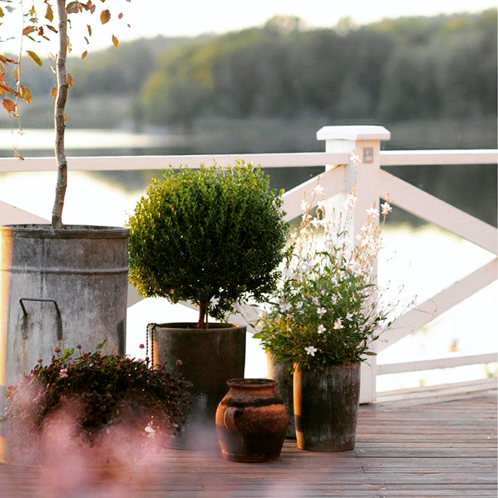
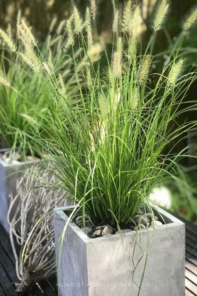
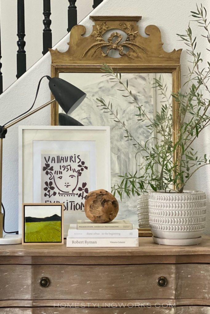
Elements of nature are easy to incorporate into your decor. In the images below, I styled my table with potted dwarf grasses (below left), which adds an airy texture and authenticity. In the image below right, I added a potted olive tree to my entry chest of drawers. Live greenery is always welcome.
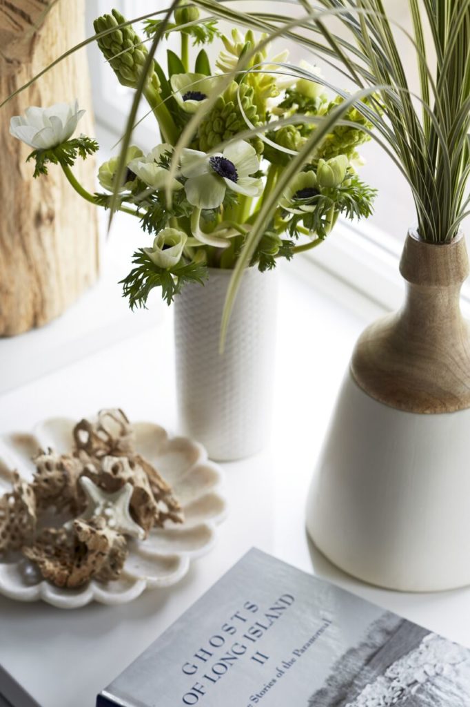
Casually arranged flowers, grasses and rooting plants in glass are also easy ways to add a natural element to your home. A textured dish with weather driftwood pieces (image below left) is another way to add an element of nature to a vignette.
You also can’t go wrong with one or two live potted plants (such as a Boston fern or Areca palm) in casual planters such as wicker baskets or aged terra cotta.
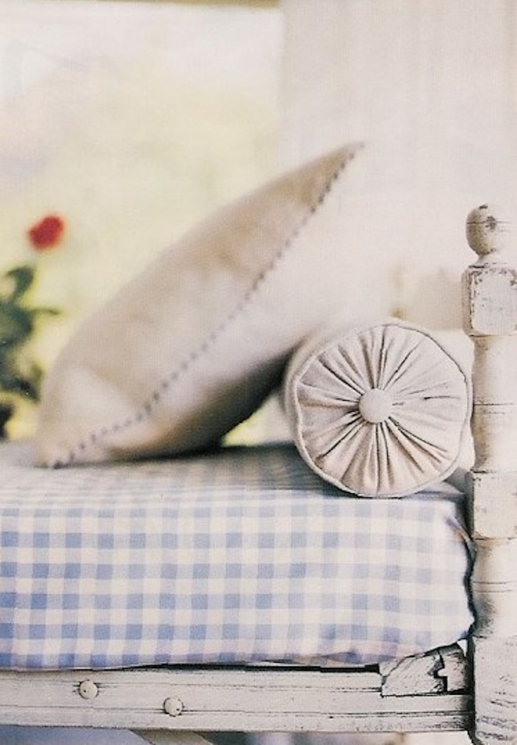
DESIGN ELEMENT #5: PATINA
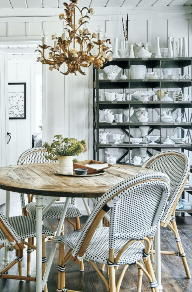
Patina is an important component to creating a casual environment in your home. Think of items with an air of antiquity about them – for example, in the kitchen, weathered wood cutting boards and bowls (below left) are beautiful and useful. In the image below right, one of my favorite antique pieces was this painted white daybed, which was photographed for a story in Better Homes & Gardens® “Cottage Style” magazine. Keep an eye out for furnishings and accessories at antique and vintage stores – items with a history add visual interest to your home, so everything isn’t brand-new, right-out-of-the-box.
“CASUAL” STYLE, TRANSLATED
I should clarify that “easy, breezy, casual” style doesn’t mean sloppy or thrown together. Much like in fashion, casual and comfortable doesn’t necessarily mean the decorating equivalent of ripped up denim jeans, an oversized sweatshirt and tattered sneakers. There’s a way to be “casual” and still look “polished”. That’s the look we’re going for when I say “casual”.
Below I’m sharing a few images of finished spaces that are evocative of this laid-back style – and they all have one thing in common in that they feel polished and put together.
ALL THE ELEMENTS – TOGETHER
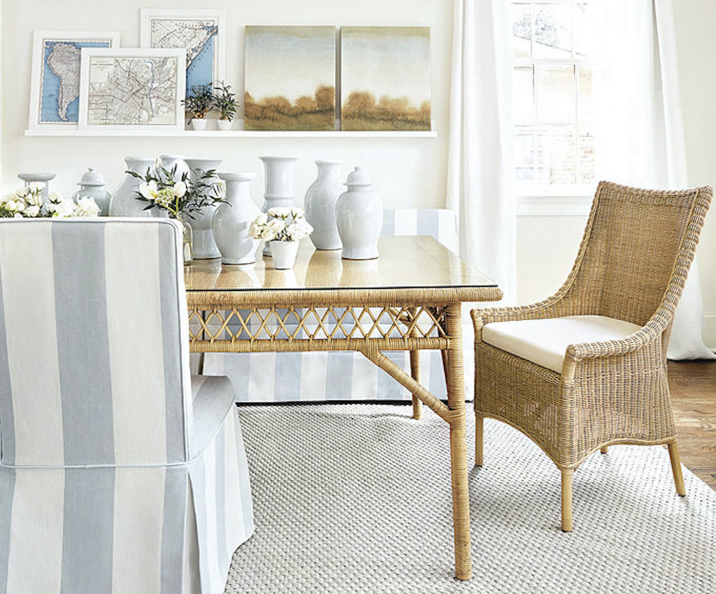
The image below is from the Ballard Designs catalog, and features a space designed by the esteemed Atlanta interior designer Suzanne Kasler.
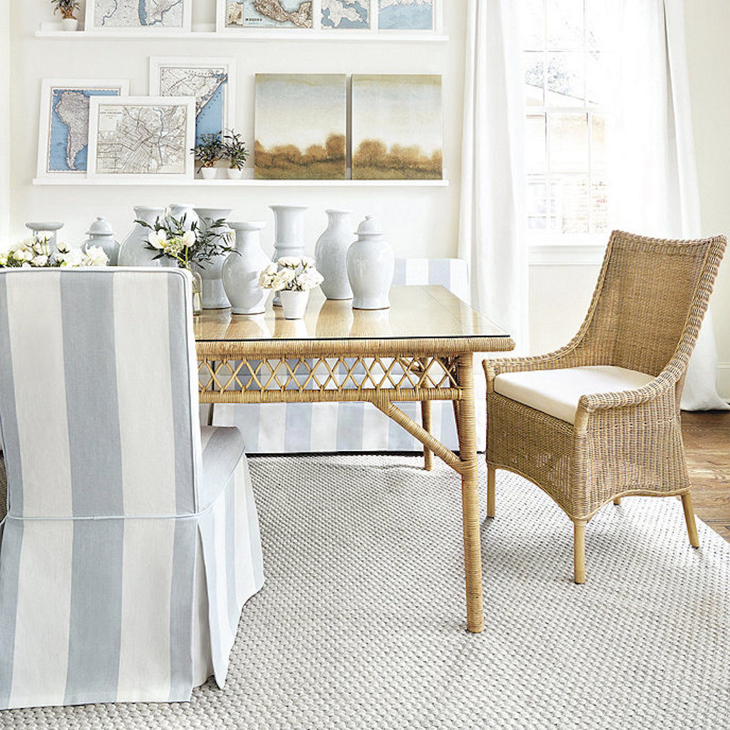
This dining room is the epitome of easy, breezy casual style, but is also quite sophisticated. The space features all the key design elements I referenced earlier in the post:
- Color Palette (soft muted tones of driftwood, sand and sea glass)
- Texture & Natural Materials (textured rug, wicker dining chair, rattan dining table, linen striped fabric on the Parsons chair and bench, crisp white curtain panels)
- Collections (shapely white vases casually grouped on the table, cool vintage-inspired maps)
- Elements of Nature (casually arranged white roses and greens, small potted plants on picture ledge)
- Patina (antique paintings)
MORE DESIGN INSPIRATION
A fabulous example of the vibes I’m talking about is in the home of the talented Houston interior designer Courtnay Tartt Elias, whom I’ve had the pleasure of working with on a few editorial photo shoots in her homes. I produced the story below (photographed by Julie Soefer) for Better Homes & Gardens® “Cottage Style” magazine, which shows the bar/entertaining area of Courtnay’s coastal Galveston, TX kitchen.
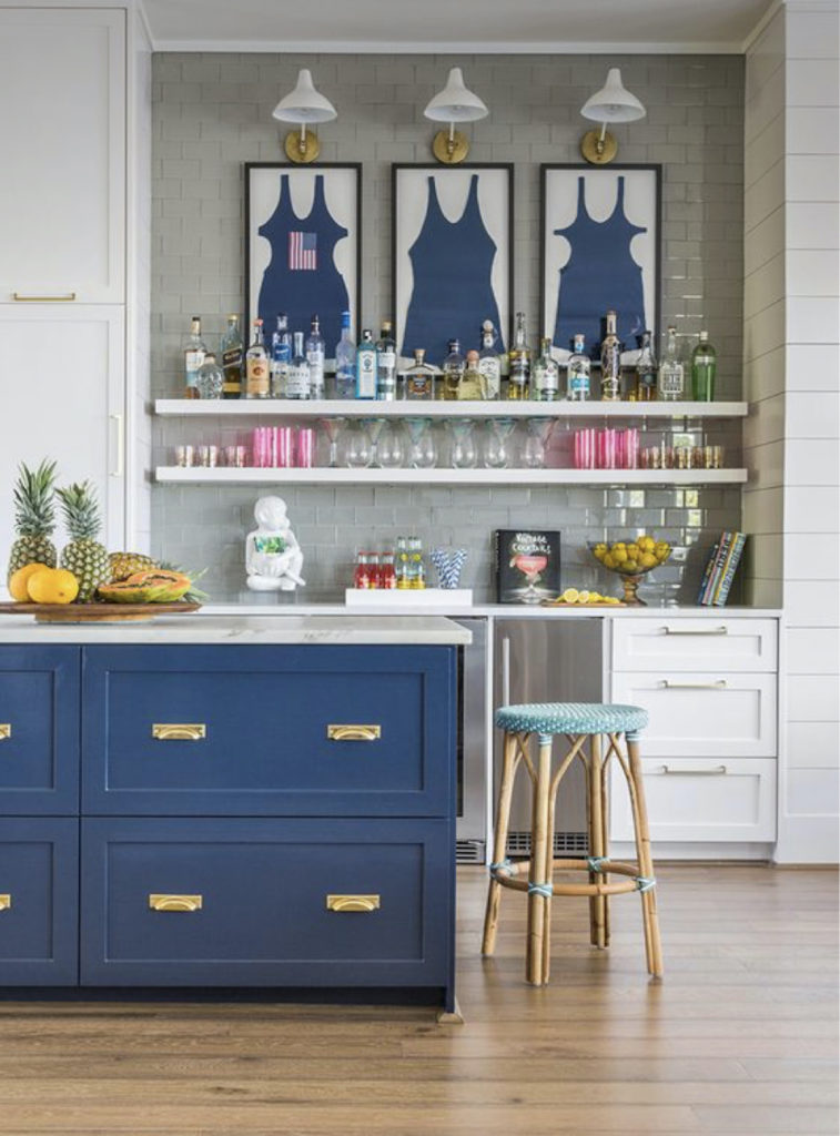
PRODUCER: Donna Talley for Better Homes & Gardens® “Cottage Style” magazine
There are very subtle, natural references to “coastal casual” in this space: The trio of framed vintage swimsuits, nautical-inspired light fixtures, and the rich blue hue of the island. Courtnay naturally made this space feel “coastal” and chic, without going over-the-top with the beach theme. Nothing here feels like it was picked up at a tourist shop, either! This space exudes a “carefree” vibe, which you can achieve, even if you’re not on the coast.
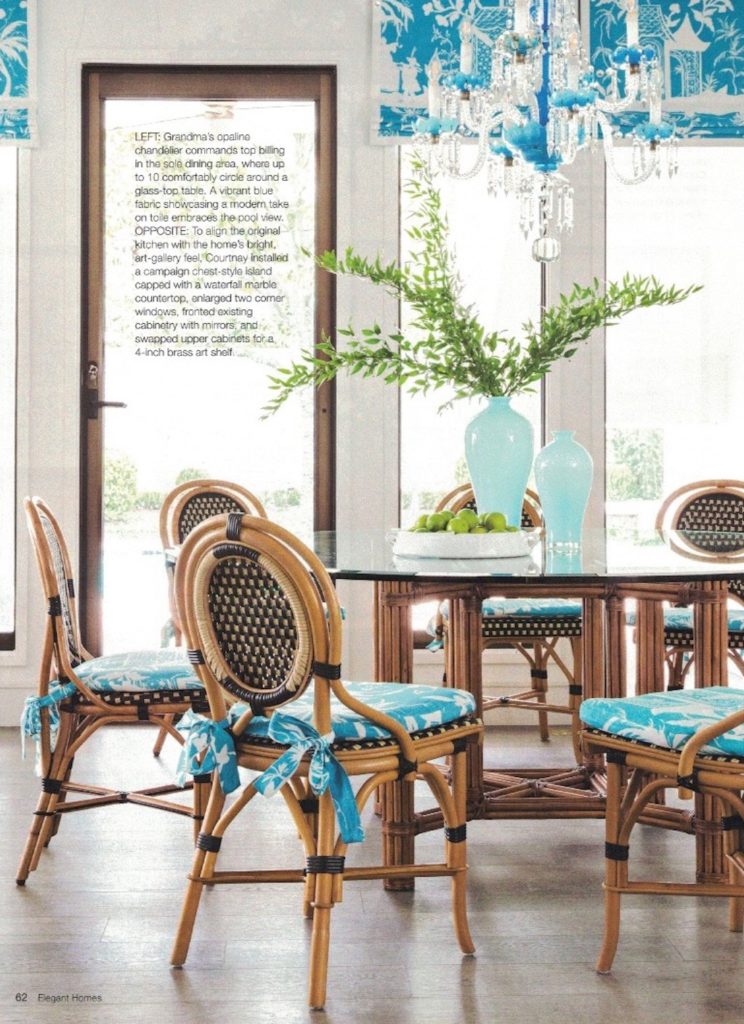
Below is another example of Courtnay’s magical design touch. This is a photo of her Houston breakfast room that I produced & styled for Better Homes & Gardens® “Elegant Homes” magazine, photographed by Julie Soefer. This space is a masterful mix of casual (rattan bistro chairs, simple green branches) and sophisticated (vibrant blue modern toile fabric, opaline chandelier) – in fresh shades of blue and white.
MORE EDITORIAL INSPIRATION
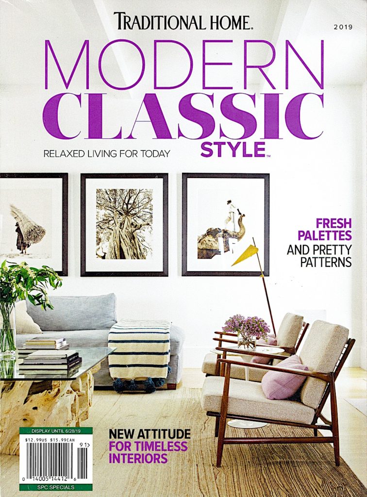
Below is another example of casual, polished style in a story I produced for Traditional Home “Modern Classic” magazine, photographed by Nathan Schroder. The homeowners were California transplants, so they asked interior designer Theresa Rowe to create a relaxed, “California Cool” vibe in their Dallas, Texas home, which she achieved by mixing textural elements with sleek and modern furnishings and accessories. As a finishing touch, I added casually arranged greens and just-picked purple flowers to style the space for the cover.
ARTFUL IDEAS
Instead of “nautical”, “beach” or “lake” themed paraphernalia or reproduction signs, I love the idea of adding framed fine art photography in a large scale, to bring that casual vibe into a space. Instead of a sign that says “At The Lake”, how about evocative images of the lake (below):


Black and white images of nature (similar to the Traditional Home magazine cover) would also go with any color scheme. Black and white photography adds a casual sophistication to a space – especially in a large format (24 x 36 or larger). A trio of images of the beach would add that easy, breezy style to any home.


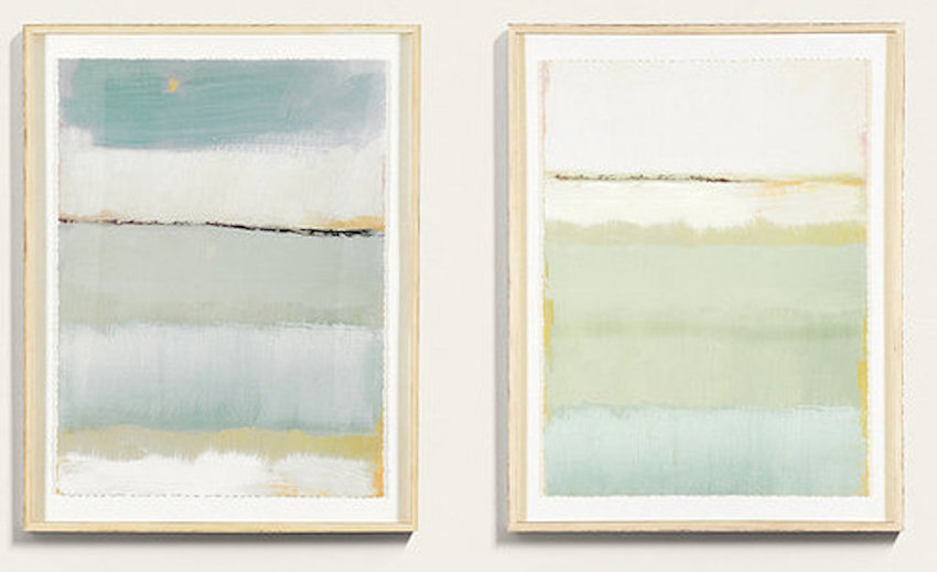
Also, art doesn’t have to be “literal” to have a casual vibe. I love the sand-and-sea color palette of the “Cote de la Mer” abstract art prints below, available as a set from Ballard Designs. Link to the pair here.
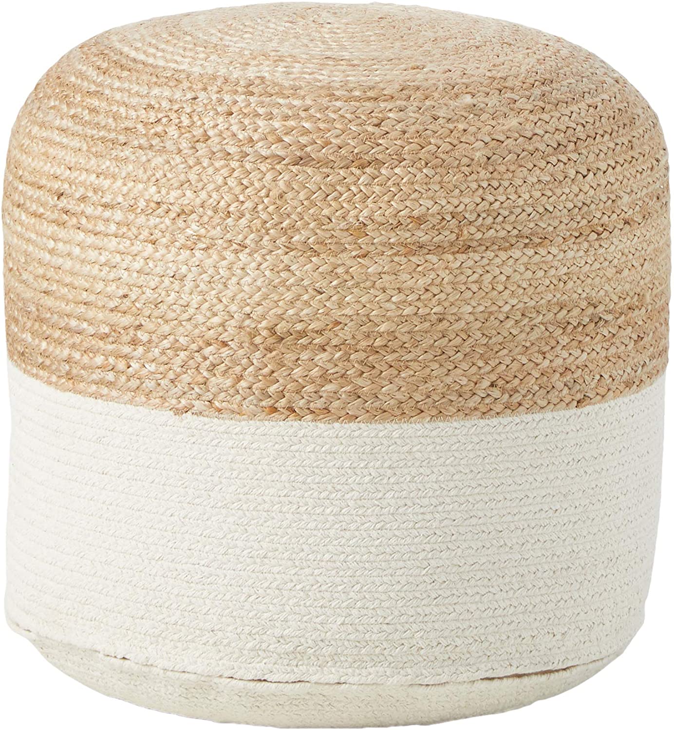
SHOP THE “EASY BREEZY” LOOK
I’ve curated a selection of furnishings and accessories to help you “get the look” in your own home.
CLICK ON THE IMAGES BELOW FOR PRODUCT LINKS:


I hope this post has inspired you to take a fresh look at how you can Make Your Every Day More Beautiful™ by incorporating a “Casual Cool” vibe throughout your home.
Designer links
To see more of Courtnay Tartt Elias’s work, check out her website at www.creativetonicdesign.com