Welcome to my new series on HomeStylingWorks called “Shop The Cover”, where I take favorite magazine covers that I’ve produced and styled, and curate a shopping gallery with very similar products. But before I get into the actual shopping part, I wanted to give you a little behind-the-scenes look at styling magazine cover-worthy spaces.
WHAT MAKES A MAGAZINE COVER?
What makes a space cover-worthy are all of the elements that come together to create a gorgeous room – not just furniture, rugs and lighting, but those extra touches like fresh clipped green branches, lush flowers, books and textural elements. It’s not any one particular item, but the combination of many design elements brought together to create a WOW! factor for a cover. Simply put, what makes a magazine cover is that the total is greater than the sum of its parts (I can thank Aristotle for that bit of wisdom).
A PEEK BEHIND-THE-SCENES
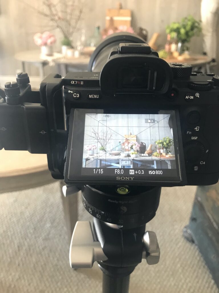
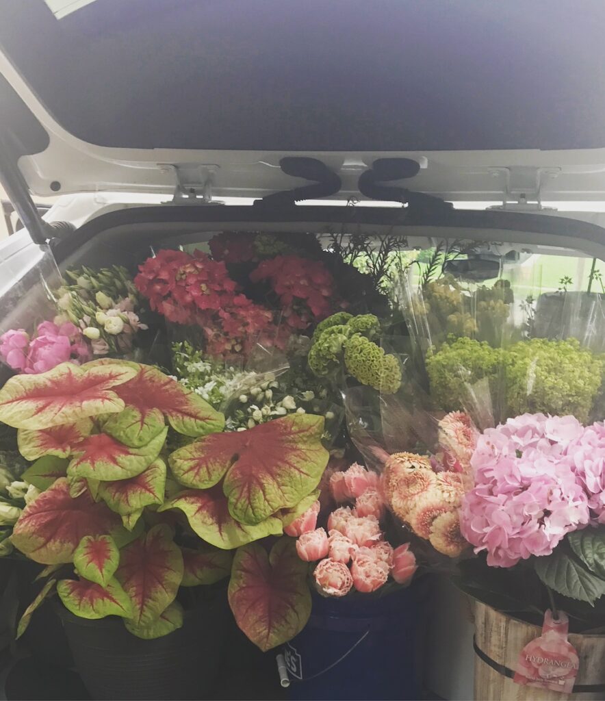
When I would shop for a photo shoot, it often took me a few days to procure additional props such as pillows, throws, flowers and vases – you know, the things that really make a room feel curated and layered. When it came time for the actual shoot, the homeowners would be so happy with how their home looked when it was professionally styled, they often bought many of the items I brought with me (I always left behind the fresh flowers for the homeowners as a thank you).
Adding those extra touches to a home really made a difference in not only how the room looked on the cover, but also how the fully styled and curated space made people FEEL about their home. That got me thinking about how my HomeStylingWorks readers could re-create some of the looks from my favorite cover stories.

SHARING MY SECRETS WITH YOU
It might seem to be a lofty goal to have your home look like it came from the pages (or cover) of a magazine, but I figured out a way to do that – and I’m going to share my secret with you!
In my “Shop The Cover” posts, I’ll select a beautiful cover image from one of the many national design magazines I’ve worked for as a story producer and photo stylist for over 20 years. I’ll share the image and then curate a shopping gallery featuring products that have the same vibe and feel as the items featured on the cover shot. The featured items will range from furniture, rugs and lighting to pillows, vases, books and other accessories. I’ll also include selections for plants, silk greenery and flowers in the mix.
What I’m doing is bringing the whole look to you in ONE SHOPPING EXPERIENCE. So let’s get started!
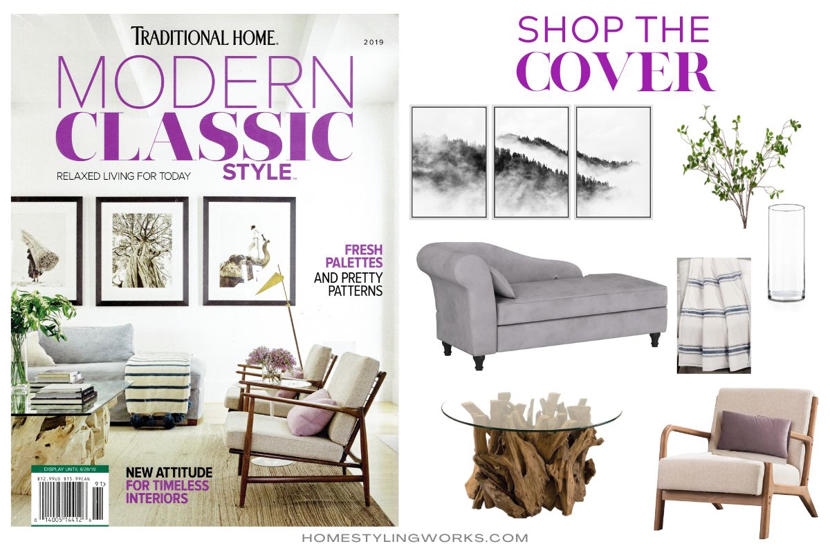
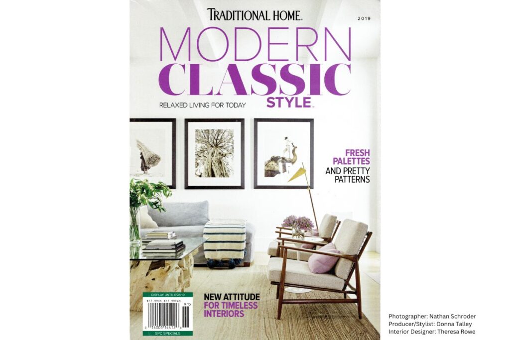
TRADITIONAL HOME “MODERN CLASSIC” COVER

Interior Designer: Theresa Rowe
The first cover I chose for this series is one of my favorite cover “children”. I styled and produced this story at a lovely home in Dallas, Texas in 2019. I was introduced to this project by the builder, Ben Coats of Coats Homes, whose projects I was scouting for the magazines. The homeowners moved to Dallas from California, and they worked with interior designer Theresa Rowe to help them achieve their desired look of “California-Cool-Meets-Texas”, with a mix of traditional and casual elements thoughtfully placed throughout the home.
When I first saw the home, I knew it had potential for being published in one of the big titles at Meredith Publishing, the venerable Traditional Home magazine. Traditional Home (or, as we Producers and Editors called it, Trad Home for short) was launched in 1989 and is one of the most difficult magazines to get into. But I thought it was worth it to submit the scouting photos to the Home Design Editor, who then presented it to the Editor-in-Chief. Much to everyone’s excitement, everyone at the magazine loved it and the story was a go!
As a producer and stylist, my job was to look at a space as though I was looking through the lens of a camera, and bring in items to enhance the beautiful space – the finishing touches that would read well on camera. I like to think of it as adding the icing on an already-delicious cake. If a room was 80% there, it was my task to bring the elusive – yet magical – 20% to the photo shoot party.
Simply put, I needed to take a beautifully designed space and make it magazine-cover-worthy.
Working with the talented photographer Nathan Schroder on this photo shoot, we were able to deliver the cover for a new Traditional Home title called Modern Classic Style for their inaugural Spring 2019 issue.
SHOP THE COVER
From our Traditional Home Modern Classic Style cover, I’ve created a shopping gallery for you to re-create the cover look in your own home. Links to the products are listed below, with the corresponding numbers from the gallery.
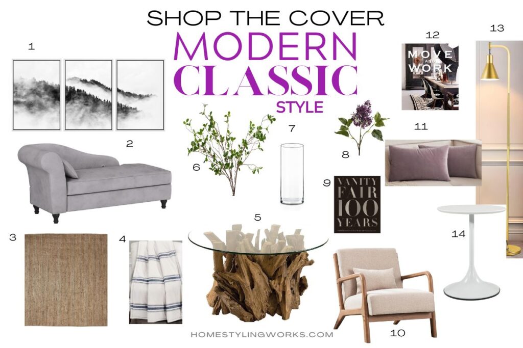

1) Set of 3 framed black and white wall prints
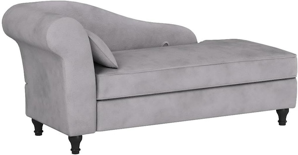
2) Gray velvet chaise lounge chair
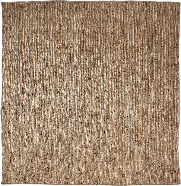
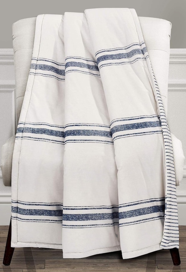
4) Navy & white striped throw blanket

5) Uttermost Teak Root Base Glass Top Coffee Table
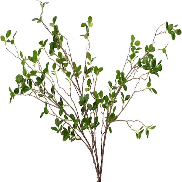
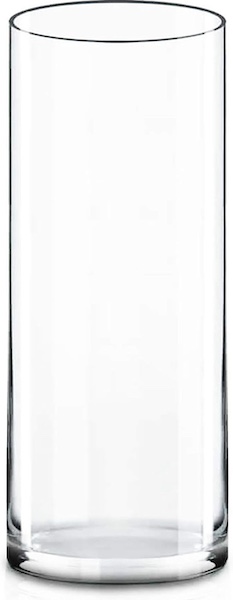
7) Clear cylinder glass vase for green branches

8) Silk lilac flower stems (set of 6)

9) “Vanity Fair 100 Years” coffee table book by Graydon Carter
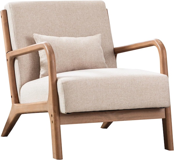
10) Mid-century modern armchair, solid wood with linen cushions
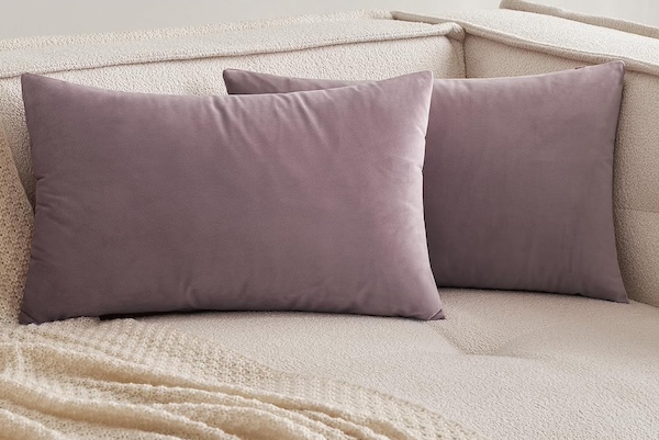
11) Set of 2 lilac velvet lumbar pillow covers

12) “Move + Work” coffee table art book by Malene Birger

13) Brass mid-century floor lamp

Thanks for stopping by and I hope this post inspires you to make your home look like a magazine cover by shopping one of my favorite cover stories!

