COLOR INSPIRATION FROM AN UNLIKELY SOURCE
In the design (and interior styling) world, inspiration can sometimes come from the unlikeliest of sources. Especially when it comes to color. The inspiration for this spring color palette post is a great example. My color inspiration came from, of all things, eggs.
Let me explain.
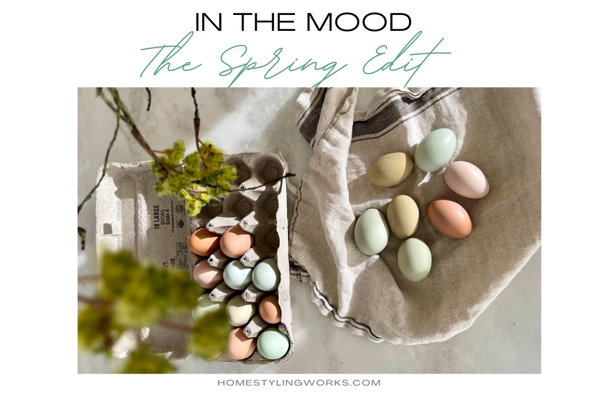
My husband’s sister, Ann, brought us fresh eggs from her chickens, and the first thing I noticed was the color palette of the eggs. These were not the ubiquitous white and brown varieties you find in the supermarket. These eggs were in hues of what I call “nature’s palette” – soft robin’s egg blues, pale blue-green, light olive green, a warm shade of ecru-beigey-blush and a rich pinkish-brown. I don’t think they even make dyes for Easter eggs in this gorgeous palette.
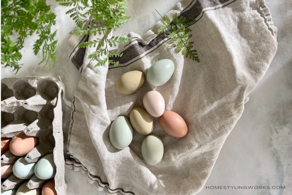
I was so inspired by the colors of the eggs in the image above, it got me thinking about how this color palette would make for a nice little spring refresh in your home.
A FRESH SPRING COLOR PALETTE
Styling your home for a spring refresh means stowing away the chunky throws and the warm, rich color palettes of fall and lightening up your decor.
You might think that means bringing in a wide array of pastels and “Easter-y” colors — lilacs, pinks and yellows. There’s nothing wrong with adding flowers in those colors as an accent, but it’s tricky. Adding a bunch of fresh-cut purple lilacs or yellow forsythia branches is a lot different than adding purple or yellow pillows or throws. Even your tabletop can take a wrong turn with pink, purple or yellow pastels. In short, decking out your home in pastels can go very cutesy, very quickly. Even if you don’t include typical Easter decorations like bunnies.
So back to the egg palette. What was so appealing to me about the colors was that they felt so fresh – like a harbinger of spring.
The egg colors inspired me to curate three color palettes for a spring refresh: Green (always sophisticated), Soft Blue and Buff-Natural. I’ve included a shopping gallery below each color palette featuring accessories that are easy to switch out for spring.
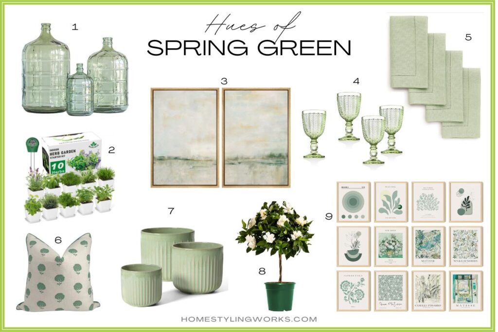
SPRING SHADE #1: EASY BEING GREEN
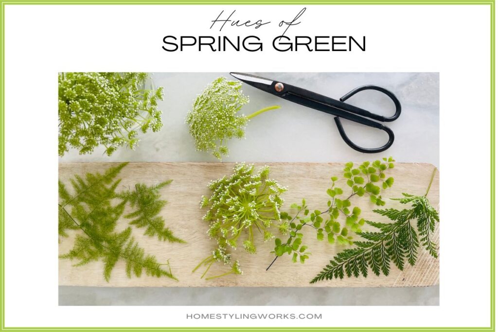
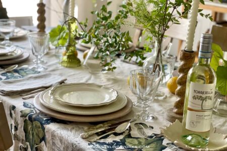
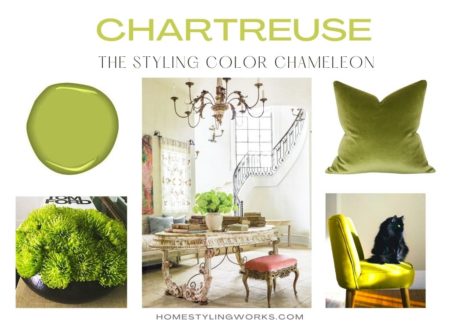
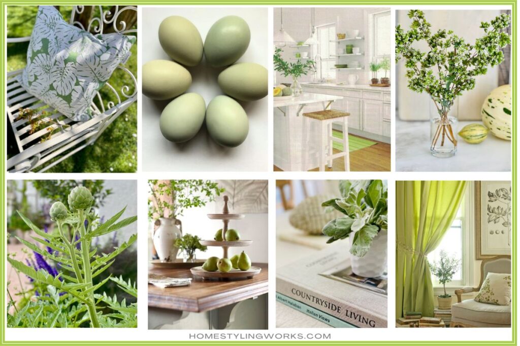
For spring, you just can’t go wrong with green. The color palette was inspired by the beautiful shade of green eggs from my sister-in-law’s Olive Egger breed of chicken. While deep forest and olive green are the hues of fall and winter, spring calls for verdant hues of celadon, chartreuse, mint, apple and seafoam green. I call them the Serene Greens.
If you look at the leaves budding out on the trees and plants, that’s the shades of fresh green we’re looking for. It always feels like spring in my house when I clip a few branches from my yard that are just budding out.
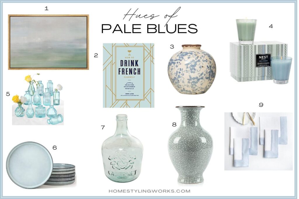
SPRING SHADE #2: CLASSIC BLUES
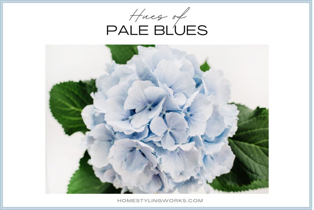
Even when used sparingly, blue can do wonders for uplifting the mood of a room. This palette was inspired by the beautiful blue eggs from my sister-in-law’s Ameraucana chickens.

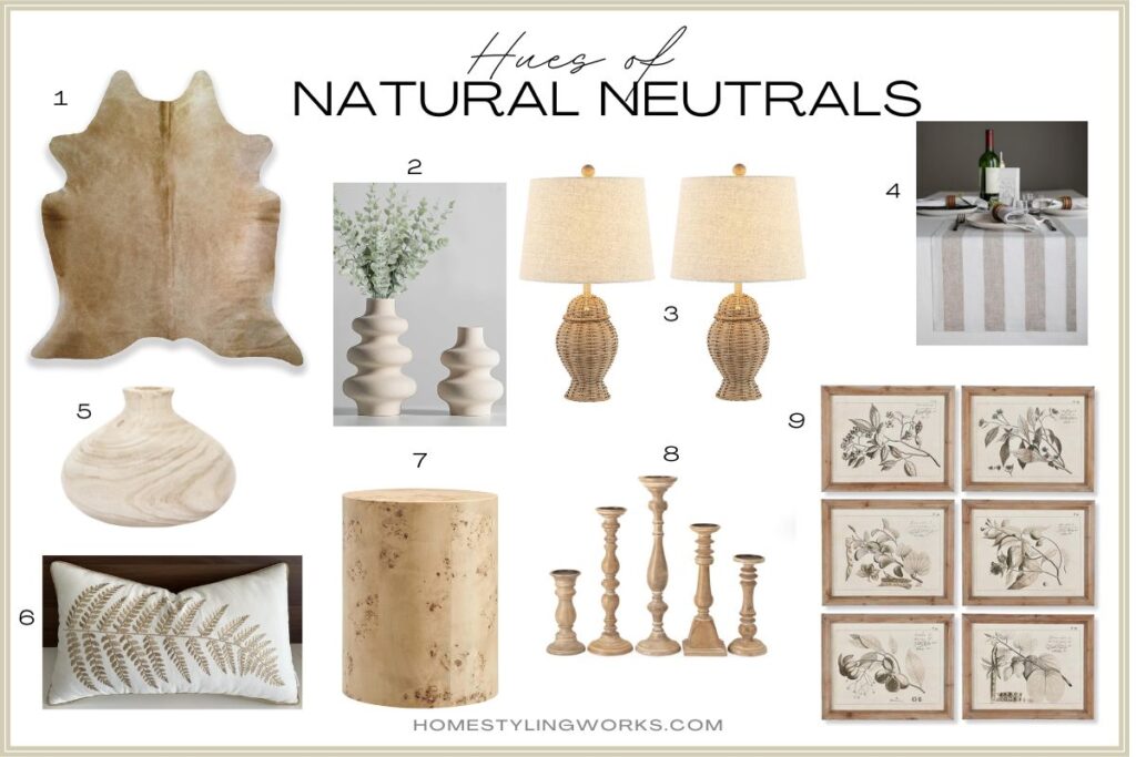
SPRING SHADE #3: NATURAL NEUTRALS
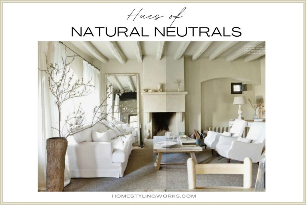
The third color palette was inspired by the eggs from the chicken breed called Rhode Island Reds – a beautiful bisque-beige color.
In the inspiration image above, this neutral room feels like spring with the addition of flowering branches in a rustic wood vase. Lighter slipcovers in shades of bisque, alabaster and cream add a light and airy feel to your home for spring, as well.
As a lover of neutral interiors in my own home, I like to switch out textures for the seasons, without adding big jolts of color. Whereas fall and winter call for faux fur pillows, chenille throws and velvet textures, I lighten the mood for spring with natural wicker, airy linen and cotton fibers, and lighter wood accessories.
The idea of the third neutral color palette is that you could mix-and-match items from this palette, accented by either the spring green OR pale blue palette.

SHOP THE COLOR PALETTES
- Large green glass bottle
- Windowsill herb kit
- Landscape canvas paintings, framed, set of 2, 16″ x 24″
- Set of 4 green glass Godinger goblets
- Set of 4 celadon green linen napkins
- Green block print pillow cover
- Set of 3 pale green ceramic planters
- Live flowering gardenia topiary tree
- Green abstract Matisse posters gallery wall prints. I would frame these in 11×14 light wood frames with an 8×10 mat, for a curated look.
- 24″ x 36″ Landscape Abstract Painting framed in natural wood
- “How To Drink French Fluently” book
- Blue and cream vase
- Nest scented candle duo (Wild Mint & Eucalyptus; Driftwood & Chamomile)
- Set of 12 pale blue bud vases
- Set of 6 pale blue stoneware salad plates
- French glass demijohn bottle
- Robin’s egg blue crackle porcelain vase
- Pale blue bordered linen napkins, set of 4
- Beige Cowhide Rug
- Set of two off-white modern vases
- Pair of French wicker lamps
- 100% Linen Cabana Stripe table runner, beige & white
- Paulownia wood vase
- Fern embroidered lumbar pillow cover
- Round burl wood end table
- Set of 5 natural wood candle holders
- Set of 6 framed fruit botanical prints
Thank you for stopping by, and I hope this post inspires you to Make Your Every Day More Beautiful by refreshing your home with sophisticated colors for spring!