SHOPPING MY “MODERN FARMHOUSE STYLE” MAGAZINE COVER
Modern farmhouse style has been one of the hottest design trends over the past few years. Hot enough that Better Homes & Gardens has made a whole magazine out of it called, appropriately enough, Modern Farmhouse Style.
While some people might be over the shiplap-and-sliding-barn-door look made popular by Joanna Gaines of “Fixer Upper” and Magnolia magazine fame, there are still several elements of modern farmhouse style that remain timeless. These elements include:
- Reclaimed wood
- Rustic beams
- Salvaged materials
- Vintage furnishings and lighting
- Textural, natural elements
Another characteristic of modern farmhouse style is a neutral color scheme of bisque, shades of white, taupe-y earthy colors, greige (gray-beige), deep rich hues of brown and ochre, and touches of black.
The “modern” part is what I think will keep this trend going. Juxtaposing contemporary touches with more rustic ones makes a space feel fresh and personal. I love the look of a modern abstract painting, a contemporary light fixture or a black-and-white framed photograph mixed with more rustic items.
This brings me to the next installment of my “Shop the Cover” series. I chose a cover story that I produced and styled for Modern Farmhouse Style magazine (one of the Better Homes & Gardens Special Interest Publications). For those of you who are just tuning in, my “Shop The Cover” series is where I select a cover story I produced in my 20-year career as an editorial story producer and photo stylist, and re-create the look with similar elements featured on the cover. I call it “one-stop-cover-shopping”, available to you with just a click!
MODERN FARMHOUSE STYLE, DECONSTRUCTED
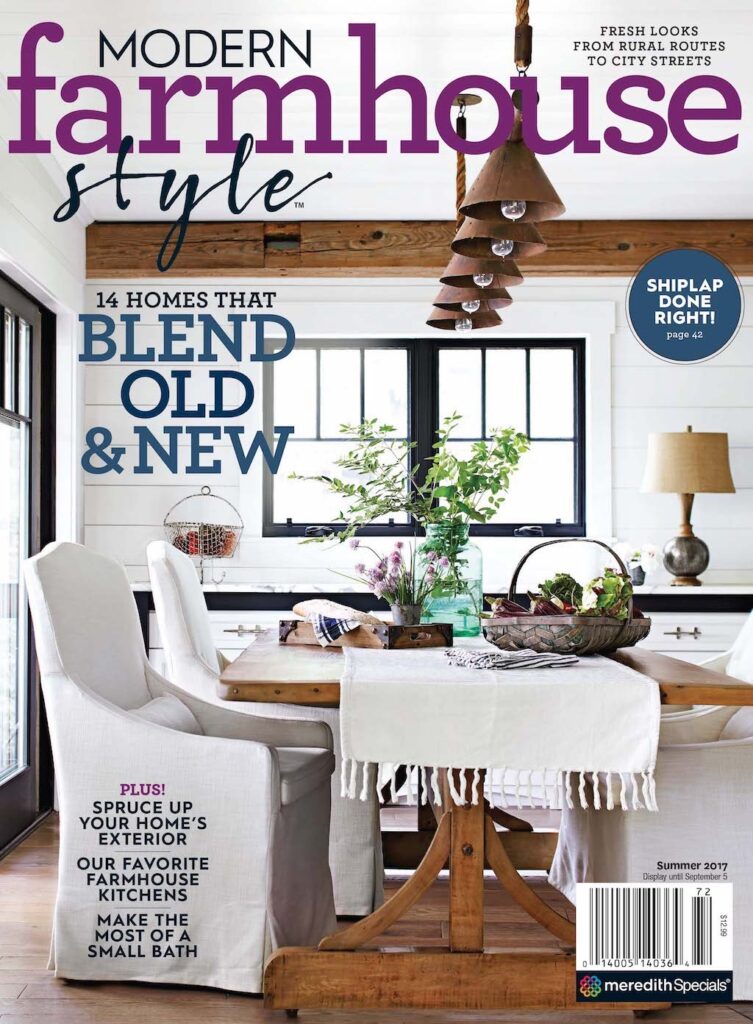
Interior Designer: Joanne Hans Chmura; Architect: Michael Phinney
The cover I chose for this post represents the best parts of Modern Farmhouse Style. I scouted this newly-built home through the talented architect, Michael Phinney of Phinney Design Group in Saratoga Springs, NY. This family-oriented vacation home is located in the picturesque Adirondack Mountains of New York State, overlooking Lake George. One whole side of the house (including the dining room pictured on the cover) has gorgeous views of the lake. I had high hopes when I submitted this project to my editors, and everyone involved was thrilled when it was selected for a multi-page feature story in the newly-minted Modern Farmhouse Style magazine.
I booked one of my favorite photographers, Laura Moss, for the photo shoot, and a few days before the shoot, I went shopping for additional home items, flowers and greenery to set the scene.
Another interesting element to this story was that the interior designer on the project, the very nice Joanne Hans Chmura of A Perfect Placement, worked with her sister, who was also the homeowner. Magazines love those kind of feel-good, making-family-memories kind of stories. Below is the story opener, which features chives I cut from my own garden to use on the tabletop in the cover shot, with the appropriately-titled “Sister Act”.
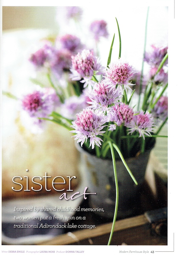
Photographer: Laura Moss; Producer: Donna Talley
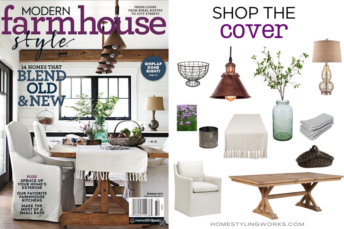
SHOP THE COVER
I brought in most of what you see on the table in the cover shot below. As I mentioned in my previous “Shop the Cover” post, I talked about how, as a producer and stylist, my job was to look at a space as though I was looking through the lens of a camera. I was tasked with bringing in items to enhance the beautiful space – the finishing touches that would read well on camera. I liken it to adding the icing on an already-delicious cake.
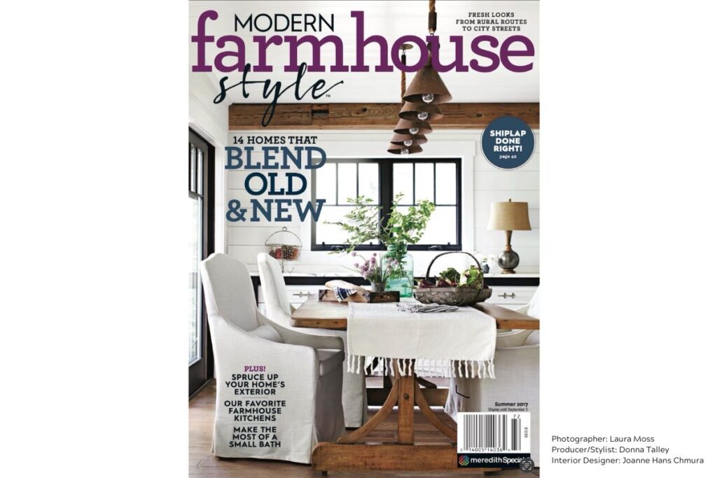
In the case of this fabulous dining room, 85% of the elements were in place – the fabulous trestle table, comfy upholstered dining chairs, cool lighting and great architectural bones (beams, a little bit of white shiplap, black windows). I styled the table with “lifestyle” elements that make the space feel livable and achievable, giving it “cover-worthy” status. That elusive 15% of cover magic.
When I styled this tabletop, I made sure to include varying heights on the table, so everything wasn’t on the same visual plane. My goal was to make the space feel casual and inspirational. The combination of all of these elements reads fresh, homey and aspirational for readers. Simplicity at its best: Green branches clipped from the verdant surroundings and placed in a recycled green glass vase, clipped flowering chives in an antique zinc cup, a basket of garden-fresh veggies. There are also textural elements to the table in the form of a fringed table runner, ticking stripe napkins and rustic tray. The total here is greater than the sum of its parts.
SHOP THE COVER
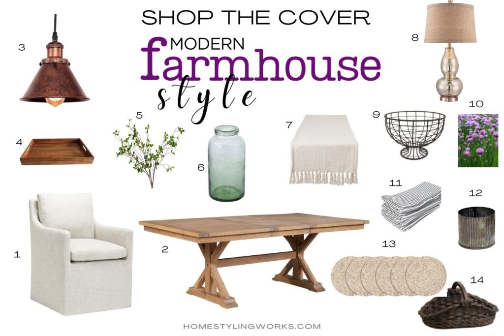
I’ve curated this cover look with links below each image. Just click on the link below each image to get this fabulous Modern Farmhouse Style look in your own home! Happy Shopping!
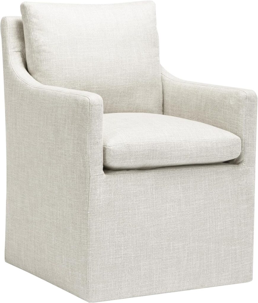
Upholstered Dining Chair with Lumbar Pillow
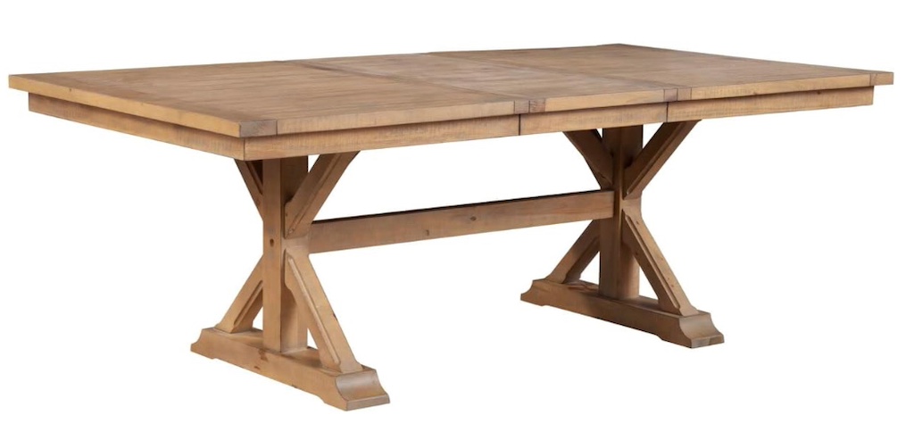
Modern Farmhouse Wood Trestle Dining Table
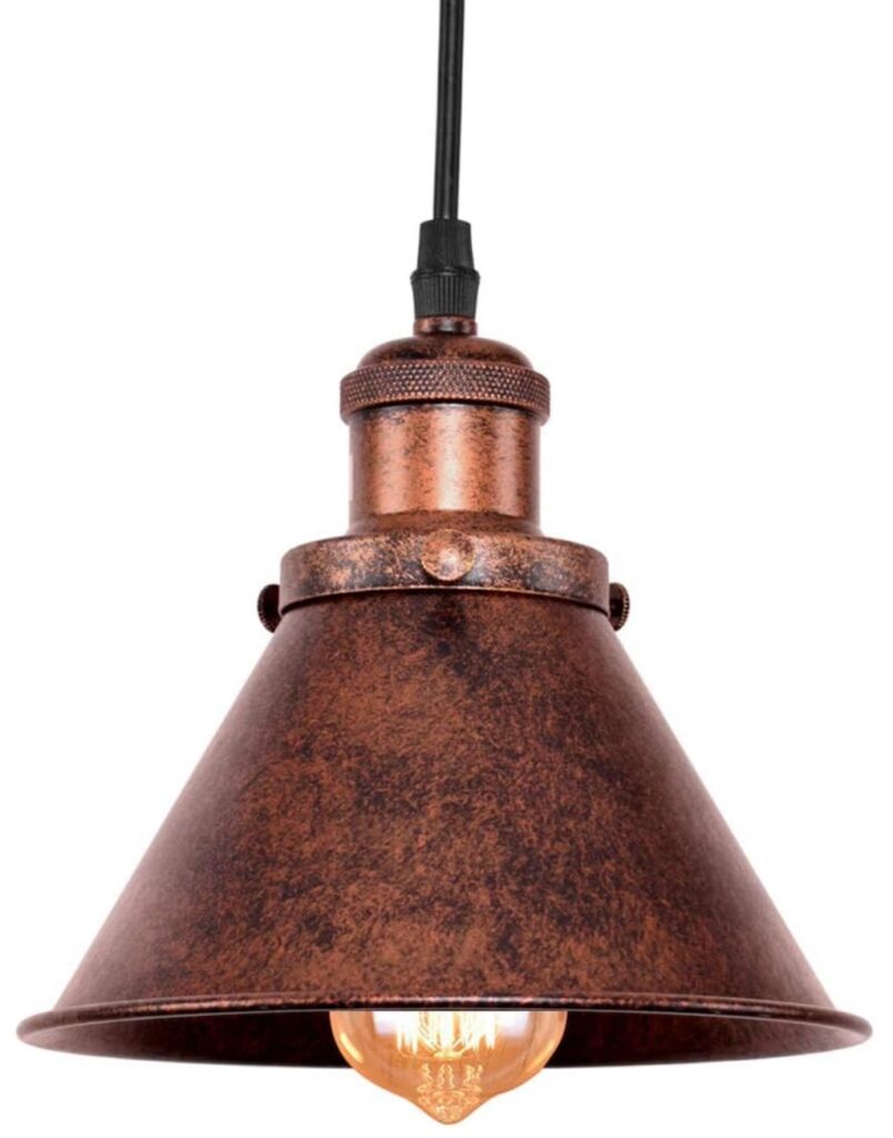
Rustic Pendant Light Fixture, Rust Finish
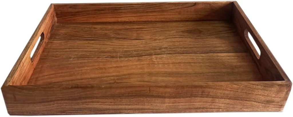
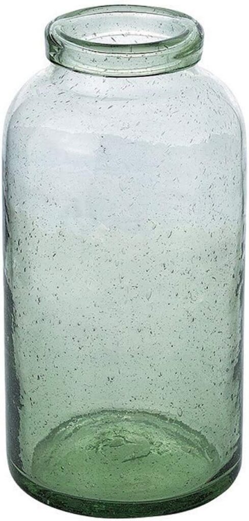

Recycled Green Glass Vase and Faux Green Branches
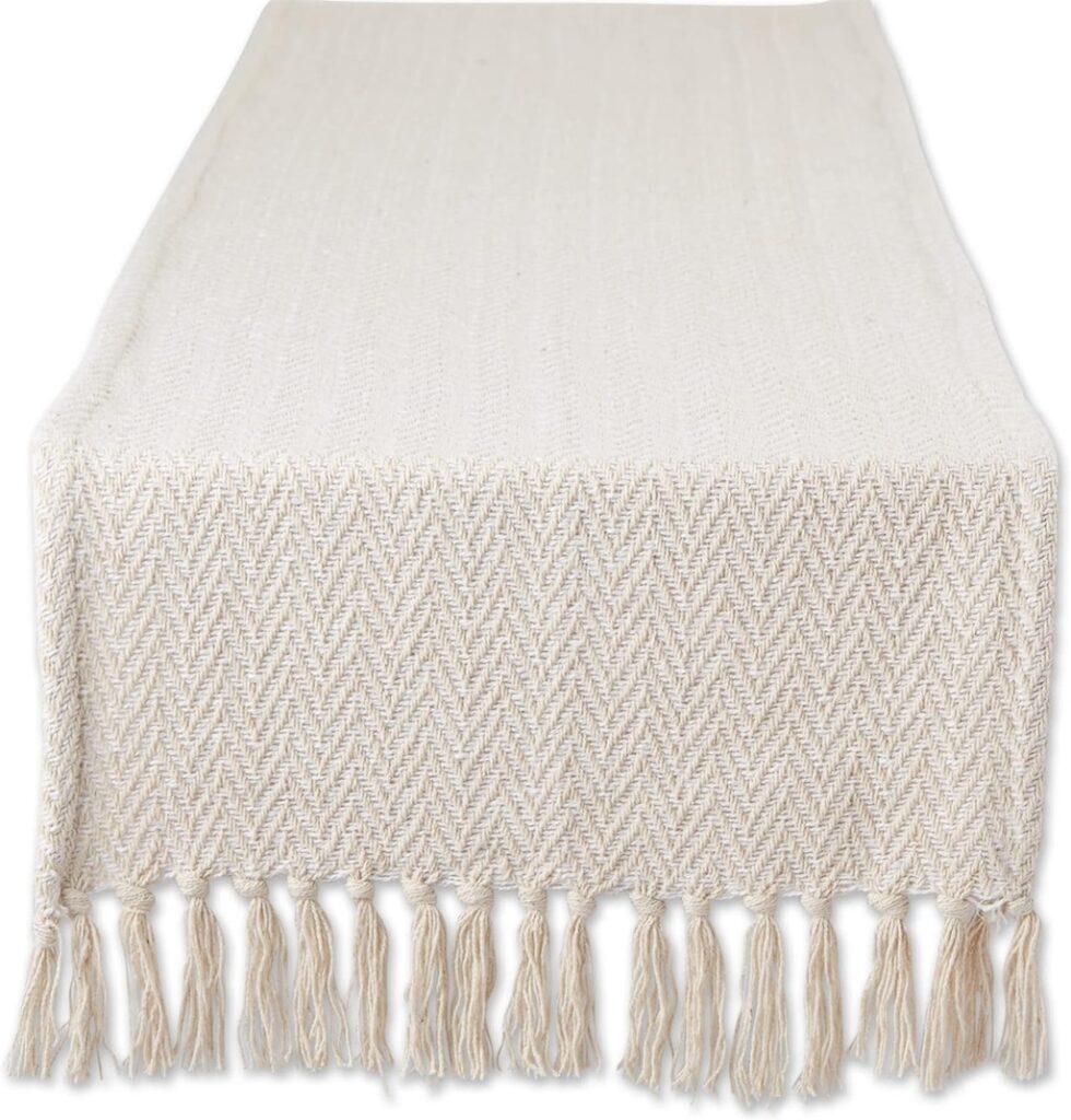
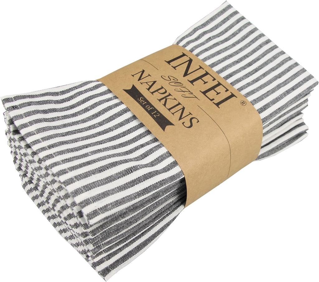
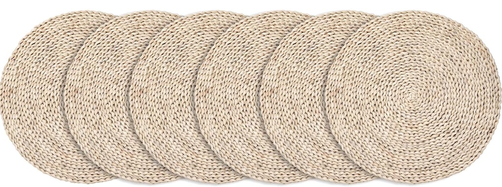
TABLETOP ITEMS: Off-white chevron table runner with fringe, Black & Cream Ticking Stripe Napkins, Natural Braided Table Mats
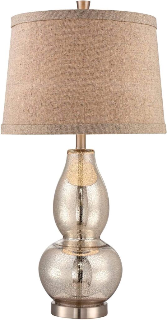
Mercury Glass Gourd Lamp with Burlap Lamp Shade
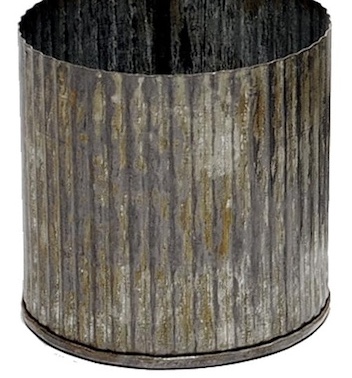
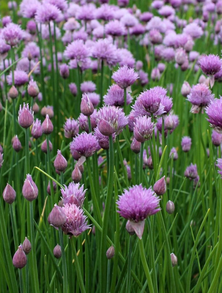
Corrugated zinc metal planter and Purple chive seeds
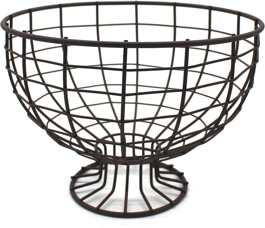
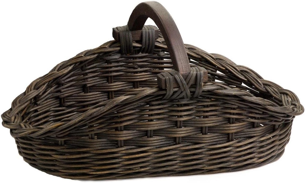
You don’t have to live in the country to have a country-inspired dining room. This look is quite transitional and would go with a lot of different home styles, whether you live at the lake, or in the city or suburbia.
Thanks for stopping by, and I hope this post has inspired you to re-create this casual, farmhouse style dining room in your own home.

