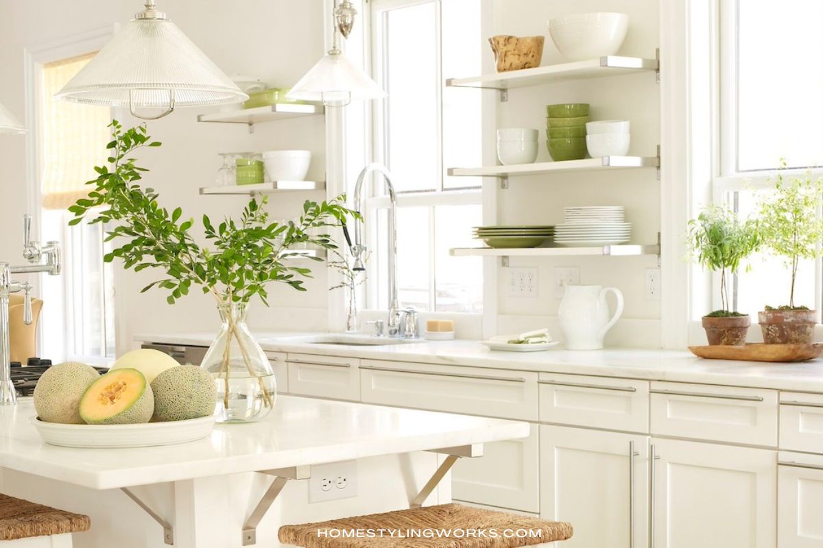
If I had to name one polarizing element in kitchen design (as in, people either love it or hate it), it would have to be open shelving.
When I was producing stories for design magazines, I remember a kitchen magazine editor telling me that they would actually get letters and phone calls when they featured open shelving in a kitchen (more on that later in the post).
Having designed several kitchens over the years – both for myself, clients and design magazine stories – I can understand why people don’t love the concept. It feels like Pressure-with-a-Capital-P to style open shelves and keep things tidy and nice-looking. Not to mention, you kind of need nice-looking stuff, too (not the hodge-podge-lodge collection of mugs from everywhere, and mismatched plates and glassware). Another reason why they’re polarizing is because people are skittish about their things collecting dust out in the open. All valid concerns.
But before I get into why I am in favor of open shelves, let’s take a quick look at how kitchen designs have evolved over the past 20 years.
LONG RUNS OF UPPER CABINETS
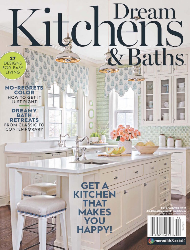
When I started producing locations for design magazines in the late 1990s and early-2000s, open shelves in kitchens weren’t popular. Most kitchens we photographed had long runs of cabinets that didn’t need any styling for a photo shoot. See examples below of three cover stories I produced and styled, with nary an open shelf in sight.
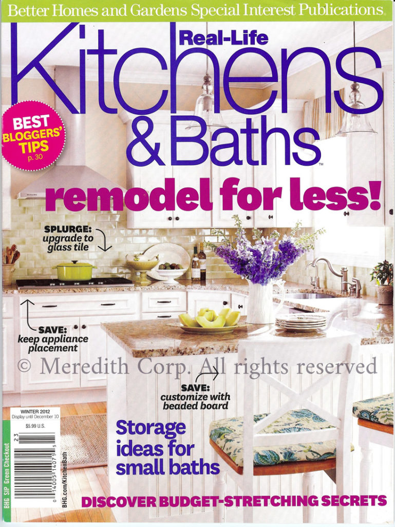
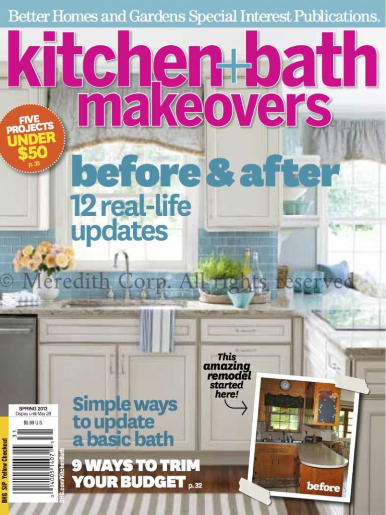
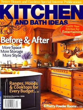
It turns out that “long runs of upper cabinets” happen to be a very American thing. In Europe, open shelves have been around for a long time. But they’re usually in the form of an open hutch, breakfront, or some kind of free-standing piece of furniture. You can read more about European kitchens in this post.
NEXT UP: GLASS-FRONT CABINETS
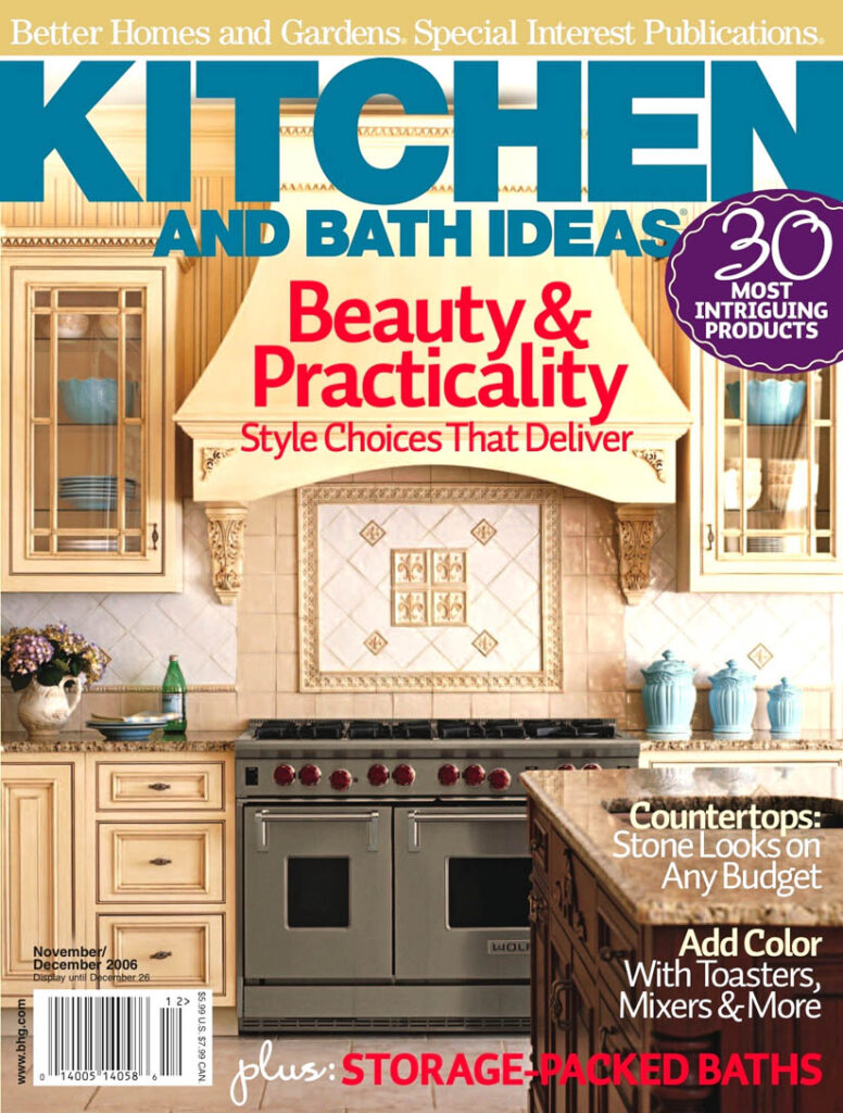
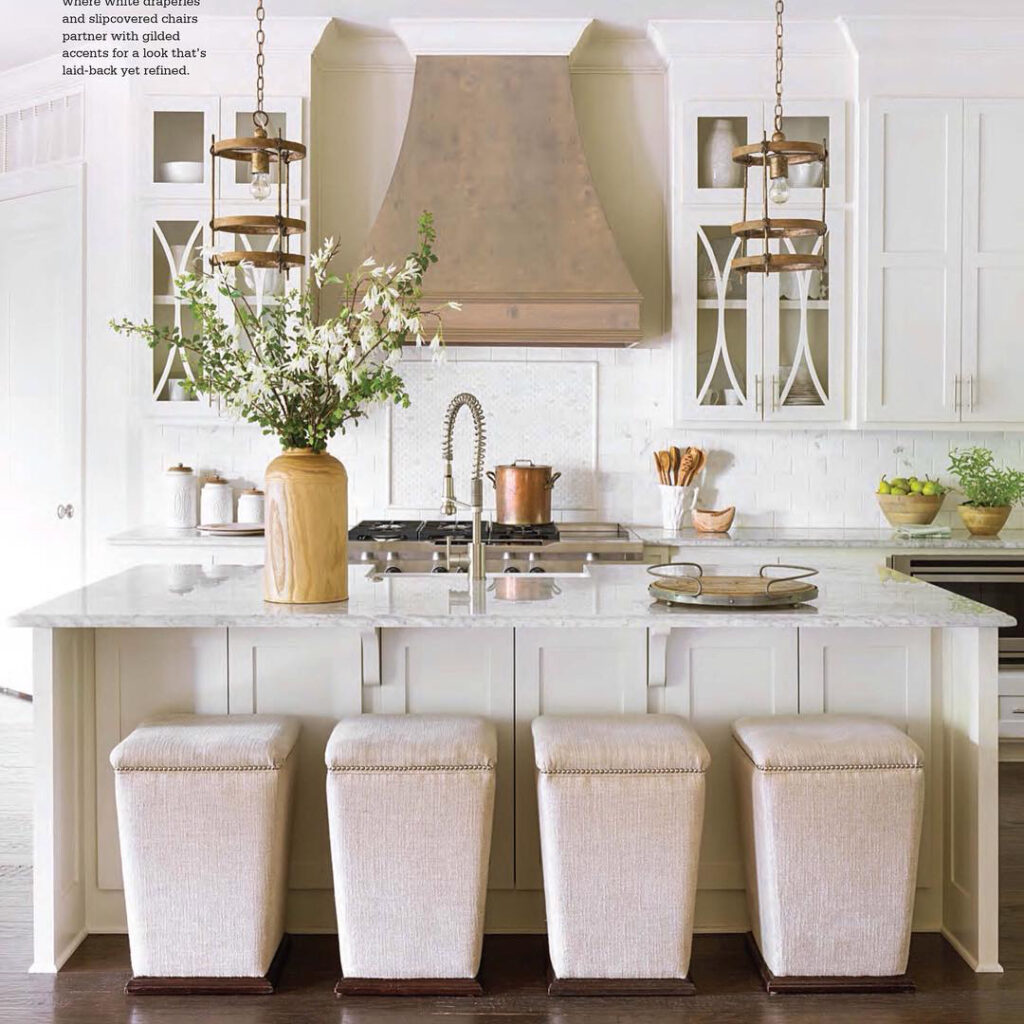
In the early 2000’s we started seeing more glass front cabinets, which as it turns out, DID need styling on photo shoots. But even glass-front cabinets were a bit intimidating to people, what with having to keep things looking pretty and organized.
Below are a few kitchen stories I produced and styled that featured glass-front cabinetry.
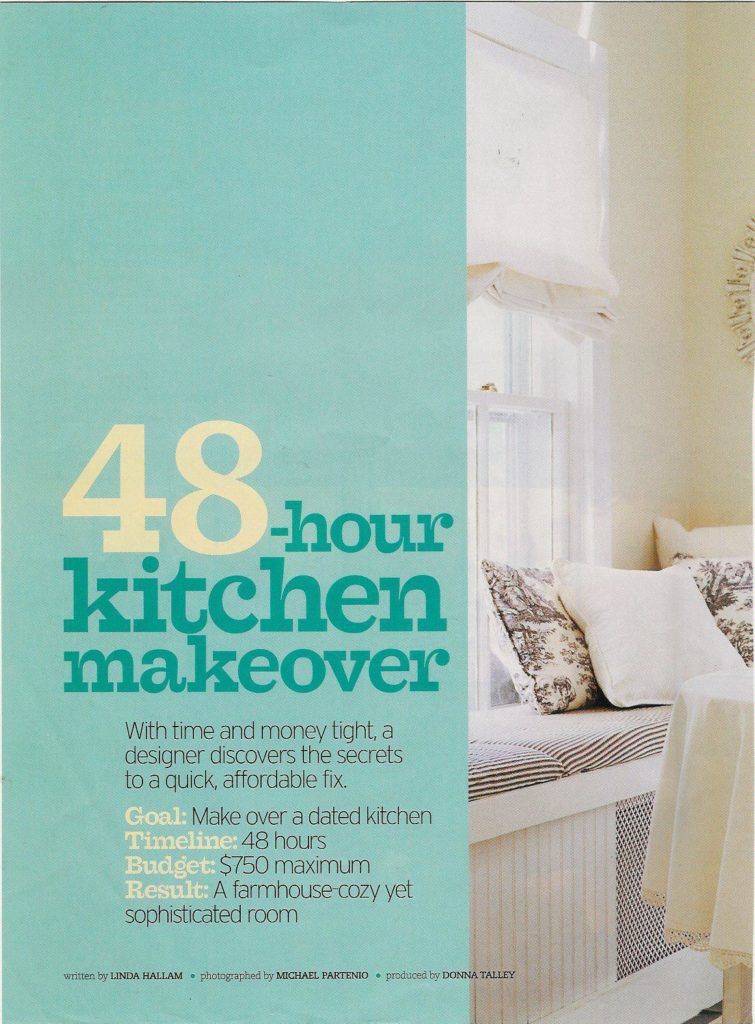
IMAGES BELOW: Before I renovated my kitchen in Saratoga Springs, NY in 2004, we photographed it for Better Homes & Gardens Kitchen & Bath Makeovers magazine as “The 48-hour Kitchen Makeover”.
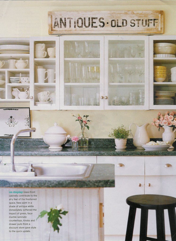
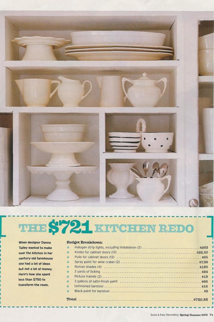
I styled the glass front cabinets with pretty glassware and removed the cabinet doors to display my collection of white ironstone pieces. This kitchen bridged the gap between glass-front cabinets AND open shelves.
For people who are skittish about entirely open shelves, glass-front cabinets could be a possibility. In fact, I consider glass-front cabinets to be the “gateway” to having actual open shelves.
THE EVOLUTION OF OPEN SHELVES IN MAGAZINES
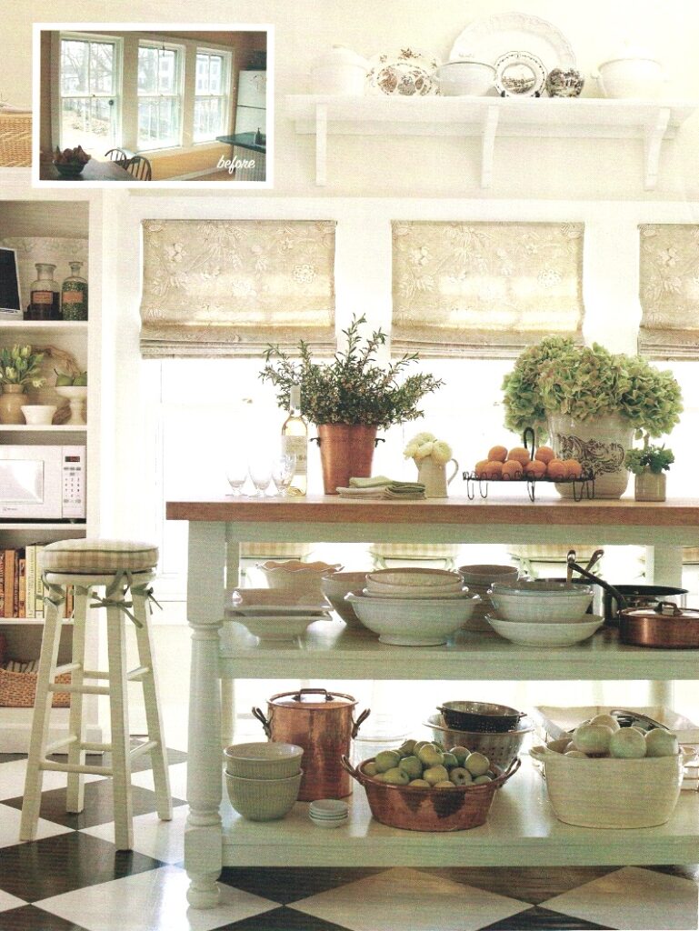
Back in 2004 (how was that 20 years ago?), I gutted the above kitchen in Saratoga and designed a custom kitchen from scratch. Since I was starting with a blank slate, I could have anything I wanted (as long as it was in the budget). As a magazine stylist, I wanted – no, I LONGED FOR – open shelves in my farmhouse style kitchen, where I could display my collections of English ironstone and French copper.
Because it was a small kitchen, I even designed the island with open shelves, because there wasn’t enough room to open and close cabinets on the island without bumping into things.

Photos: Michael Partenio
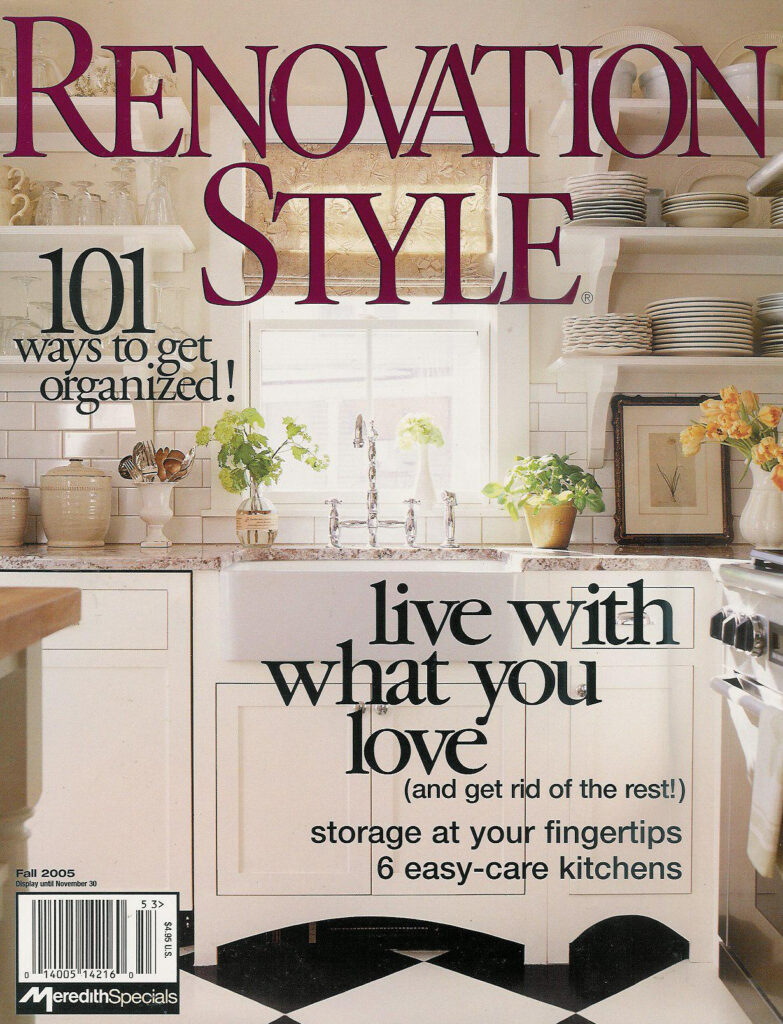
IMAGE BELOW: My kitchen made the cover of Renovation Style magazine in 2005, and it was a pretty big deal for the magazine to feature open shelves on the cover. I would say that in the mid-2000’s, open shelving was gaining traction in kitchen design. But, nonetheless, the magazine editor I mentioned earlier in the post received a lot of calls and letters about those open shelves on the cover. There were becoming a thing… but apparently not to everyone!
Right around that same time, I was producing and styling more and more kitchens that featured open shelves. The image below features a kitchen I designed in Williamsville, NY for Better Homes & Gardens Real Life Kitchens & Baths magazine. This was quite the before-and-after makeover of a very dated kitchen, and I managed to sell the homeowner on the convenience and practicality of removing all the upper cabinets on one side of the kitchen and replacing them with open shelves.
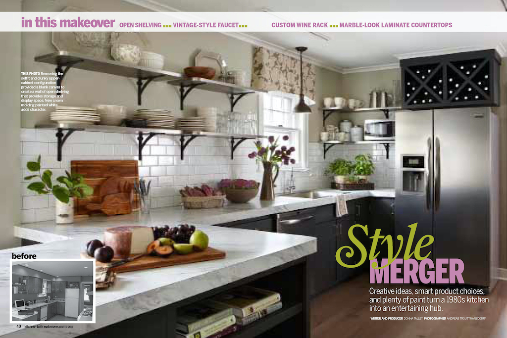
I zoned the open shelves for specific, everyday use items: Coffee/tea accoutrements to the right of the sink, and everyday plates, bowls and glassware right near the serving peninsula.
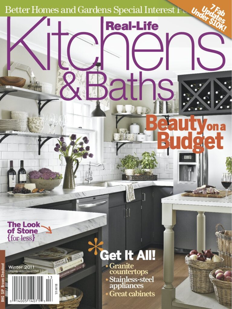
The kitchen also made the magazine’s cover, so open shelving was officially a THING by 2011.
WHY HAVE OPEN SHELVES? MAKING THE CASE
I can name a few reasons why I like to include open shelves in my kitchen designs:
ONE: They add an airy quality to a kitchen space, and lighten things up (especially if the rest of the kitchen has wood cabinetry).
TWO: They’re an opportunity to display a special collection, such as copper pots.
THREE: They’re practical in that you can have everyday items at your fingertips. And when you have guests, no one has to ask which cabinets the glasses are in.
FOUR: If you’ve ever banged your head on an open upper cabinet when unloading the dishwasher, there’s a good enough reason, if any, to not have big runs of upper cabinets.
OPEN SHELVES… IN LIMITED DOSES
I will admit that today, I wouldn’t design a kitchen with SO MANY open shelves as I did in my house in Saratoga. Mostly because I did have to take things down from the upper shelves and give them a good washing every couple of months. They were pretty high maintenance.
The solution is to incorporate open shelving in smaller doses, perhaps flanking a window, near the sink or above the dishwasher (which makes it easy to put things away after washing).
OPEN SHELVES: A REAL LIFE DESIGN
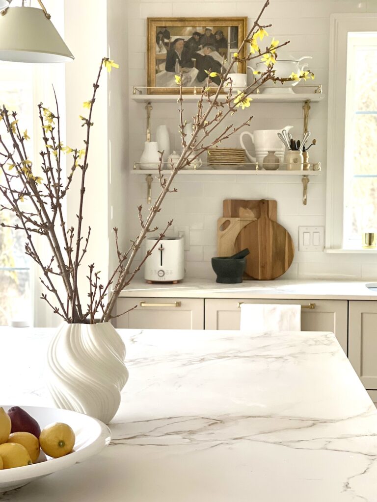
I recently designed a kitchen in upstate New York, and the homeowner (who is also a dear friend) didn’t need a lot of persuading when I suggested open shelves on each side of the sink. The “before” kitchen below had a lot of upper cabinets, and surprisingly didn’t have easy-to-access storage (see note above about the “head banging upper cabinet” factor. That happened a lot here!)
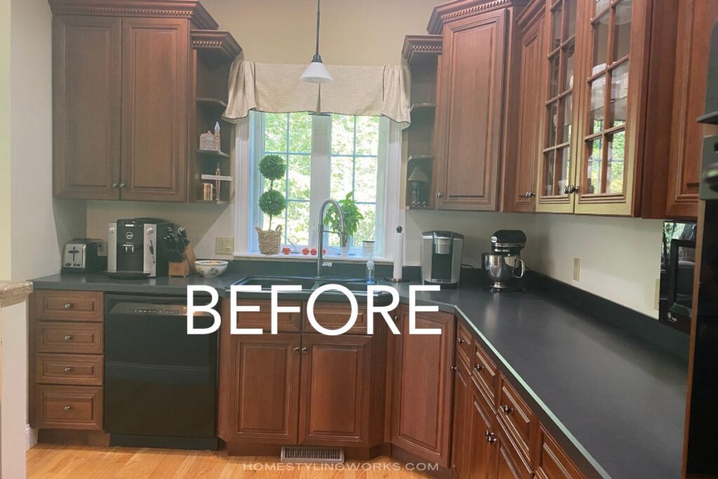
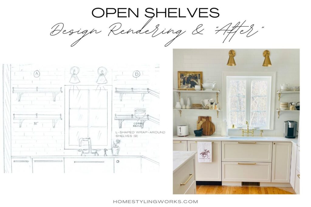
The new kitchen design called for a complete gut job. When I was designing the sink wall, I hand-rendered the concept for the open shelves that would replace the upper cabinets on each side of the sink. The image below shows the finished kitchen with new lower cabinets and the custom shelves flanking the sink window. It doesn’t even look like the same kitchen!
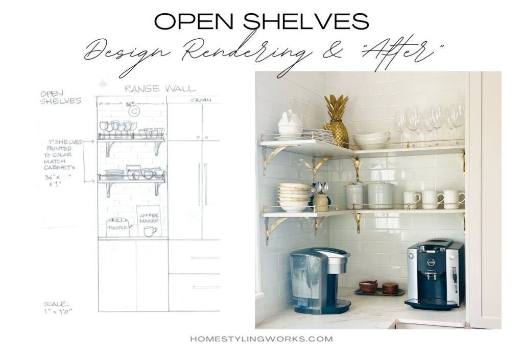
OPEN SHELVES, BOOKSHELF STYLE
Another solution is to incorporate a bookshelf-style open shelving concept. In the images below that I styled for various magazines, the built-in bookshelves became a vehicle for displaying practical items (such as a microwave and small TV in the center image), as well as cookbooks, baskets and more decorative serving pieces like tureens, cake stands, bowls and platters. In the image below left, I styled the shelves with decorative glass jars holding pasta, a selection of olive oils and vinegars, heavier Dutch ovens, and baskets on the bottom shelf holding bottled water and wine. I look at the open shelves in these images as kind of a butler’s pantry with no doors.
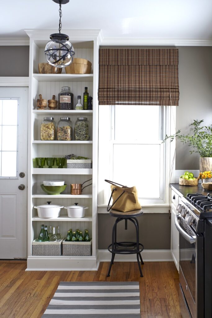
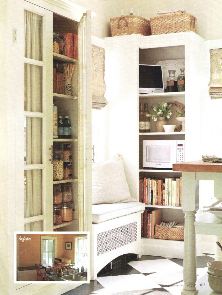
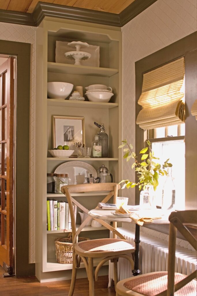
Photo left: Laura Moss; Photo center: Michael Partenio; Photo right: John Bessler
STYLING YOUR OPEN SHELVES
Now that you get the feel for how you can creatively style open shelves to be both practical and beautiful in your kitchen, I’ve created two “Shop The Look” galleries from two different open shelf styles shown in the post. The first one is a very elegant look, English-inspired, and the second one is a more textural, farmhouse/rustic look. The product links correspond to the numbers on the photos. Just click on the links below each image to shop!
SHOP THE LOOK: FRESH TRADITIONAL
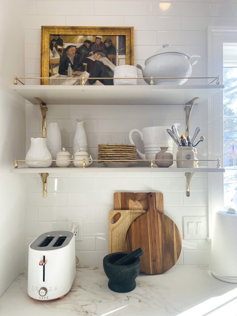
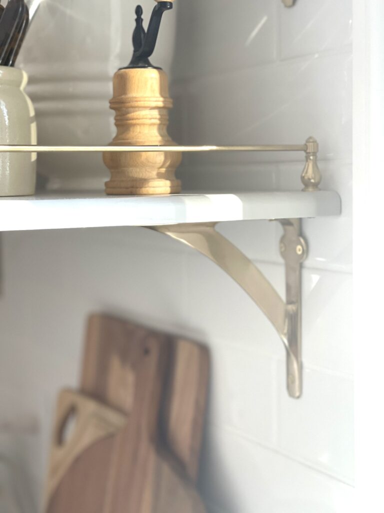
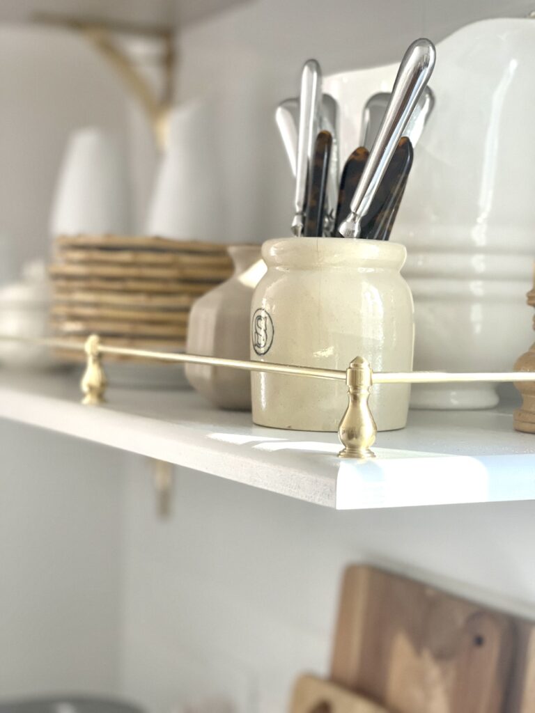
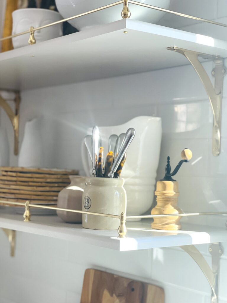
To get a similar look to these custom-designed shelves in your own kitchen, you can use a ready-made 12″ deep white shelf held up by beautiful brass brackets on each end. You can also find tutorials on how to make the brass gallery railing with brass rods and spindles on PInterest and YouTube.
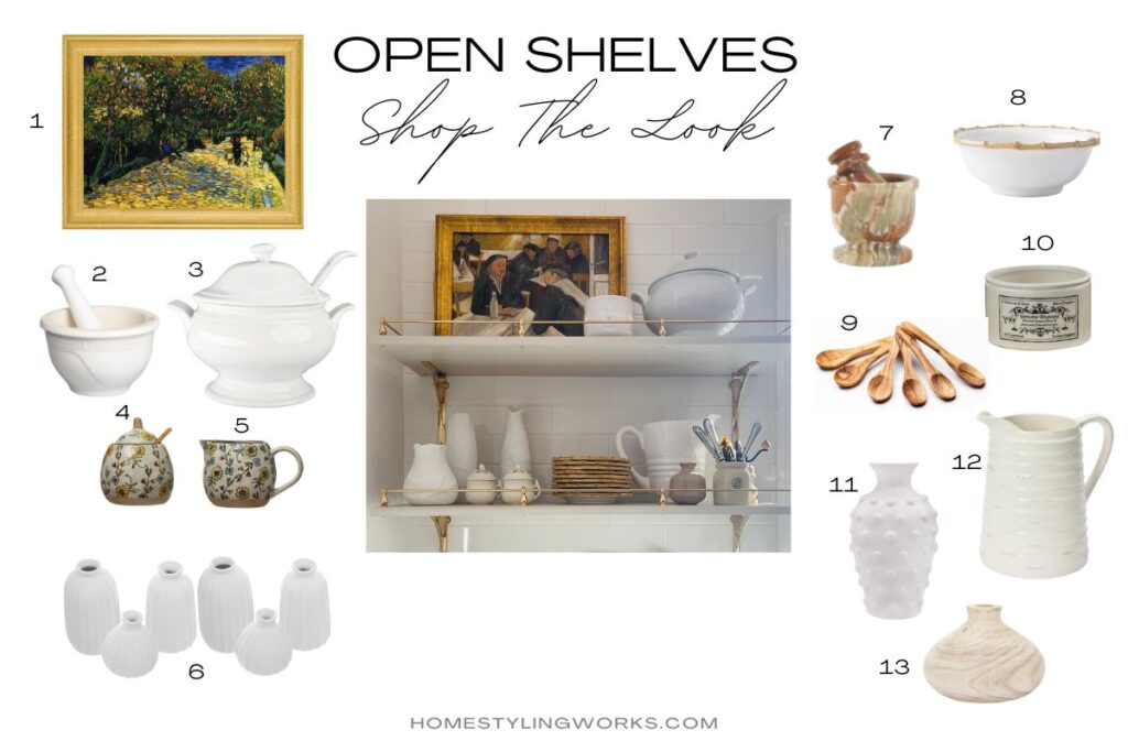
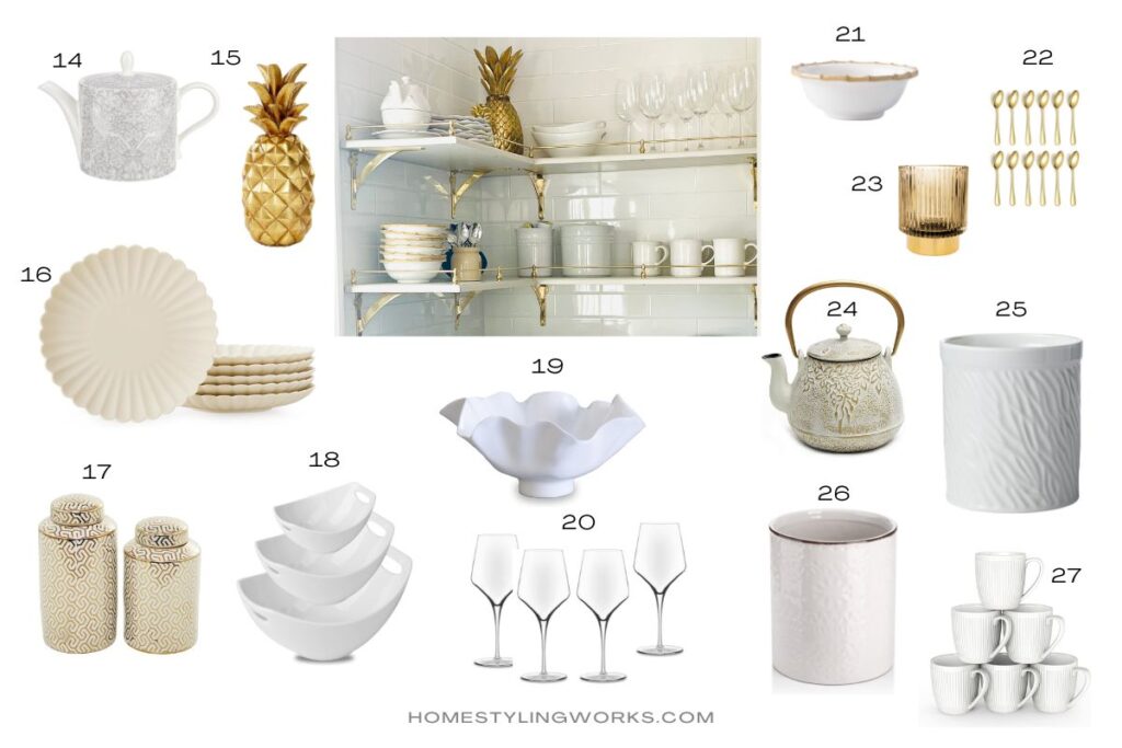
- Framed painting
- Le Creuset white stoneware mortar & pestle
- French soup tureen with lid & ladle
- Sugar bowl
- Creamer
- Set of 6 white bud vases
- Marble mortar & pestle
- Juliska Bamboo cereal bowl (a more economical option would be this set of melamine dishes with a similar look)
- Set of 6 olive wood mini spoons
- Vintage style marmalade crock
- White modern hobnail vase
- White pitcher
- Small pauwlonia vase
- Spode Pure Morris Strawberry Thief teapot, Made in England
- Brass decorative resin pineapple
- Set of 6 scalloped matte cream salad plates
- Pair of gold and cream Novogratz cannister jars (as an alternative to the brass pineapple)
- Set of 3 nesting serving bowls with handles
- Decorative scalloped bowl (melamine is a good option for items on higher shelves)
- Set of 4 everyday wine glasses
- Juliska Bamboo cereal bowls
- Set of 10 gold tasting/coffee spoons
- Amber glass jar (for gold spoons)
- Japanese cast iron tea kettle
- White crock (for keeping coffee pods within easy reach of the Keurig coffee maker)
- White crock (for sugar packets for coffee). I also like the texture on this option.
- Set of 6 everyday white coffee mugs
SHOP THE LOOK: MODERN FARMHOUSE
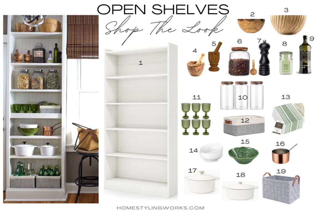
- White bookshelves (6-tier)
- Olive wood bowl
- Decorative wood salad bowl
- Olive wood mortar & pestle
- Wood mortar & pestle
- Clear glass coffee bean cannister with scoop
- Peugeot Paris pepper mill
- Sicilian sea salt
- Olive oil
- Clear glass cannisters with wood lids (pretty pasta suggestions for the containers here, here and here)
- Set of 6 green goblets
- Gray & white basket with leather handles (to hold dish towels)
- Set of 6 sage green striped dish towels
- Set of 2 white serving bowls (another pretty option here)
- Green majolica serving bowl
- Mini copper sauce pan
- Enameled cast iron white Dutch oven (8 quart)
- Enameled cast iron white Dutch oven (5.7 quart)
- Gray weave basket with leather handles (to hold wine bottles and Pellegrino water)
For more open shelf styling inspirations, I also delve into Styling Your White Collections in this post.
I hope these ideas have inspired you to give open shelving a try in your own kitchen.

