NOTE: UPDATED JANUARY 2025 FROM A PREVIOUS POST
I admit it. I’m a color-phobe. It’s not that I don’t like color – I just like it in low-commitment doses (flowers, pillows, plants, art). In other words, items that are easy to change. When I use color in my home, I definitely have a favorite – and it’s chartreuse. I have a very specific reason for loving chartreuse: it plays nicely with all the other color kids in the playground (I’ll elaborate on that later in the post).
In today’s post, I’m going to show you how to incorporate this unique color in your home decor. This post is for color-lovers and color-phobes alike!
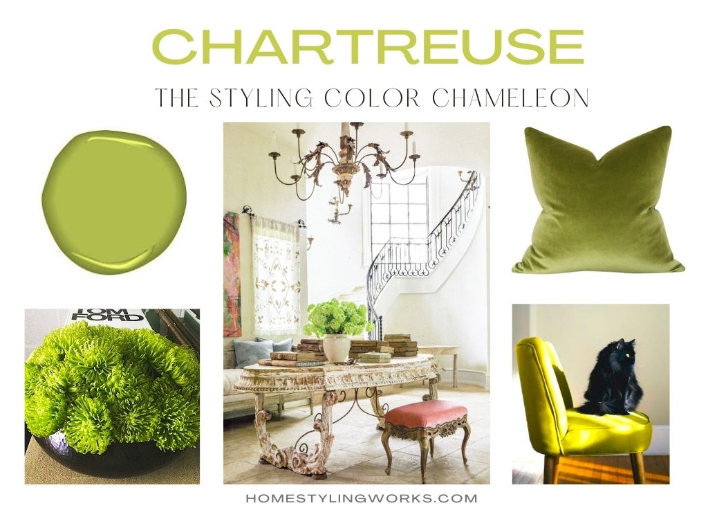
WHAT EXACTLY IS CHARTREUSE?
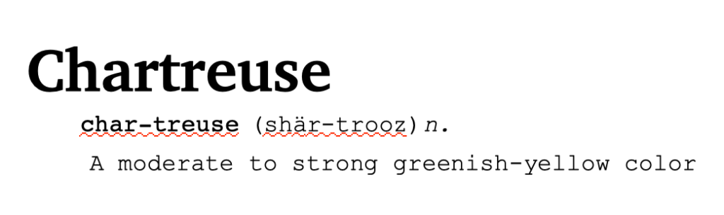
The color was named after a French liqueur called Chartreuse, invented by the Carthusian monks in the 1700’s, which has a distinctive greenish-yellow hue. I’ve never tried it, but it sure is a pretty color.

Chartreuse (as a color) first became fashionable in the 1800’s, where it was used in silk and velvet fabrics to make fans, gowns, purses, and shoes. It reached its apex in the 1920’s, when women began wearing this vibrant hue as an act of boldness and rebellion (my kinda ladies!) It gained popularity in home decor in the 1960’s and has made a comeback in recent years as “retro” colors are coming back into favor.
A RANGE OF COLORS
There’s really no ONE shade of chartreuse – it sometimes reads “yellow-green” (meaning more yellow than green), and other times it reads “green-yellow” (more green than yellow).
Just like every other hue on the color wheel, chartreuse comes in different tints, shades, and tones – both warm and cool.
I created the color chart below to show the ranges of chartreuse.

When it leans towards green, it feels like a spring hue. When it leans towards yellow, it tends to be more vibrant. The brighter shades are in the lime or apple green hues, and the more muted shades tend towards pistachio or olive green.
WHAT MAKES CHARTREUSE A CHAMELEON?
A chameleon (the lizard-y animal) changes its colors to reflect or absorb light and temperature. When lying under the hot sun, for example, chameleons can change into a lighter color to reflect the brightness of the sun. Chartreuse (the color) does the same thing. When paired with another color, it complements and accents that color.
I’ve created the “CHARTREUSE COLOR STORIES” below with images I’ve styled over the years for magazines where I incorporated chartreuse accessories and flowers.
CHARTREUSE + COLOR FRIENDS
As you can see from the “Color Stories” below, you can incorporate chartreuse in small, low-commitment ways with art, flowers, rugs, pillows and bedding. These Color Stories highlight chartreuse as an accent color.
Chartreuse + Black
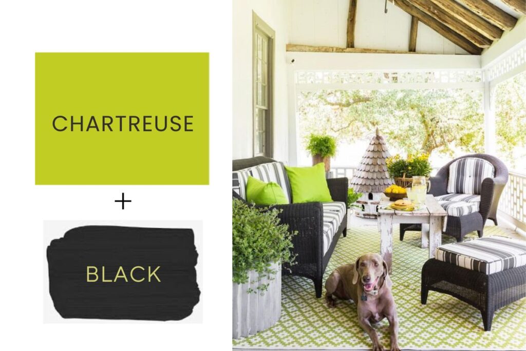
Photo: Julie Soefer
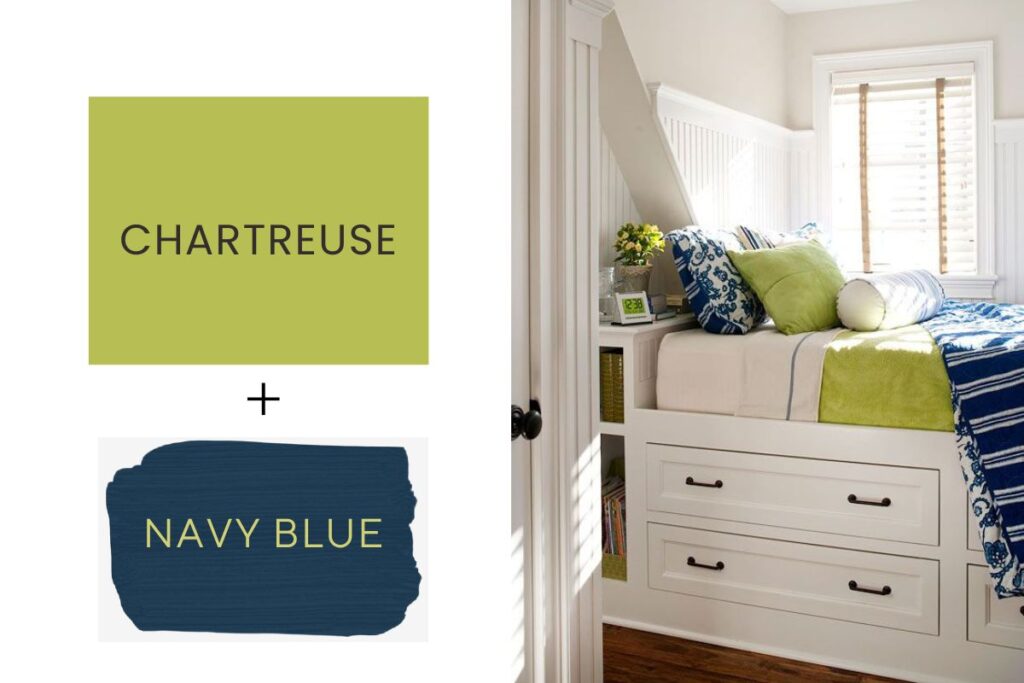
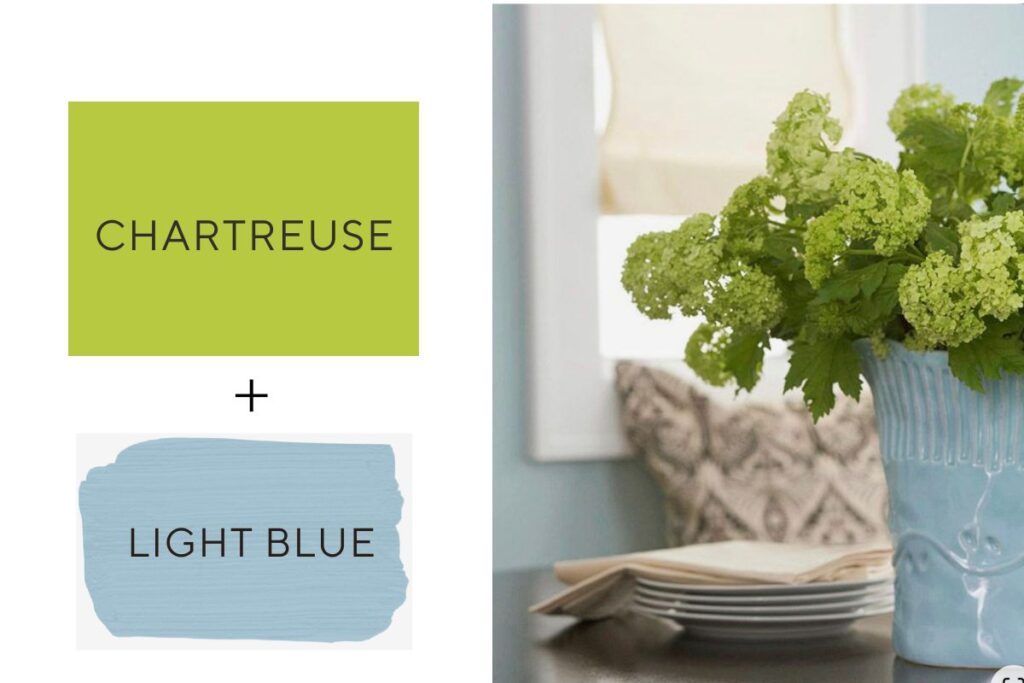
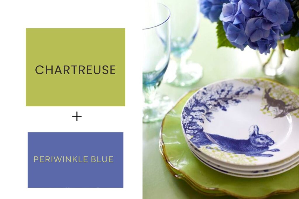
Chartreuse + Shades of Blue
Dark colors like navy blue make chartreuse pop. In the image below, I styled this guest bedroom space with navy striped bedding, accented by a chartreuse blanket and throw pillow.
The vignette below shows how chartreuse pairs so nicely with a robin’s egg blue hue. Chartreuse viburnum flowers enhance the soft blue color of the vase in this kitchen I designed for Better Homes & Gardens® “Kitchen Makeovers” magazine.
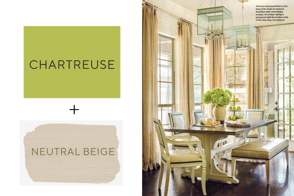
Chartreuse + Neutrals
In this beautiful dining room designed by designer Melissa Hall that was featured in Better Homes & Gardens® “Dream Kitchens” magazine, I styled the space with a lush arrangement of chartreuse green hydrangeas and pears. The chartreuse adds a subtle pop of color in this elegantly neutral space.
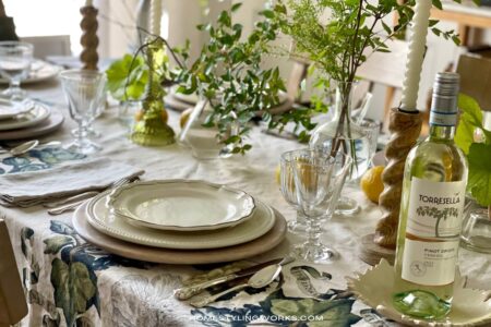
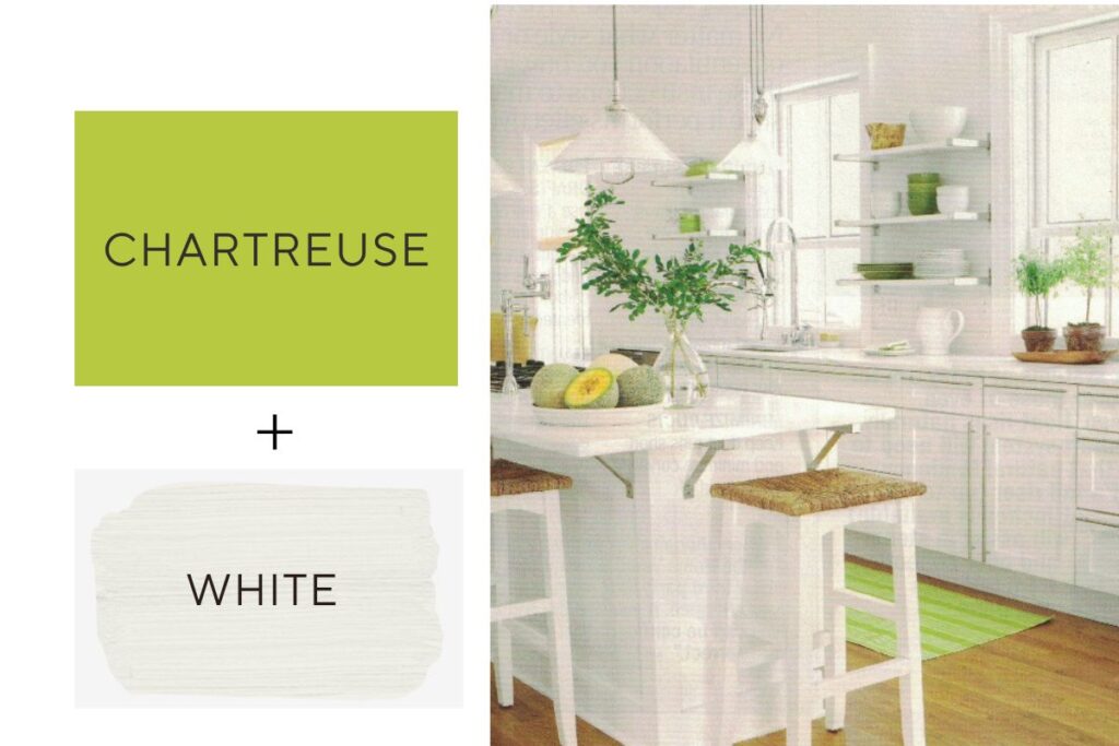
I often talk about how white goes with everything (one of the reasons why I collect white accessories – they’re easy to incorporate with other colors). The kitchen below is a great example on how to make an all-white kitchen more interesting by strategically incorporating color into the space. I produced this story for Better Homes & Gardens® magazine, and I added a few chartreuse elements to the kitchen: a runner from Dash & Albert, a pair of lime-green herb topiaries, and chartreuse-green plates and bowls on the open shelves.
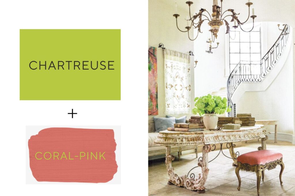
Chartreuse + Pink
The entry space below shows how to make pink look incredibly sophisticated. The homeowner worked with Houston antiques dealer Kay O’Toole to furnish the space with gorgeous French antiques and accessories. I produced this story for Traditional Home “Country French” magazine and to style the space, I added bright green viburnum flowers in a vintage crock. The chartreuse color of the flowers perfectly accents the coral-pink of the antique footstool and contemporary art.
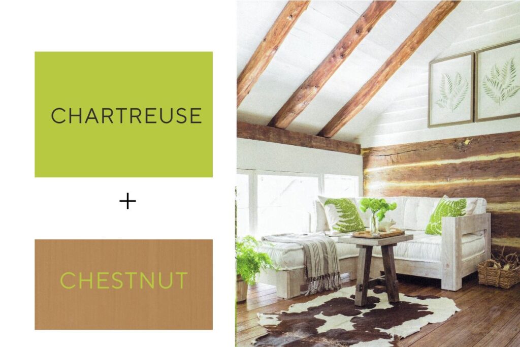
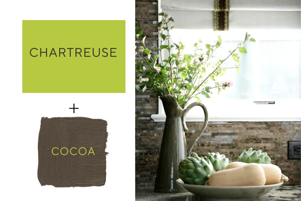
Chartreuse + Brown
CHARTREUSE ACCENTS
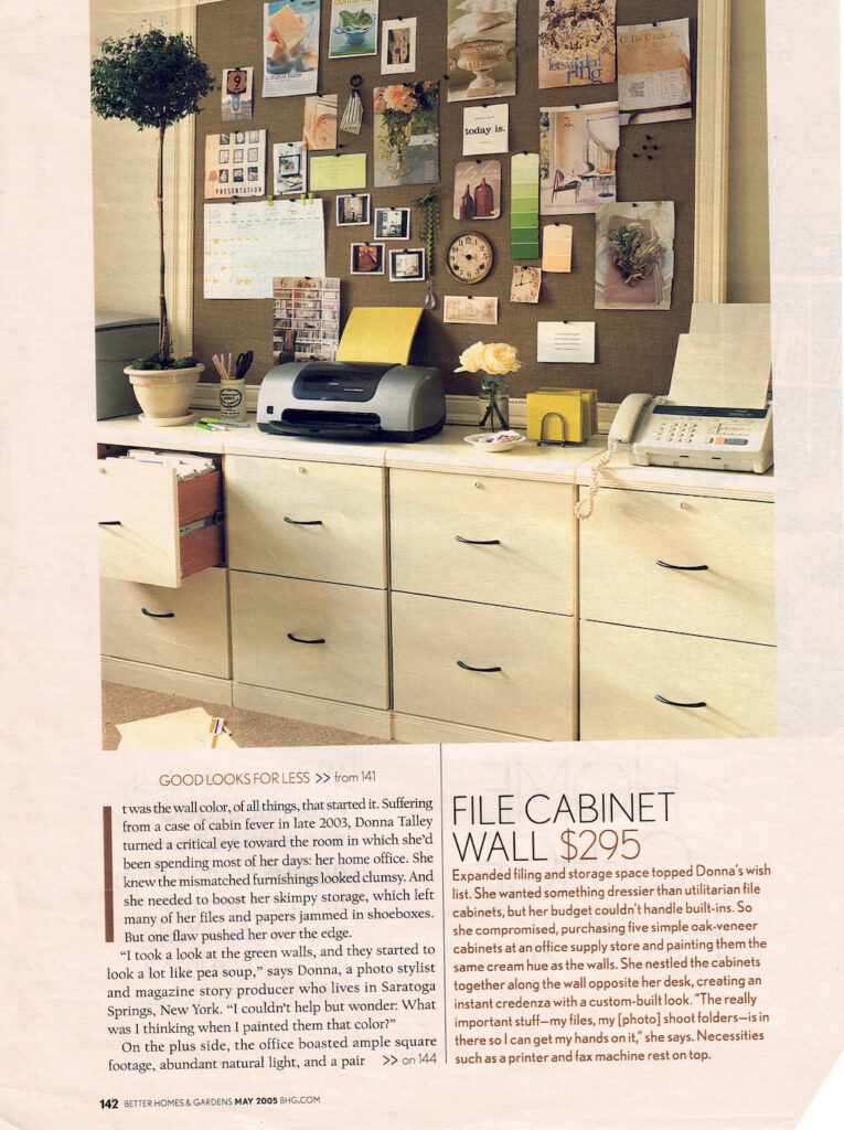
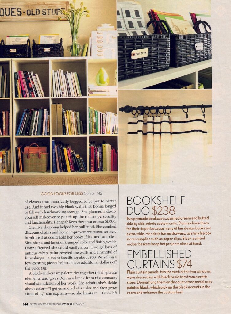
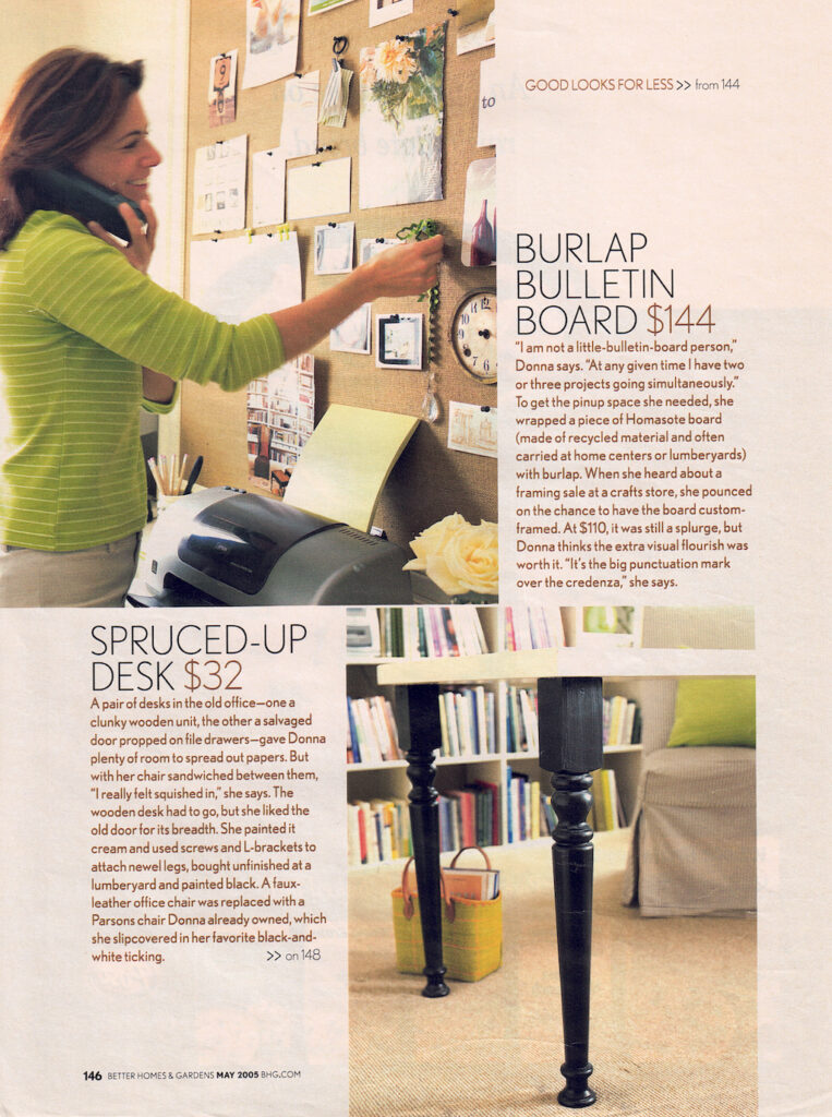
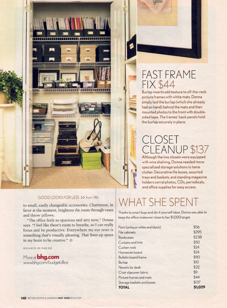
I first discovered chartreuse as an accent color when my former home office was photographed by Ann Stratton for a feature story in Better Homes & Gardens magazine back in 2005. As you can see, just a few chartreuse accents in the form of pillows and vases brightens up the neutral space. If I were styling this space today, I would swap out the black-and-white ticking striped chair for a bolder chartreuse office chair and added a tall white vase with chartreuse branches on top of the file cabinets or bookshelves.
Here are a few more ways to add chartreuse to your home interiors:
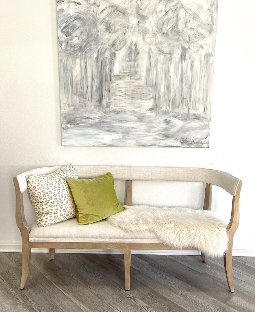
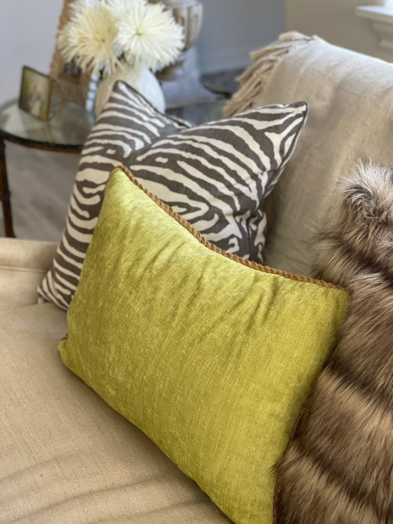
ACCENT PILLOWS are an easy styling tool to inject a pop of color into your decor. In my entry foyer and living room (below), I used chartreuse velvet accent pillows to complement the neutral furnishings. I’ve linked to a more chartreuse accent pillows in the shopping gallery at the end of the post.
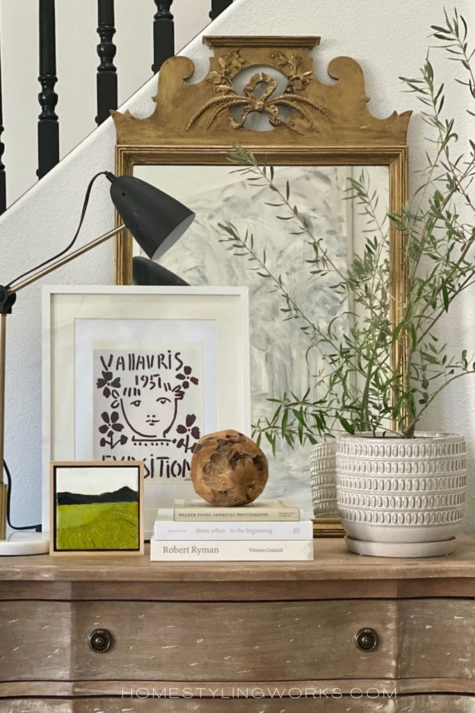
ARTWORK is another way to incorporate chartreuse in small doses. Below is a little vignette in my home, featuring a favorite small encaustic painting I bought on Etsy, which pops against the black-and-white art print behind it. The key to using chartreuse with artwork is to let it take center stage. You don’t want a table (or wall) full of chartreuse – it loses its impact when there’s too much of the color. Also, chartreuse looks particularly rich when paired with black and white art and photography.
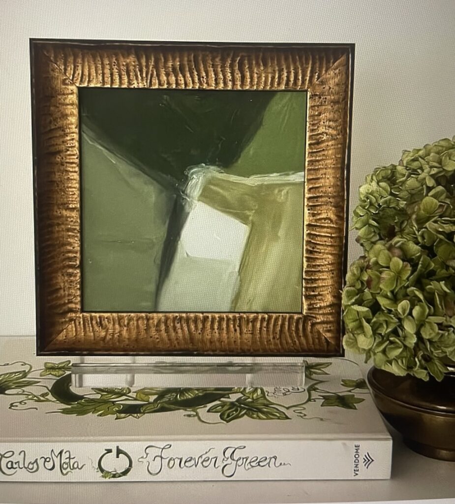
BELOW: If you have it in your budget for original art, a very talented designer-turned-fine artist who I worked with in my magazine producing days is Amanda Carol Eck. Her gorgeous abstract art pieces are framed in exquisite vintage frames, and she incorporates chartreuse in a lot of her work (she also does commissions). The piece below is sold, but you can check out her website at AmandaCarolCollection.com and follow her on Instagram to see her latest work. I would also encourage you to subscribe on her website to get early access to her “Reserve” and “Vault” pieces. Amanda is a talent to watch!
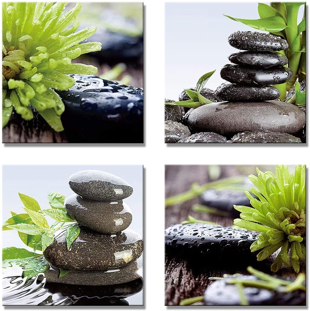
BELOW: A more budget-friendly art option is to hang a grouping of four modern photographs featuring chartreuse plants and nature scenes would look fantastic against a dark wall or even a neutral bathroom. They come in 12″ square and 16″ square sizes. This is a great way to add chartreuse to your decor for under $50. I’ve linked to more art pieces in the gallery at the end of the post.
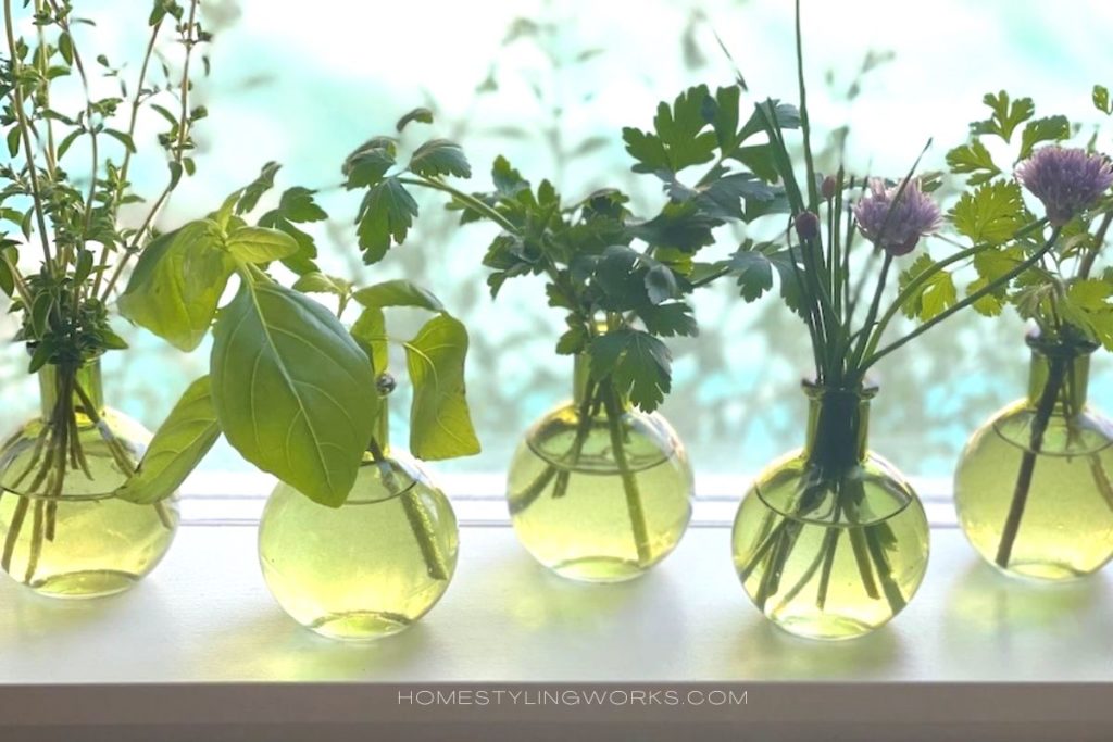
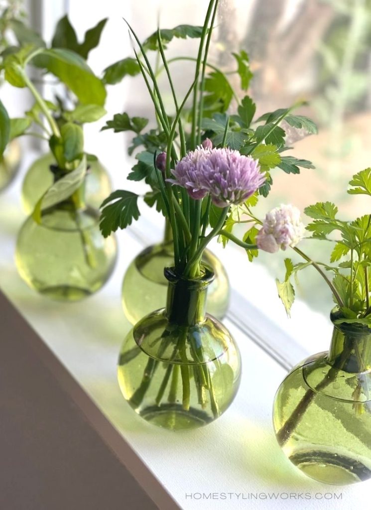
A COLLECTION OF CHARTREUSE BOTTLES. The image below features six chartreuse bud vases in my kitchen window that I filled with herb clippings. A quick styling tip is to place clear (or colored) glass bottles in a windowsill or on a table in front of a window, so they catch the light. I’ve linked these bud vases in the shopping gallery at the bottom of the post.
CHARTREUSE IN THE KITCHEN
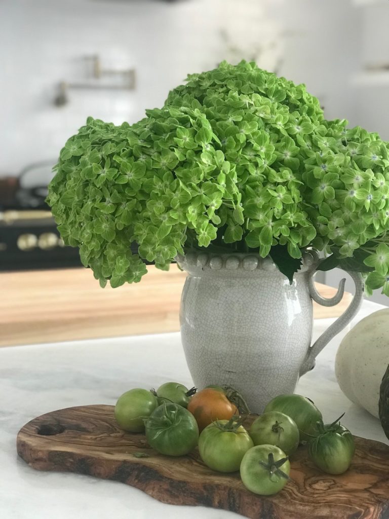
FRUIT & VEGGIES in chartreuse hues on display in the kitchen – I call this “Styling from the Produce Aisle”. Below are images showing various shades of chartreuse fruit, veggies and flowers. The image on the left is in my fkitchen, which features a simple display of just-picked green tomatoes from our garden with a pitcher of chartreuse-green hydrangeas. The photo right is a kitchen story I produced for Better Homes & Gardens® “Kitchen & Bath Makeovers” magazine featuring a vignette of pears and pale-green hellebores, which pop against the gray marble subway tile.

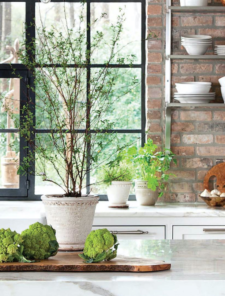
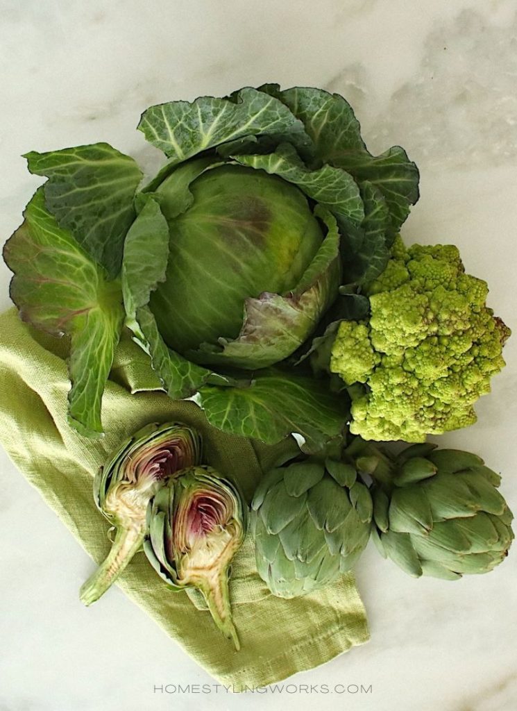
Another favorite veggie I like to style with is “Romanesco” cauliflower – which is cross between cauliflower and broccoli. It has a beautiful chartreuse hue, and I used it to style the kitchen in the photo below left for Traditional Home magazine. The potted fresh herbs also add a touch of chartreuse-green near the window. Below right are a few of my favorite foods to style with in different chartreuse hues.
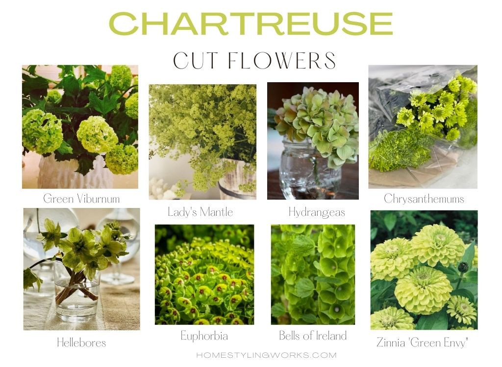
MY FAVORITE CHARTREUSE FLOWERS
Flowers (and plants) are the easiest way to add a pop of chartreuse to any home interior. Below are a few of my favorites that you can find at the supermarket or farmer’s market: Green viburnum, Lady’s Mantle, Hydrangeas, Chrysanthemums, Hellebores, Euphorbia, Bells of Ireland and Zinnias all come in varying shades of chartreuse.
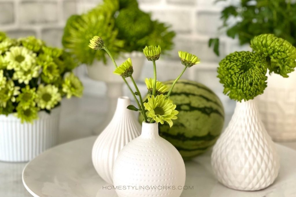
A quick flower styling note: If you’re using chartreuse flowers, it’s best to use a neutral or white vase, so the flowers take center stage. Conversely, if you’re using a chartreuse vase, choose white flowers or flowering branches to balance the color of the vase. Below is an example of how I styled chartreuse mums with my collection of white vases. I also go further into detail about how to style a White Collection in this post.
CHARTREUSE IN LARGER DOSES
If you’re more adventurous and you want to take chartreuse one step further, here are a couple of ways to incorporate the color into furnishings.
CURTAIN PANELS
Here are a couple of examples of chartreuse in larger doses with curtain panels. Below left is from a photo shoot I produced and styled for Better Homes & Gardens magazine. For this story about switching out neutrals for bold colors, I swapped the cream linen curtains in my living room for bold chartreuse silk curtain panels, with button tiebacks. You can also use these chartreuse velvet panels, which would look especially beautiful in a bedroom.
The image below right (via House Beautiful) features curtain panels in a rich chartreuse-yellow silk fabric, and the velvet dining chairs add another layer of color in more of a chartreuse-green shade. Note how the chartreuse pops against the subtle pale-blue walls and how the color complements the raspberry-pink accents in the space.


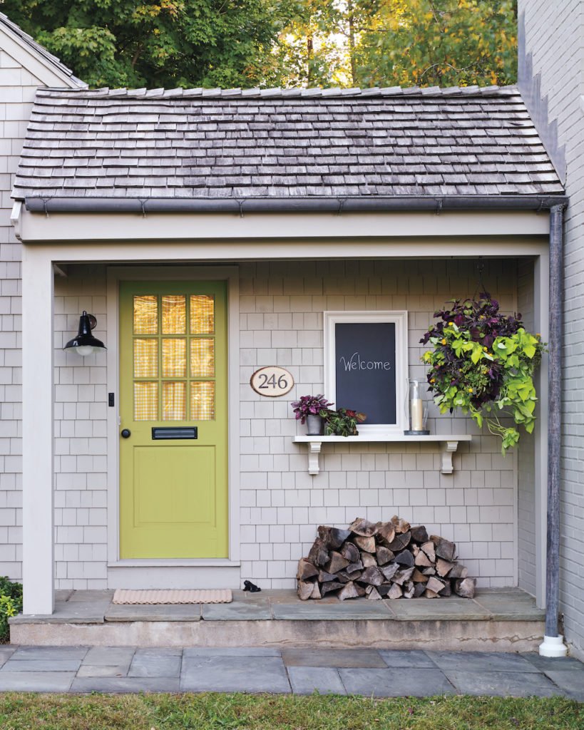
PAINT YOUR FRONT DOOR
I’ve seen this quite a bit lately – painting the front door a rich shade of chartreuse, which pops against both a dark exterior and a lighter one. Think of it this way: if you don’t like it, re-painting your front door is pretty easy (don’t ask how I know!)

MORE IDEAS
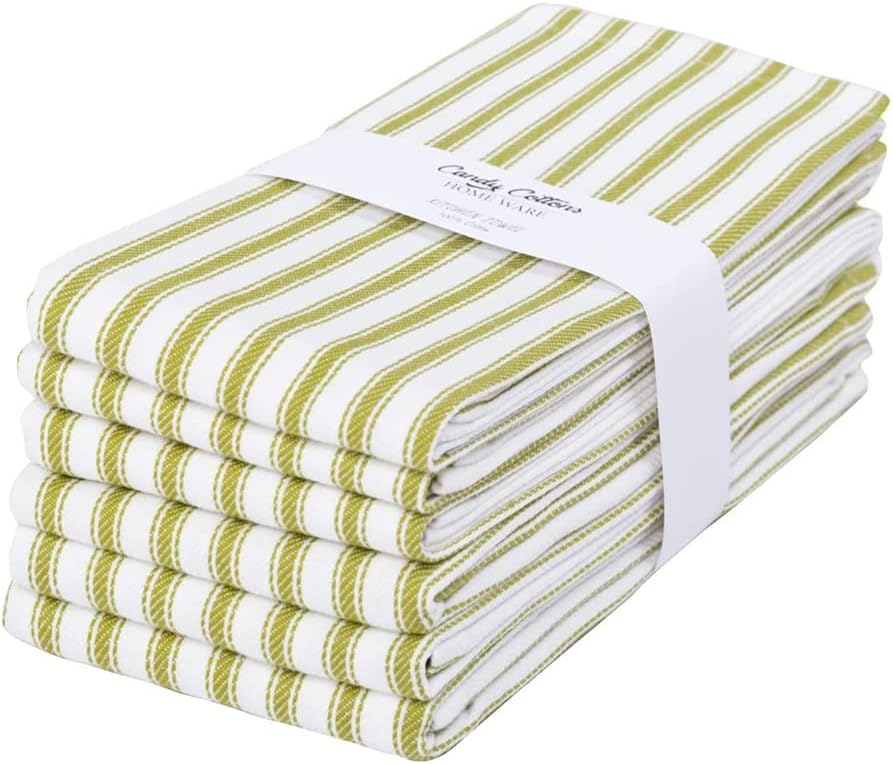
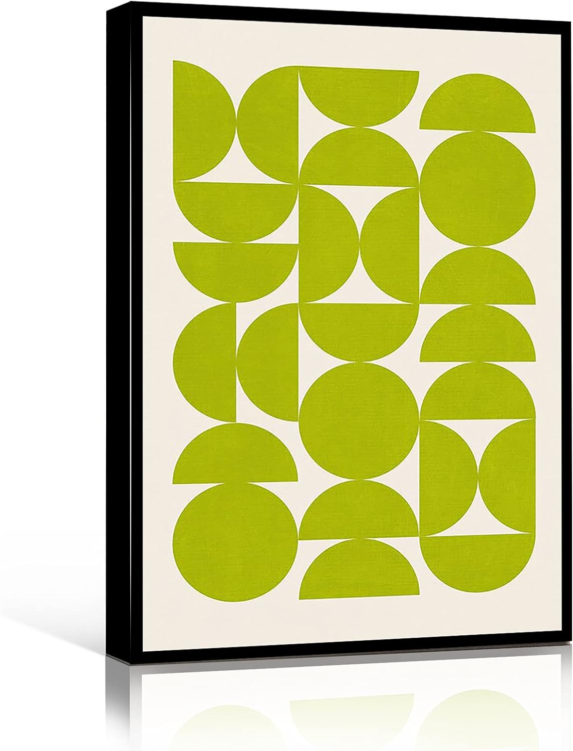
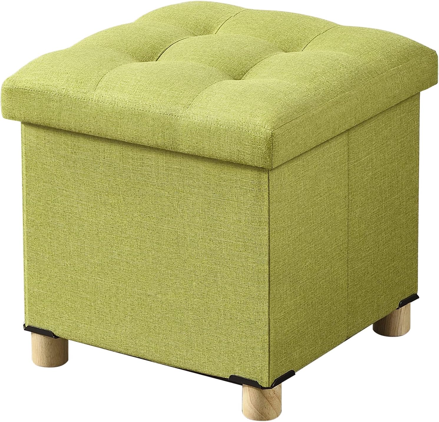
In the shopping gallery below, I’ve curated a collection of home accessories in varying shades of chartreuse – from artwork, bedding, plates and towels to chairs, rugs, curtains, throws and pillows. There are chartreuse options for every room in your home!
SHOPPING GALLERY
CLICK THE IMAGES BELOW FOR PRODUCT LINKS:


I hope this post has inspired you to take a fresh look at this beautiful color, and Make Your Every Day More Beautiful® with chartreuse accents throughout your home.
AND CHECK OUT MY NEW YOUTUBE VIDEO ABOUT STYLING YOUR HOME WITH CHARTREUSE!